The time indictors on the left and right now reflect the wallpaper color in iOS 8. Here's what it looks like with one of the new black iOS 8 wallpapers. It's very hard to see indoors, and completely invisible outside. Also, the album and artist line has been dimmed, and is harder to read too.

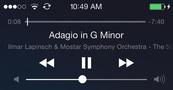
Here's another example on iOS8. You can see the time is tinted blue like the wallpaper in iOS 8. It looks fine here, but it's really bad on a vibrant wallpaper; they stand out way too much. So depending on the wallpaper, the text is nearly impossible to read, or too prominent.
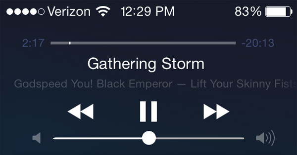
Now here is iOS 7. I don't understand the change to having one item of text be tinted. It looks out of place. iOS 7 looks like a more cohesive design.
Here's an instance where I pulled NC overtop an app with a dark theme. The X on the right side is virtually invisible because it takes up the appearance of the black behind it.

I know that there's the option to remove the translucency, but I don't think I should have to do that just to fix these examples. I think maybe there should be some sort of minimum delta that the text can't go below to keep it light enough in these situations. Also, Yosemite handles NC overtop of a black bg better.
Has anyone else noticed these things?
Here's another example on iOS8. You can see the time is tinted blue like the wallpaper in iOS 8. It looks fine here, but it's really bad on a vibrant wallpaper; they stand out way too much. So depending on the wallpaper, the text is nearly impossible to read, or too prominent.
Now here is iOS 7. I don't understand the change to having one item of text be tinted. It looks out of place. iOS 7 looks like a more cohesive design.
Here's an instance where I pulled NC overtop an app with a dark theme. The X on the right side is virtually invisible because it takes up the appearance of the black behind it.
I know that there's the option to remove the translucency, but I don't think I should have to do that just to fix these examples. I think maybe there should be some sort of minimum delta that the text can't go below to keep it light enough in these situations. Also, Yosemite handles NC overtop of a black bg better.
Has anyone else noticed these things?