Become a MacRumors Supporter for $50/year with no ads, ability to filter front page stories, and private forums.
Wow! So the transparency is faked on the menu bar?! Too bad my Mac (4 year old 12" PowerBook with 32MB VRAM Nvidia GO 5200) doesn't support the transparnecy.

Actually, I was hoping for a Tinkertool option to turn on the transparency - only because the drab grey opaque title bar with black apple and spotlight logo reminds me of crappy OS 9. BRING BACK THE GLOSSY TIGER ONE WILL YOU APPLE!

I find it very strange that my oldish Mac doesn't support the fake menu bar transparency - especially as I get all the dashboard effects without any issue, plus the new dynamic blur behind transparent menus and sheets.
 
I've found LeoColorBar... works, it just puts a bar on your desktop picture no hackery involved. If you set it to 50% it looks normal again.

This is cool. Thanks for the link. This will come in handy when I upgrade to Leopard. And yes, I agree, the menu bar should not be transparent, looks bad.

Apple made steps backward with the dock, stacks and the menubar, well... and the folders if you ask me. Everything else looks nice though.
 
Excuse me, some people actually WANT the transparency... but are unfortunately left in the dust because our hardware doesn't support it.

https://forums.macrumors.com/threads/374851/

Well, the grass is always greener and all that...! :p

And I still don't understand why some machines don't support the "transparency", since according to sources in this thread the effect is actually only simulated, and not created on-the-fly via use of a filter or core image, etc. If that's the case, then as I speculated before surely even really low spec. machines should be able to handle such a simple task, shouldn't they? :confused:
 
It does make sense but at the same time, if they were going for the whole "making everything else besides the active window not so apparent", then why the big blinging 3D dock with reflections, blue LED lights, and enough eye-candy to kill a small kitten? But then again, you can hide the dock I guess. ;)

Hmm...Well a lot of people weren't just expecting usability GUI changes but also aesthetic changes. Why? Because they were all expecting something big to come from CoreAnimation so Apple is probably having difficulty combining usability with aesthetic changes. Consider this more "experimentation" of a good GUI that Apple has done throughout the development of Mac OS X. It certainly looks cool but for a working environment? Not so much...

Honestly, the more I think about it, the more I think Apple really did have some huge and amazing (secret) features planned for Leopard, but which they eventually realized they simply wouldn't be able to pull off in time for release.

I have to agree with this as Apple never said anything about the Top Secret features being released on Leopard. Perhaps an implication was made but no promise was made in that regard. One evidence of this is that Apple recognized that the dock wasn't that great and made a last minute change to allow the dock to look less fancy. They haven't completed the GUI either as we still have Aqua scrollbars and buttons.

Changes probably were just made for the sake of "change" in order for people to have a reason to upgrade. I'm sure a lot were expecting a big visual changes to this big cat so Apple compensated it. To me they just weren't necessarily ready with all their ideas. If it's really "top secret" then why release something crappy? They probably just put shots of the new GUI here and there in Leopard to get some feedback.
 
Well, the grass is always greener and all that...! :p

And I still don't understand why some machines don't support the "transparency", since according to sources in this thread the effect is actually only simulated, and not created on-the-fly via use of a filter or core image, etc. If that's the case, then as I speculated before surely even really low spec. machines should be able to handle such a simple task, shouldn't they? :confused:
Exactly. In previous builds up to the last one before the retail version it was transparent on my G4 DA 800 (from a QS) with Radeon 9200 AGP 128 but not anymore. And now that it's faked it should definitely still be able to since it now looks like it does the exact same thing as MenuShade does in Tiger (i.e. doesn't show windows behind it), which probably explains why MenuShade quits after about ten seconds in Leopard.
 
Wow, Ive seen nitpick some ridiculous things here but this is right up there. Right up there with the dock angle not being in perfect symmetry with the horizon or whatever that other thread was about.

Agreed... I think Apple put this in there because all the people that whinged and moaned about the brushed metal effect in Tiger, would not have anything to whinge and moan about any more.
So, In with the transparent menu bar!
 
I think the idea is that the menubar should integrate visually with the desktop rather than being a component of the UI sitting on top of it.
This is a departure from a long tradition, so many will initially find it to be visually "wrong".
One of the things that separates the MacOS from Windows is the persistent contextual menubar, and this kind of gives it some special significance.
I'm not convinced that "readability" is an actual issue for a menubar.

On the other hand, the concept of the desktop being such a prominent feature of a modern system seems a little short-sighted to me.
This and the 3D Dock are examples of "thinking inside the box" IMO.
Most busy users spend relatively little time looking at the bare desktop, and are more often going to perceive the menubar as a part of their applications, in which case the desktop theme of the menubar would only tend to break the theme set by applications, and serves no Earthly purpose in this context.

The violation of the illusion of transparency is IMO insignificant; the finding of this problem is an indication that the concept as a whole is being scrutinized.
I don't recall reading this much comment on previous menubar themes, so the problem is not the lack of true transparency; it's likely that the entire concept is a flop in the eyes of many users.
ie: fixing the transparency violation in Expose is not going to satisfy anyone who is looking for flaws; they will simply continue look for other "violations".
 
Thanks for the reply. Wow - so they did actually implement it in a more logical (if not entirely practical) way at one time. If it's ok to ask, what did you find crappy about it when it worked that way? Were the windows showing through just obscuring the menu bar text too much, or was it just too "busy"?

In Exposé, shoving all the windows to the side leaves a little bit of the windows still visible, but for most (if not all) applications, this little bit that's visible isn't revealing or distracting if you're just trying to look at the desktop. The windows showing through the menu bar were distracting and took away the focus from working on the desktop. It may sound really picky and a non-issue, but given the topic at hand, it's relatively important.

Another thing to consider at that time was how the menu bar looked—it used to be much more transparent and not blur the background as much. Those differences might've made it possible to show windows through the menu bar, but I still (personally) believe that their design decision (to make the menu bar its own entity and not have true transparency) was the correct one.
-Chasen

P.S. I'm not a hard-core defender of Apple's design decisions in Leopard, but I do think they did a good job with the menu bar given the fact that they decided to make it "transparent."
 
Hmm...I see what you're saying but I disagree.

Transparency is pretty sweet. I wasn't sure of it until I got leopard and realized just how distracting a white menubar can be. I'm definitely digging this new design.
 
No defaults, menubar.xml *probably* false hope

I spent a few hours getting acquainted with the System folder in Leopard when I first got it. One of the things I tried to do was disable the transparency on the menubar. I was not successful. Here's a list of things that were mentioned above and elsewhere and their effect:

Trick: Put a white/black rectangle on the top of background images to "disable" the transparent effect.

Result: This is the *best* way I know of so far to get rid of it. It works very well but takes a lot of effort to do especially if you like to change backgrounds a lot. It has to be something like 21pixels tall in a native screen resolution image. Black gives it a more grey Leopard-like look, white of course is much brighter and looks more like the Tiger menubar.


Trick: Find the defaults setting for the menubar and disable it, like the no_glass setting for the dock.

Result: After a thorough search of the defaults and domains, there is no such setting even related to the menubar. The closest thing in there is SystemUI and Menuclock domains, and they don't affect transparency. (To get a list of domains, type "defaults domains > ~/Desktop/defaults_domains.txt". Use "defaults read > ~/Desktop/defaults_read.txt" to get the whole thing)


Trick: Edit the menubar.xml file in /System/Library/PrivateFrameworks/CoreUI.framework/Versions/A/Resources/LeopardUI.bundle->Contents/Recipes

Result: This framework is apparently supposed to deal with resolution independence and how to draw certain elements at different scales [see http://arstechnica.com/reviews/os/mac-os-x-10-5.ars/10]. Playing with the setting did not affect the menubar in any noticeable way in my experiments.


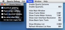
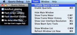
Trick: Use Quartz Debug [Spotlight it] to disable Quartz Extreme, and Voila, no more transparent menubar. (Screen shots below)

Result: Voila, the rest of the system struggles with effect like minimizing windows. This solution is only useful to show a connection between the two features and to preview the bar as opaque, but does not solve anything.


Trick: Just keep reinstalling the OS until the bar is Opaque for no clear reason.

Result: Of course this is a joke. Some people have been getting an opaque bar on the same machines others have been getting transparent bars. This seems to indicate a flaw in the way the OS determines whether to enable the feature.


Those are the only techniques I've seen attempted so far. My guess is the opacity is coded in somewhere rather than a config file setting (maybe as a last-minute hack to get it out the door as speculated in prior posts). One thing is for sure though: there are a lot of people who do not like the feature and would like a way to disable it. It's not like Apple to "fix" something that's not broken, so a way to disable it may not ever be provided by them. On the other hand, I don't think it would be that unlikely to include a tick box for the setting somewhere in 10.5.x either, I'm just not holding my breath. Somebody will create a clever hack soon though no doubt.
 

Attachments

  • opaque.jpg
    opaque.jpg
    61.1 KB · Views: 71
  • trans.jpg
    trans.jpg
    63.2 KB · Views: 71
I like the transparency, I think it looks great. If you don't like it either use a solid colour wallpaper or add a solid colour to the top of an existing wallpaper so it appears as though you have a solid menu.
 
C'mon is it really that bad? I mean you can read the text, its just different. I think it looks cool with my desktop.
 

Attachments

  • Picture 1.jpg
    Picture 1.jpg
    20.8 KB · Views: 86
C'mon is it really that bad? I mean you can read the text, its just different. I think it looks cool with my desktop.

I thought I did like it, but I prefer how 10.4.10 looked - more professional.

My desktop is the default Aqua Blue again, as the Aurora is just not professional looks or very fitting in my mind. Maybe I will change it back if I ever use time machine.

Now I am just waiting for a nice app to make the dock little blue glowing dots turn into black arrows. I like the 3D effect - no problem there. I just prefer the little black triangles.
 
How does something that is THAT transparent, create such a dark drop shadow?
 
I think it's kind of unfair how Apple doesn't give us some simple choices to change our interface to fit our unique tastes. I mean, they could at least give us an on/off switch for the menu bar transparency in the Appearance Pref Pane... that would be simple and it wouldn't add too much confusion. They also could have had an on/off switch for the 3D Dock in the Dock Pref Pane. It's lame that they force us into these changes that may not look so great to some people. Oh, and by the way, not everyone reads these forums and has a single clue about hacking with the Terminal so most people will just live with the change and try to get over it.
 
I found nothing wrong with the brushed metal. I thought it looked great, and I also love the new transparent menu bar.
 
Question. Has anyone tried using the "Change Desktop Every..." option in the Desktops and Screensavers Pref Pane? Does the Menubar dynamically change as the Desktop picture fades into other pictures?
 
Register on MacRumors! This sidebar will go away, and you'll see fewer ads.