Become a MacRumors Supporter for $50/year with no ads, ability to filter front page stories, and private forums.
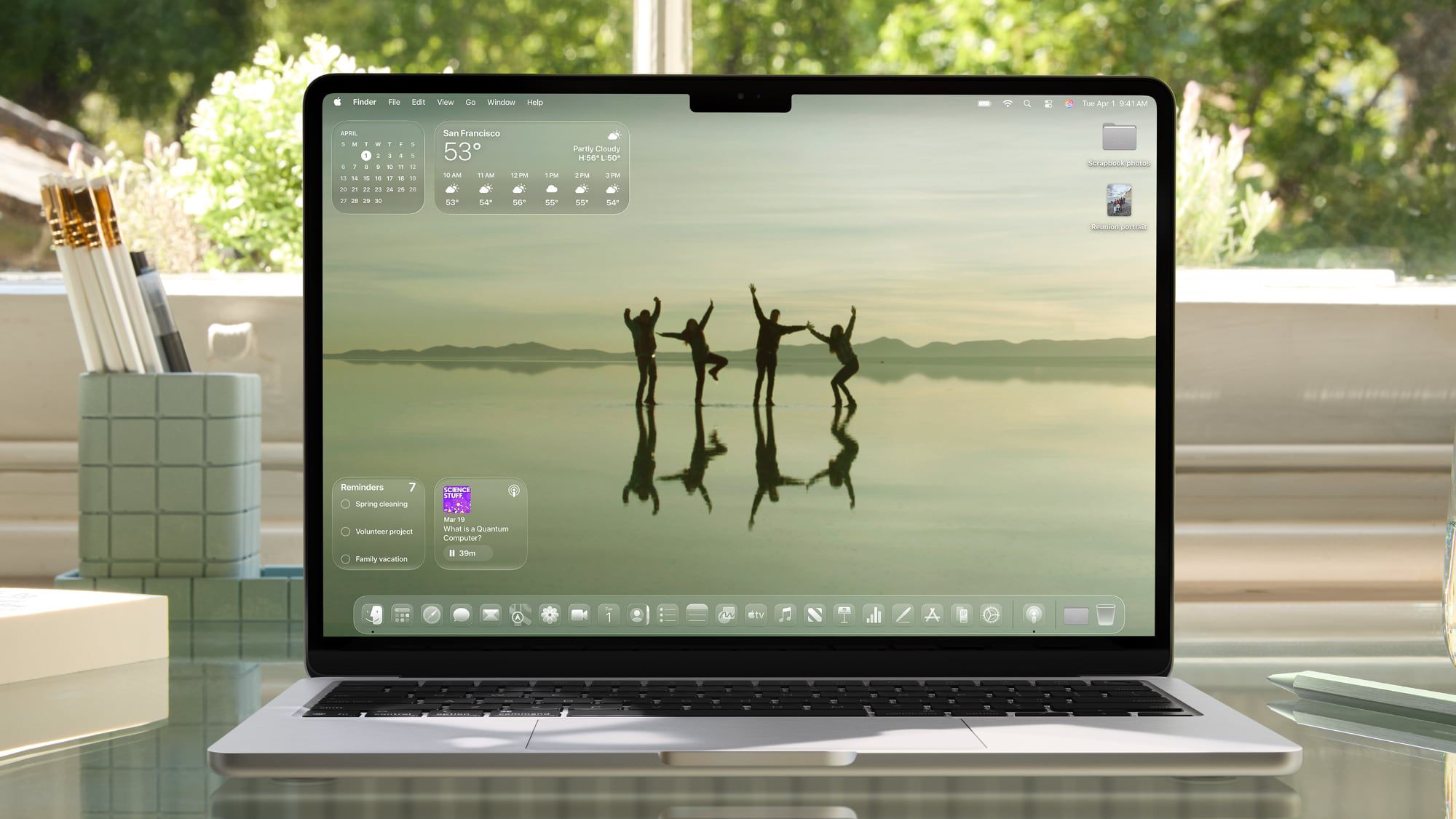
Its hard for a company (or anyone for that matter) to admit they missed the mark, and it really depends, will Tim Apple double down on macos 27 or accept the criticisms and change the UI away from liquid glass.
That is very true. For me, MacOS 26 is ok. You and I have been around long enough to have dealt with some less than thrilling MacOS. I think it is going to get harder and harder to "wow" people with an OS, especially when there have been ongoing bugs or apps that seemed to fall short of ability. As you said, a lot of this will be on Tim's shoulders. Not that ling until June.
 
  • Like
Reactions: StoneJack
You're definitely the only person I've ever heard say that, especially around these parts.

To each our own! 👍

I use scaling with macOS for many reasons, but none of them is because it's sharper, that's for sure.
I think it's a resolution thing. I'm used to Windows, where every bump in resolution makes everything clearer and sharper. Maybe my eyes are weird, I don't know, but I swear everything looks cleaner and more smooth with the higher resolution/spacing.
 
Last edited:
Its hard for a company (or anyone for that matter) to admit they missed the mark, and it really depends, will Tim Apple double down on macos 27 or accept the criticisms and change the UI away from liquid glass.

Double down? The person in charge of Tahoe design is gone.


He ( and Ive ) is likely ar more response for the state of human computer interaction design , so was a deeper root cause of the problem .

Apple probably isn’t going to throw all of it in the trash can . There is too much intertwined in VisionOs and most of the other OS instances to make that tractable for a couple of cycles ( at least ).

Chuckled at the daring fireball report that he didn’t notice the webcam indicator like was active on the Neo he was evaluating because the indicator was blended into all the transparency of the glassy UI. Dali down the transparency and light ‘worked’ as intended.
 
Last edited:
I revise my opinion of the silver / white

Citrus and Indigo both look better

Surprised that I liked indigo in person much more than I thought I would and silver a lot less.

Increasingly think indigo would be the move if I were to get one.

Citrus is still cool too though
 
  • Like
Reactions: 4sallypat
Register on MacRumors! This sidebar will go away, and you'll see fewer ads.