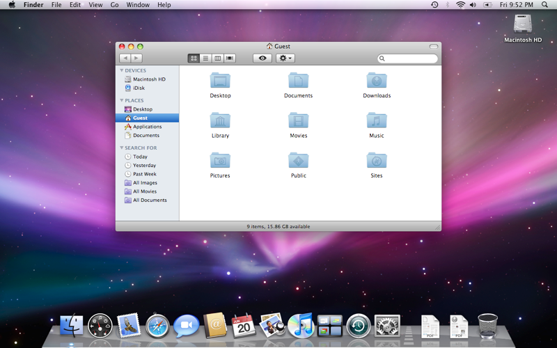
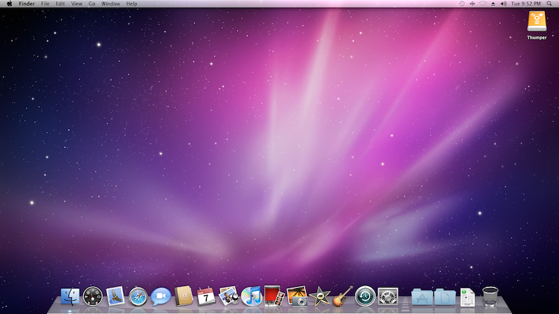
Everybody likes everything design-related in Apple products/software but there are some things in Snow Leopard that make me think that it was either rushed or the graphic/GUI designers didn't pay too much attention.
When using the arrow keys in stacks you can see an ugly blue shadow that highlights the selected item. Blue? Why blue? It does not combine with the dock and looks awful with most wallpapers. Also they use a square for highlighting any of the icons, even the "open in finder" round icon with the arrow. They could have at least made this blue highlight follow the shape of the icon just like the shadow on the icons on the dock.
Also in exposé they use the same ugly blue for highlighting windows.
Maybe is because I am graphic designer but it really bothers me. I have seen they use a similar color in front row but it doesn't look back there because of the black background.
Okay, I am being picky.


 =
=