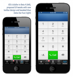
I'm hoping we'll see some UI improvements that have been saved for the GM build of iOS 6. Anyone else?
While it's obviously not hugely important, slight but noticeable visual tweaks would be appreciated by many users, even if they are evolutionary.
I don't think any of the following tweaks would be hard, nor do I think they would need any developer testing. Some ideas:
- Proper implementation of the tinted status bar. The tinted status bar parameters were altered in Beta 4 which broke it for apps that had featured it. Examples for me are Facebook Messenger and Things, both of which had the tinted bar up to Beta 3. Hopefully this behaviour is more standard in the GM build, because it's very inconsistent at the moment.
- Tweaked default titlebar color. I think the default blue titlebar color should be just a shade more blue. Its kind of washed out appearance at the moment isn't as nice as it could be.

- Mountain Lion-style improvements. While we've seen stuff go "back to the Mac" I really hope we'll see a few things go "back to iOS" namely the unified search in Safari and the new frosted glass dock.
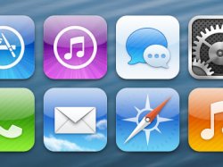
- Refined stock icons. Completely wishful thinking, but it would be amazing to see new or at least refined stock icons. At the very least, small tweaks like this:
- More new wallpapers. The iOS 6 wallpapers so far are a little bit standard, there aren't that many, and I don't like the default so much. I hope we see a new default wallpaper in the GM build as well as some additions.
- Death of the pinstripes in stock apps. Like the phasing out of pinstripes in OS X years back, the pinstripes on iPhone are starting to look a tad dated. Removing them entirely would be a nice move, perhaps in favour of a very light linen or speckled background a la OS X Lion onwards. Even just keeping the color but having it block would be preferable.
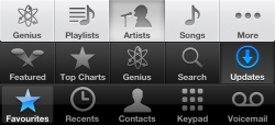
- Unification of toolbar styles in stock apps. The new App Store and Music toolbars are lovely, but the Phone and other apps still have the old style. Would updating them really be that hard?
- Refined on-screen keyboard appearance. The keyboard is showing its age, with rather harsh shadows. Tweaking/flattening the on-screen keyboard's appearance would be welcomed. If the dialler can be refined why not the keyboard? It's been the same for 5 years while so much else has been refined.
Such changes as these don't require much, if any, developer testing, and so it's possible/hopeful Apple are reserving some UI improvements for the GM. With Mountain Lion this was the case, with the frosted dock not appearing until the GM.
What's stopping Apple from small cosmetic tweaks and improvements? I can't help but think Apple have been too conservative with the UI in iOS 6. I'm not asking for a complete overhaul, more tweaks a la Tiger to Leopard or even Snow Leopard to Lion.
So much has changed in iOS's UI yet certain elements like the keyboard are 5 years old now and beginning to show their age. It seems a shame Apple are preparing to release killer new hardware with such a modest iOS update from a UI perspective.
Come on Apple, let's see some refinement in the UI in the GM build!
If anyone has any thoughts would love to hear them.
While it's obviously not hugely important, slight but noticeable visual tweaks would be appreciated by many users, even if they are evolutionary.
I don't think any of the following tweaks would be hard, nor do I think they would need any developer testing. Some ideas:
- Proper implementation of the tinted status bar. The tinted status bar parameters were altered in Beta 4 which broke it for apps that had featured it. Examples for me are Facebook Messenger and Things, both of which had the tinted bar up to Beta 3. Hopefully this behaviour is more standard in the GM build, because it's very inconsistent at the moment.
- Tweaked default titlebar color. I think the default blue titlebar color should be just a shade more blue. Its kind of washed out appearance at the moment isn't as nice as it could be.

- Mountain Lion-style improvements. While we've seen stuff go "back to the Mac" I really hope we'll see a few things go "back to iOS" namely the unified search in Safari and the new frosted glass dock.
- Refined stock icons. Completely wishful thinking, but it would be amazing to see new or at least refined stock icons. At the very least, small tweaks like this:

- More new wallpapers. The iOS 6 wallpapers so far are a little bit standard, there aren't that many, and I don't like the default so much. I hope we see a new default wallpaper in the GM build as well as some additions.
- Death of the pinstripes in stock apps. Like the phasing out of pinstripes in OS X years back, the pinstripes on iPhone are starting to look a tad dated. Removing them entirely would be a nice move, perhaps in favour of a very light linen or speckled background a la OS X Lion onwards. Even just keeping the color but having it block would be preferable.
- Unification of toolbar styles in stock apps. The new App Store and Music toolbars are lovely, but the Phone and other apps still have the old style. Would updating them really be that hard?

- Refined on-screen keyboard appearance. The keyboard is showing its age, with rather harsh shadows. Tweaking/flattening the on-screen keyboard's appearance would be welcomed. If the dialler can be refined why not the keyboard? It's been the same for 5 years while so much else has been refined.
Such changes as these don't require much, if any, developer testing, and so it's possible/hopeful Apple are reserving some UI improvements for the GM. With Mountain Lion this was the case, with the frosted dock not appearing until the GM.
What's stopping Apple from small cosmetic tweaks and improvements? I can't help but think Apple have been too conservative with the UI in iOS 6. I'm not asking for a complete overhaul, more tweaks a la Tiger to Leopard or even Snow Leopard to Lion.
So much has changed in iOS's UI yet certain elements like the keyboard are 5 years old now and beginning to show their age. It seems a shame Apple are preparing to release killer new hardware with such a modest iOS update from a UI perspective.
Come on Apple, let's see some refinement in the UI in the GM build!
If anyone has any thoughts would love to hear them.
Last edited:


