Become a MacRumors Supporter for $50/year with no ads, ability to filter front page stories, and private forums.

MacRumors

macrumors bot
Original poster
Apr 12, 2001
67,490
37,778


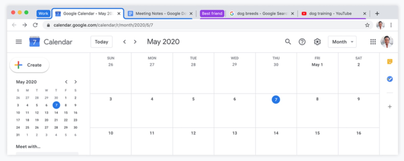
Google has announced a new tab grouping feature coming to Chrome browser that lets users better organize their tabs, however many they have open at the same time.
google-chrome-tab-groups.jpg

The new Tab groups option will appear in a tab's right-click menu and lets you group your tabs together and label them with a custom name and color. Once the tabs are grouped together, you can move and reorder them on the tab strip in one go.

Google suggests a few use cases in its Keyword blog:
Through our own usage and early user research, we've found that some people like to group their Chrome tabs by topic. For instance, it helps if you're working on several projects, or looking through multiple shopping and review sites.

Others have been grouping their tabs by how urgent they are - "ASAP," "this week" and "later." Similarly, tab groups can help keep track of your progress on certain tasks: "haven't started," "in progress," "need to follow up" and "completed."
Google says that that tab groups are fully customizable and are saved when you close and reopen Chrome, just like regular tabs.

The tab grouping feature is set to roll out gradually from next week, but anyone eager to try it out now can download the latest version of Google Chrome Beta for Mac.

Article Link: Upcoming Chrome Browser Feature Lets You Group Together Multiple Tabs
 
Others have been grouping their tabs by how urgent they are - "ASAP," "this week" and "later." Similarly, tab groups can help keep track of your progress on certain tasks: "haven't started," "in progress," "need to follow up" and "completed."

If you are rearranging Chrome tabs as your todo manager, you need a better system.
 
I hope one day Chrome will have this feature: Not ramping my MacBook’s fans up to 100%.

Yeah, Safari is usually better.
I do prefer the web inspector in chrome to debug stuff though, so I use both. I only use Safari to inspect webviews in iOS apps, but for web content Chrome is better. I'd consider Firefox but is way too slow.
 
Maybe one day they will come up with a system to save webpages in your browser. They could even add a map like structure so you can sort them by topic. It would be like placing a marker in a book. So when you close the book, you can always easily find back that page. Then I don't have to constantly keep all these books/pages open. They could name it 'bookmarks'.
 
I hope one day Chrome will have this feature: Not ramping my MacBook’s fans up to 100%.

Just out of curiosity: Does Safari really work silent with the same amount of windows, tabs and extensions? I‘m asking because I recently found out that Quicktime only draws like 3 % of CPU usage with h.264 1080p mp4 files while VLC uses at least 15-25 % on the same machine so I found some new hope in Apple‘s software engineering.
 
Just out of curiosity: Does Safari really work silent with the same amount of windows, tabs and extensions? I‘m asking because I recently found out that Quicktime only draws like 3 % of CPU usage with h.264 1080p mp4 files while VLC uses at least 15-25 % on the same machine so I found some new hope in Apple‘s software engineering.

I think I had close to 100 tabs open in Safari just yesterday (closed many afterwards), usually doesn't consume much % proc, right now I have about 50 open tabs, about 5% cpu for my whole system.


If only google wasn’t crap

Even if it was ok I would still not use that "spyware".
 
Chrome is a hard pass for me. It's getting to the point that Webkit has IE 5 levels of market dominance. I use Safari for work and when on battery, and Firefox for everything else.

I really wish more people made the switch to Firefox, it's a fantastic browser with the best privacy set up out of the box.
 
Errr, so the close tab control remains on the wrong side? And why are my tabs above my window bar. So ficking dumb. I hate it and avoid it. Like my other apps which conform to MacOS UI conventions.
 
Tabs as present, aren't a great way to organize open pages if there's more than a dozen, they are presented horizontally, and then hidden under (+) expansion.

Many attempts have been made to improve tabs, but all largely, failed.
 
Looks really cluttered and visually distracting.

Am I the only one who, when presented with this all-white calendar presentation, needs extra time to suss out the different useful zones/informational areas? The top bar area is white, the side bars are white, the calendar is white, the top tools area is white...zero affordances to help the user instantly (intuitively) suss out and differentiate, say, content from tools from info/FYI?

Secondly, Google’s (and Apple’s, unfortunately) clinging to using underlines (usually) to signify “selected” (instead of the more intuitive “depressed” apperance) is once again coming back to haunt... from a quick look, is the blue underline a selection or a grouping? This may not be the best example but to this day, using an often-hard-to-discern blue underline for a selected item is much less intuitive than some prior methods before this unnecessary UI reinvention.
 
  • Like
Reactions: jagooch
Google says:
Through our own usage and early user research, we've found that some people like to group their Chrome tabs by topic. For instance, it helps if you're working on several projects, or looking through multiple shopping and review sites.

but this is nothing new, the Vivaldi browser (which I recommend you to try) has had this for a long time!
Take a look at it:
 
  • Like
Reactions: c0ppo
Register on MacRumors! This sidebar will go away, and you'll see fewer ads.