Become a MacRumors Supporter for $50/year with no ads, ability to filter front page stories, and private forums.

MacRumors

macrumors bot
Original poster
Apr 12, 2001
68,046
38,758


Hulu is about to update its streaming app to make it easier to navigate and discover new content, according to TechCrunch.

Hulu-UI_Higher-Density.jpg

The big change coming in the next few weeks will be to the Hulu Lineup screen that users see when the app is launched.

Hulu wants to trial two different variations to see which one has the most engagement: a "Hulu Picks" collection that will be curated by staff, and an "Unwatched in My Stuff" option that will show users things in their list that they've yet to watch.
hulu-details-Content.jpg

Hulu told TechCrunch it will test both options with a portion of users in the coming weeks in order to determine which one sees the best response.

Elsewhere, other upcoming changes will include enabling users to view content while they search the thumbnail interface for something to watch.

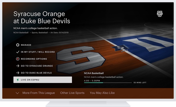
Subscribers can also expect a larger, more prominent "Details" button on content within collections like Kids, News, and Sports. More metadata will be available, too, including things like genre, rating, and release year.

hulu-Live-Guide.jpg

In addition, the Details button is set to feature quick user actions such as playing the next episode in a series, adding items to "My Stuff," and other show-specific settings.

When browsing the Live TV channel guide, users will be able to view two weeks ahead, rather than just what's on now and next. In general, users will also see a refreshed palette for the interface, including background artwork and movie posters.

Article Link: Upcoming Hulu App Interface Changes Aim to Simplify Navigation and Aid Discoverability
 
Hopefully they fixed the issue where even though I try to remove some shows from my favorite list it wont come off the list of favorites even though I checked it off.
 
Their's has to be the worst UI--follows all of the tenants of "It doesn't have to work, it just has to look good." Not to mention the stability of their service is ****--my favorite being when the stream playback is fine, but it crashes on one of their ad spots.
 
Last edited:
Netflix speak for: “silly human thought My List meant you do the organising of it”. They’re after Recently Watched now. Netflix get worse by the week. Totally anti-user Netflix has become. #deletenetflix

Netflix will likely add ads any day now, the way they are going.

Timing is everything. Let’s hope Apple brings a semblance of sanity back to streaming. My list is my list, and recently watched should be organised chronologically. No, ifs ands or buts.
 
So so glad to hear this. And the screenshots look like they addressed my two biggest problems with the UI:

Going back to a grid. I hate that right now it's swipe, see what's on the screen, swipe, see what's on the next screen.

And making it easy to understand what is selected with a highlight or bold. The current overlining is so confusing. Who overlines?
 
It’s kind of funny how the general consensus is how terrible the Hulu app is (which I agree). How does a company release a design like that where people feel it’s almost not useable? Was their feedback so bias during initial testing that they got the wrong idea?

Any time the UI makes it difficult to browse for new shows and make it seem like Hulu has only 20 shows available, you’ve got a problem.
 
  • Like
Reactions: Arran
Surround sound / 5.1 from Apple TV yet? No. Making the interface more usable is important (was the dumbest interface out there) - but totally non-competitive with Amazon Prime and Netflix by only streaming basic stereo sound. Pretty pitiful.
 
  • Like
Reactions: wasima and killr_b
The UI is currently GOD LEVEL AWFUL! I don't use it much but it looked like the generic template that you find on a website or UI interface builder. Even the background I swear I have seen in templates. I was exceptionally difficult to find anything. So good to see they will change it, I hope it's much better.
 
  • Like
Reactions: Arran
Netflix speak for: “silly human thought My List meant you do the organising of it”. They’re after Recently Watched now. Netflix get worse by the week. Totally anti-user Netflix has become. #deletenetflix

Netflix will likely add ads any day now, the way they are going.

Timing is everything. Let’s hope Apple brings a semblance of sanity back to streaming. My list is my list, and recently watched should be organised chronologically. No, ifs ands or buts.


All I need from Netflix is the most obvious ALREADY WATCHED button!

there is so much stuff on my list that I have already seen all seasons of but it still shows me the show as „continue watching“ on my list cuz the pilot decided to play again for like 5 seconds.
 
  • Like
Reactions: Mac Fly (film)
Their's has to be the worst UI--follows all of the tenants of "It doesn't have to work, it just has to look good." Not to mention the stability of their service is ****--my favorite being when the stream playback is fine, but it crashes on one of their ad spots.

Pay a couple bucks more for no ads. I've had a very stable Hulu instance for about a year on two different devices (Apple TV and XBox) and pretty much never have streams crash out.
 
Hopefully they fixed the issue where even though I try to remove some shows from my favorite list it wont come off the list of favorites even though I checked it off.
I had the same thing happen to me
Hopefully they fixed the issue where even though I try to remove some shows from my favorite list it wont come off the list of favorites even though I checked it off.
I had the same problem. They have an option to add an episode of a show to a list called “My Episodes”. Because one episode was on that list I could not remove the show from Favorites until I remove the episode from My Episodes.
 
Register on MacRumors! This sidebar will go away, and you'll see fewer ads.