The app screen with a grid would be handy. It's a PITA to arrange the icons in a way that makes sense, because the hit targets are kind of small and everything shifts around when you move the icon. I have mine arranged in a starfish-like layout, where my 90% apps are smack in the middle. It took a lot of fiddling to get everything into a spot.
Got a tip for us?
Let us know
Become a MacRumors Supporter for $50/year with no ads, ability to filter front page stories, and private forums.
watchOS 10 Rumored to Feature New Home Screen Layout With Folders
- Thread starter MacRumors
- Start date
- Sort by reaction score
You are using an out of date browser. It may not display this or other websites correctly.
You should upgrade or use an alternative browser.
You should upgrade or use an alternative browser.

Gator5000e
macrumors 65816
Just give me a way to delete all text messages at one time. The swiping, taping the trash can and then taping delete gets tedious.
tomtad
macrumors 68040
Folders... on a tiny watch screen? This seems just a tad unlikely. 😅
Maybe not folders but I can see some sort of grouping, similar to what you have in App Library in the iPhone.
Having all your Fitness apps, Travel apps, Audio apps etc in distinct groups would be handy. Much better than scrolling down a huge list or poking through a sea of dots like we have now.
B4U
macrumors 601
Now try that on the smaller screen. 😱Instant widgets to Apple Watch OS 10 would be an awesome and welcome feature.
View attachment 2190369
Phineasgage1848
macrumors regular
User 6502
macrumors 65816
Yeah, it’s because they don’t ever do any changes. Just tiny incremental improvements, and for some reason they still manage to break everything else every time they do each one of these tiny tweaks.Apple has set the bar suuuuper low for any “biggest changes since…” claims these days.
Just ordered an Apple Watch 8 Graphite in stainless steel, so Watch OS 10 will complement it nicely, but I'm sure it will be more than just an updated Home Screen 😊
The upcoming watchOS 10 software update for the Apple Watch will feature a new Home Screen layout, according to information shared today by anonymous Twitter account @analyst941. Apple is expected to announce watchOS 10 at WWDC on June 5.
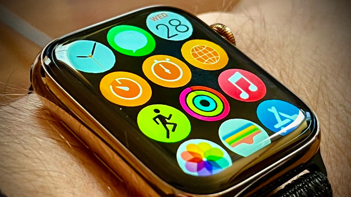
Apple Watch mockup shared by @analyst941
The source claimed the new layout would be easier to navigate and have more iOS-like aspects, including folders for apps. However, they are unsure if the new layout would be enabled by default or available as a secondary option. The source did not share any additional information, but said they will provide more details soon.
In his newsletter last weekend, Bloomberg's Mark Gurman said watchOS 10 will be the Apple Watch's biggest software update since 2015. Notably, he said one of the planned enhancements for the Apple Watch is an "updated interface," which would align with a redesigned Home Screen. Apple Watch apps have been organized in a honeycomb grid since the device launched in 2015, with a scrollable list view also available.
The anonymous source behind this rumor leaked accurate information about the iPhone 14 Pro's Dynamic Island on the MacRumors Forums before the device was announced last year. However, they do not have a long-term track record with rumors yet, so there is no guarantee the latest information they shared will prove to be accurate.
Article Link: watchOS 10 Rumored to Feature New Home Screen Layout With Folders

I'd prefer a command line tool instead. Or should Apple go for Apple watch Norton commander edition?Folders?. Do we need that???.
goonie4life9
macrumors 65816
Here’s a preview of Apple’s PR: “For the 10th anniversary of the Apple Watch, we wanted to do something special. Apple Watch has changed so many lived and allowed Apple Watch users to learn more about themselves than they ever thought possible. Today, Apple reinvents the Apple Watch. This is the biggest change to the wearables market since Apple’s groundbreaking announcement of the original Apple Watch. With watchOS 10, we’ve completely transformed the user experience, pushing the most advanced wearable OS to the next level.”
ThisBougieLife
Suspended
I won't buy an Apple Watch until it has mouse and keyboard support can run dual monitors. 😉
We're basically still on iOS 7 🤣
Apple has set the bar suuuuper low for any “biggest changes since…” claims these days.
We're basically still on iOS 7 🤣
Tagbert
macrumors 604
on external screens, of course! 😆Fingers crossed for Stage Manager 🤞🏻
Tagbert
macrumors 604
I would use the phone for this or any large volume actions. Hard to do on a small screen and not delete the wrong thing.Just give me a way to delete all text messages at one time. The swiping, taping the trash can and then taping delete gets tedious.
Zc456
macrumors 6502
iOS 7.16 Lynx.We're basically still on iOS 7 🤣
I definitely prefer the grid style in the mockup over how it is now. I don't like the icons being different sizes, it's awkward now.
I agree. Honestly, though I have slightly mixed feelings. The current "cluster/cloud" design is somewhat iconic (please pardon the pun). But from a usability perspective, it needs work. The grid style (similar to the mockup) would likely be an improvement simply due to the icon size/tap region improvement.
This could be improved further by allowing you to manage app existence or home screen visibility similar to how it is on the iPhone (e.g., "Remove From Home Screen" for infrequently used apps).
Gengar
macrumors 65816
Analog Kid
macrumors G3
You know what app management system could use folders? Mac...
Drives me absolutely crazy how hard it is to organize apps on a Mac. Everything goes into one folder, and if you pull them out of that folder updates don't always behave as you'd expect.
Drives me absolutely crazy how hard it is to organize apps on a Mac. Everything goes into one folder, and if you pull them out of that folder updates don't always behave as you'd expect.
Looks like many huge changes. Looking forward to seeing it at WWDC.
dampfnudel
macrumors 603
DarthDon
macrumors 6502a
Even if i keep repeating - no stand-alone, no money. Since apple watch 1 ;-)
If you need for a watch an iphone, for the iphone a computer, the watch is just a moneymaker.
If you need for a watch an iphone, for the iphone a computer, the watch is just a moneymaker.
It should be 3 rows of icons instead of the 4 in this mockup and the middle row should be slightly "magnified" and show the titles of the apps under. I always use list view because navigating through the honeycomb makes me feel like I'm going mad.
The upcoming watchOS 10 software update for the Apple Watch will feature a new Home Screen layout, according to information shared today by anonymous Twitter account @analyst941. Apple is expected to announce watchOS 10 at WWDC on June 5.
Apple Watch mockup shared by @analyst941
The source claimed the new layout would be easier to navigate and have more iOS-like aspects, including folders for apps. However, they are unsure if the new layout would be enabled by default or available as a secondary option. The source did not share any additional information, but said they will provide more details soon.
In his newsletter last weekend, Bloomberg's Mark Gurman said watchOS 10 will be the Apple Watch's biggest software update since 2015. Notably, he said one of the planned enhancements for the Apple Watch is an "updated interface," which would align with a redesigned Home Screen. Apple Watch apps have been organized in a honeycomb grid since the device launched in 2015, with a scrollable list view also available.
The anonymous source behind this rumor leaked accurate information about the iPhone 14 Pro's Dynamic Island on the MacRumors Forums before the device was announced last year. However, they do not have a long-term track record with rumors yet, so there is no guarantee the latest information they shared will prove to be accurate.
Article Link: watchOS 10 Rumored to Feature New Home Screen Layout With Folders
JustAnExpat
macrumors 65816
Is the Apple Watch 8 different in how the app layout is? On my Series 3 watch, it's a list of application organized by name, with the icon to the left and the name to the right. The Digital Crown is used to scroll through the list. I think it's simple and easy to use as is.
What's wrong with this interface (assuming Apple didn't radically change it in Apple Watch 9). Or am I looking at something different?
What's wrong with this interface (assuming Apple didn't radically change it in Apple Watch 9). Or am I looking at something different?
Register on MacRumors! This sidebar will go away, and you'll see fewer ads.