Become a MacRumors Supporter for $50/year with no ads, ability to filter front page stories, and private forums.
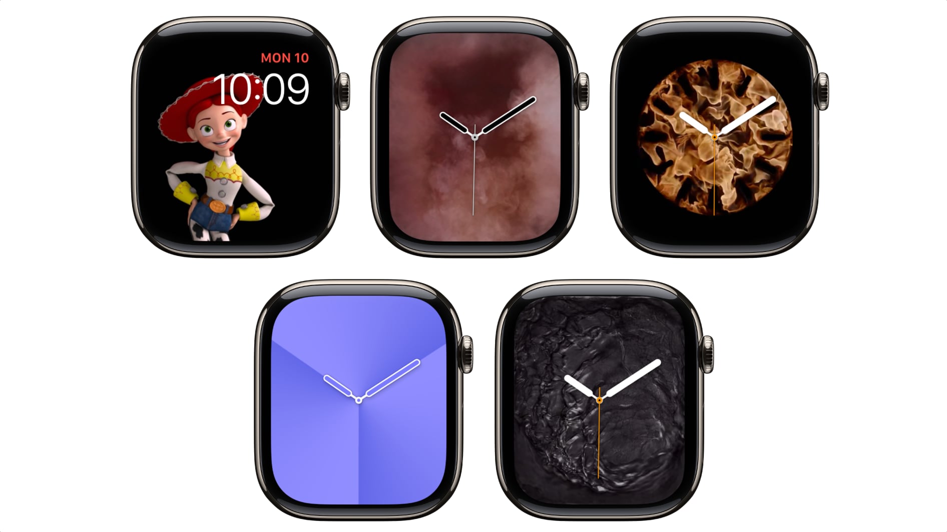
Considering what you can do graphically these days the Apple Watch faces are pretty disappointing. The number one thing you do with an Apple Watch is tell time yet the watch faces get old really fast. Look at all the fake Facebook (Fakebook) ads for cool watch faces for Apple Watches. This shows the want for cool watch faces.

Apple, please create an Apple Watch face kit, watch face store, or SDK to to allow third parties to safely make something other than pride faces that are cool and not plain and boring. It’s long overdue.
 
Why, there are atleast 5 that look just like it?
To my eye they don’t. (Shrug), I want to like the wayfinder face, but like the dark backgrounds, but my brain processes white better than blue, yellow, or orange. Is what it is.


Jason


Apple has removed several Apple Watch faces that are options in watchOS 11, nixing the Fire/Water, Gradient, Liquid Metal, Vapor, and Toy Story watch faces, according to a post on Reddit.

watchos-26-removed-faces.jpg

Apple tends to quietly remove some watch face options when it launches a new version of iOS, so it is not a huge surprise to see these go missing. It is not clear why Apple picked these watch faces in particular, but it could be because they were used less often.

Apple didn't add new watch faces with watchOS 26, but some watch faces have new Liquid Glass-inspired design options.

Article Link: watchOS 26 Removes These Apple Watch Faces
Just noticed it. This was my favourite. A quick animation followed by a minimalist design great for dress watch. Why? Especially as it was the USP used in Apple stores when they first brought it out and people must have bought the watch partially based on this look.
 
Register on MacRumors! This sidebar will go away, and you'll see fewer ads.