Become a MacRumors Supporter for $50/year with no ads, ability to filter front page stories, and private forums.
I'm so happy they pushed watchOS 26 with its Liquid Glass and performance penalty to my Series 7, only to drop the watch now.

Anyway, I'll keep using what I have and tbh it's mostly become my running watch anyway. When my S7 dies I'll probably replace it with the cheapest Garmin or a refurbished SE, whatever is cheaper, for workouts and go back to wearing actual watches.

It's the nature of things, but I'm really tired of every part of my life constantly being dependent on continued software support.
 
Can't believe they dropped three Watch generations from support at once. Got my mum a Series 8 not that long ago - and the SE2 was even newer. That's really poor from Apple. Missing unsupported features on older devices is one thing, but dropping support entirely limits its useful life.
 
Dynamic App Grid? Apple loves gimmicky features that add no value at all.
Also really bad for usability as it means your muscle memory becomes useless. Right now I know to press the crown and then immediately top middle tap for mail. This will be gone if everything's rearranged depending on AI's view on what I'm using.


...

watchos-27-dynamic-app-grid.jpg

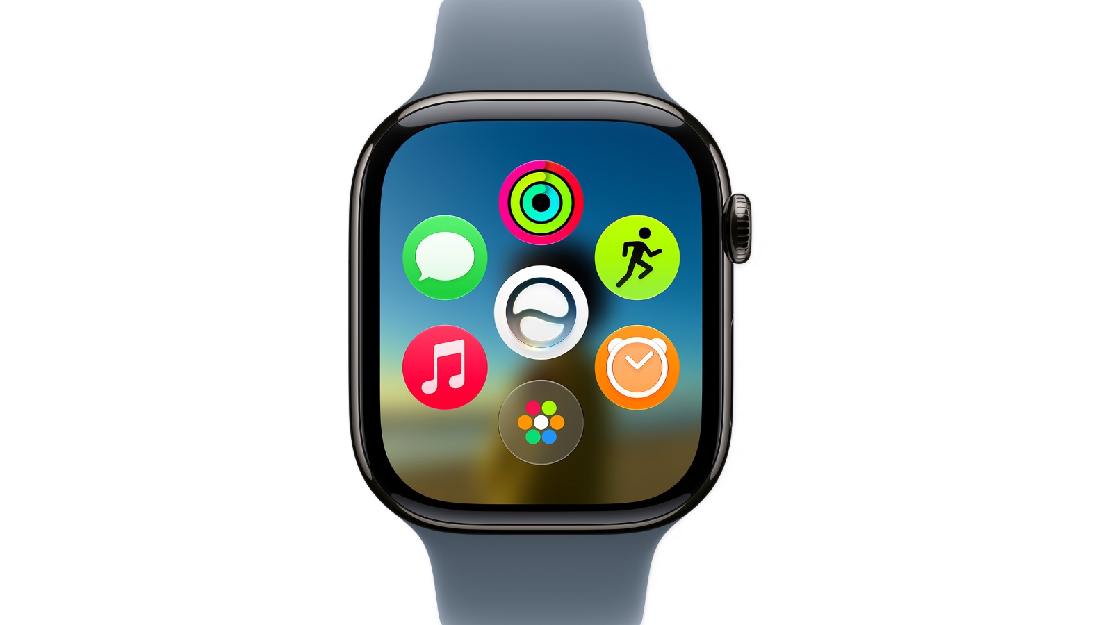
The new dynamic app grid surfaces and rearranges five apps based on context and usage. Users can simply tap the bottom center icon to go to the rest of their apps.

...

5 apps based on context and usage and the bottom centre icon to get to the rest of your apps? I count 7 icons in total on that image so what is the 7th (I presume centre) icon for? Maybe I should recognise it from the icon graphic but I don't.

I actually quite like this idea, at least enough to give it a chance, but I already see other commenters don't so I hope Apple does the decent thing here (and it so often doesn't with stuff like this) and makes it an option so that people who want to can maintain the previous behaviour. I would definitely enable this feature for a while but it would be comforting to know that I could disable it if I decided I didn't like it.
 
  • Like
Reactions: robfoll
I'd rather tap twice to select and just tap once to advance each step through the Smart Stack. While this change adds functionality, it's been annoying having to repeatedly double-pinch to go through each item.

I can definitely see your point there. I'm encouraged to see this extra gesture but I would like to see Apple now go further in a couple of ways...

1 - Make this single pinch gesture available in more or even every app on the watch.

2 - Make the single and double-pinch gestures customisable per app.

With the above you (and now you mention it probably I) would get what we want with the Smart Stack - if we consider the watch face an app to fit in with my point 2 above. We could customise single-pinch (SP) as the navigation (moving through the stack) action and double-pinch (DP) as the select action.

I would immediately also both of my suggestions above to enhance my experience with Workouts. I value the current DP behaviour to cycle through the stats screen but I am torn because I would also like a gesture to pause and resume a workout easily. With my suggestions that could be possible if I could set the SP gesture in Workouts to cycle through the stats screen and the DP gesture to do pause and resume.

I'm sure others could find plenty of uses for the pair of pinch gestures in apps that they use.
 
  • Like
Reactions: robfoll
This new WatchOS some have downloaded is the first beta release. So even the developers have not had a chance to start their debug process and getting their apps top work and some of the operating is being tested by non-Apple employees for the first time. So one should expect issues. They have to this time next year to get it working properly as released software. The "26" series should get their final polish soon and then be considered done except for security updates or critical issues from outside Apple.

I plan to sit out the beta process until at least January as we will be out of the country soon and do not want to have a device lockup during a beta process while not at some location where my spare devices reside.
 
  • Like
Reactions: robfoll
Please fix the horrific liquid (gl)ass downgrade to the fitness app.
Thank you for your attention to this matter.
 
Great, even something as simple as getting to the app grid requires 2 actions now.
From watching YT vids of this dynamic grid, it appears that you can scroll the digital crown down when on the dynamic grid to get to the full app grid, and when at the top of the grid, scroll up to get back to the dynamic grid.

Slightly less painful then having to tap the screen.
 
Love this new app grid! Im guessing they did this because most of us only use a handful of apps regularly and don't need to see a giant grid of dozens of seldom used apps.
 
  • Like
Reactions: robfoll
Agreed.
They forced me to do this for an app grid and a Siri app that just runs the logic on your iPhone anyway...
View attachment 2636462
Yeah I am pretty irritated by no watchOS 27 for Ultra or Series 9. My wife and I cannot update which is insane. The Series 9 came out less than 3 years old. To be fair, I was planning to upgrade to Ultra 4 this year, but the fact my wife's Series 9 can't get OS27 is bull$hit.
 
Yeah I am pretty irritated by no watchOS 27 for Ultra or Series 9. My wife and I cannot update which is insane. The Series 9 came out less than 3 years old. To be fair, I was planning to upgrade to Ultra 4 this year, but the fact my wife's Series 9 can't get OS27 is bull$hit.
S9 is supported, there's been a story and Apple left it off the list accidentally
 
The new dynamic app grid surfaces and rearranges five apps based on context and usage.

I have no idea who likes their UI rearranging all the time like this.

I can't stand stuff like that, that keeps you guessing and works against muscle memory that is developed over time with usage.
 
I'm so happy they pushed watchOS 26 with its Liquid Glass and performance penalty to my Series 7, only to drop the watch now.

Anyway, I'll keep using what I have and tbh it's mostly become my running watch anyway. When my S7 dies I'll probably replace it with the cheapest Garmin or a refurbished SE, whatever is cheaper, for workouts and go back to wearing actual watches.

It's the nature of things, but I'm really tired of every part of my life constantly being dependent on continued software support.
I use aw for basic stuff – mostly to read glucose levels from my cgm sensor and to 'close my rings'. I had a S5 until recently, the battery would last just half a day – used it daily for almost 7 years. I've changed the battery at Apple store last week and they basically give you a brand new watch (they may call it refurbished, but it's not). In my case, it was a S6 – I believe because it's the lowest series supporting current watchOS. Which makes me think, once watchOS27 is publicly released, the lowest supported watch will be s9 and you may get that as a $100 replacement. If you use your watch for its basic functionality, it may be worth it.
 
New dynamic grid is more like how I prefer to use the watch: press crown, pick app I frequently/recently used, interact, press crown to close. I'll go back and forth with the Smart Stack.
 
Rather than a dynamic app grid, how about just letting the user hide apps that they never use? I've been wanting that feature of a decade. There are so many apps that I never ever want to see in my app grid.
 
Love this new app grid! Im guessing they did this because most of us only use a handful of apps regularly and don't need to see a giant grid of dozens of seldom used apps.
I agree I only use a few apps regularly and this gets me direct access to them without having to scroll through the list or poke at the huge grid. I like this update.
 
Register on MacRumors! This sidebar will go away, and you'll see fewer ads.