Become a MacRumors Supporter for $50/year with no ads, ability to filter front page stories, and private forums.

maflynn

macrumors Haswell
Original poster
May 3, 2009
74,747
45,087
Is it me, or is the battery complication harder to read now?

It used to be a circle and as the battery was consumed a portion of the circle would disappear Capto_Capture 2017-09-22_09-14-42_AM.png
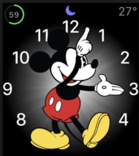
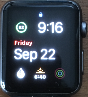
Now at least on my the circle is always complete but it seems bolded on and slowly unbolds
Capto_Capture 2017-09-22_09-17-20_AM.png

Sorry for the image quality but you see what I mean.

Visually speaking its harder to quickly discern the state of the battery. If I tap it, I get a better image, but I'm just talking how watchos3 seemed to show this better then watchos4

Is there a setting for me get this back to the way it was?
 
Think the green is just thinner & and the number is grey, which are bad choice.

EDIT: from your picture it appears that way but when I compares my S1 & S2 it appears to be the same.
 
Last edited:
My colors are white or close to white and I don’t seem to have that issue. Switching faces and colors didn’t really show it the way your second picture does. Hmmm
 
Its not the color but rather fact that the circle disappears as the battery is consumed, at least with the older version of watchOS but now there's just a slight change in the circle
 
Agree that it's an odd design choice that just seems to reduce contrast while serving no good purpose. It doesn't even look good.
 
Its not the color but rather fact that the circle disappears as the battery is consumed, at least with the older version of watchOS but now there's just a slight change in the circle

Mine on watchOS 4 and the circle also disappears.
 
  • Like
Reactions: edhchoe
Mine on watchOS 4 and the circle also disappears.
Odd, mine doesn't

I'll reboot my watch and see if that fixes it
[doublepost=1506095062][/doublepost]Nope, I still have it, no matter what watch face I use, new or old.

Deleting and re-adding it doesn't do anything either. As you can see this is a different watch face, and yet the battery on the lower right hand side shows a full circle even though my battery is at 71%
Capto_Capture 2017-09-22_11-43-24_AM.png
 
Odd, mine doesn't

I'll reboot my watch and see if that fixes it
[doublepost=1506095062][/doublepost]Nope, I still have it, no matter what watch face I use, new or old.

Deleting and re-adding it doesn't do anything either. As you can see this is a different watch face, and yet the battery on the lower right hand side shows a full circle even though my battery is at 71%
View attachment 720027

Very weird. This's mine:
oQkTzzM.jpg


Are we talking about the same complication? or is it because of that specific watch face?
 
  • Like
Reactions: edhchoe
Mine is the same. The background circle is now a thinner green line rather than translucent black. I assumed this was an intentional design change though.
 
The clean install fixed the issue. I now of course need to configure the watch the way I like it, but now the battery indicator is back to "normal"
 
  • Like
Reactions: matrix07
Ugh. How long did that all take?

I think I'm going to hold off as other than this one UI bug things work about as I'd expect, and I'll have to go through this process again in a couple of weeks when I get the new model anyhow.
 
QUOTE="maflynn, post: 25089995, member: 311274"]Is it me, or is the battery complication harder to read now?

It used to be a circle and as the battery was consumed a portion of the circle would disappear. Now at least on my the circle is always complete but it seems bolded on and slowly unbolds.[/QUOTE]

It is totally not just you.

The watchOS 4 battery complication has been wrecked. MUCH harder to read at a brief glance now. I don't believe reinstalling has any effect. This is a design choice by Apple. Another terrible case of function follows form.

Can we please have a 3rd-party guy create an app with a readable battery complication?

View attachment 725859
[doublepost=1508260706][/doublepost]
The clean install fixed the issue. I now of course need to configure the watch the way I like it, but now the battery indicator is back to "normal"

Are you sure?- that didn’t work for me. Attached is my screen shot.
 

Attachments

  • 0DCA286F-1C19-417E-95BB-34EEE0098D2D.png
    0DCA286F-1C19-417E-95BB-34EEE0098D2D.png
    26.8 KB · Views: 120
Last edited:
QUOTE="maflynn, post: 25089995, member: 311274"]Is it me, or is the battery complication harder to read now?
...

Looks fine on mine. I even tried diff colors.
It actually looks worse in the screen capture. But not as bad as yours.

5EBD0A19-5071-424C-A664-6DC117B69995.jpeg
 
Definitely the bold setting doing it. I kinda get what you saying, but the number is the most important thing to see not the circle.
 
I know this is totally not the point, but I have long since stopped using the battery complication. I used to always have it, but now battery life hasn't been a huge issue, and it's so easy to swipe up for control center to see battery life if I need to. Just something to consider. It took me awhile to realize that I didn't need it anymore, and when I accepted that it freed up a complication spot for me. I find it seems to also make me less anxious about battery life because I'm not always staring at it. Haha. Just a thought.
 
With the Series 0 I used the battery complication regularly, but after upgrading to a Series 2 and realising I could get two days between charges, I stopped obsessing and removed it.
 
Should report this to Apple. :)

Bold text shouldn't do anything to icon. A bug surely.
Yeah I could see doing a stroke on letters and maybe numbers over a certain size but not an icon that's as small as that. It honestly looks like everything just has a stroke applied without any consideration towards readability/legibility. I'd like to say it's very un-Apple but how long did we suffer through this?

Screen Shot 2017-10-20 at 9.54.56 PM.png
 
  • Like
Reactions: matrix07
The bold setting effects everything, not just text. It isn’t a bug.

You're right. I just notice the Activities icon is also bolder. Strange how they think increasing something that shouldn't be there in the first place will increase the legibility.
 
Register on MacRumors! This sidebar will go away, and you'll see fewer ads.