Become a MacRumors Supporter for $50/year with no ads, ability to filter front page stories, and private forums.

JackT06

macrumors 6502
Original poster
Jul 24, 2009
293
0
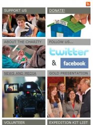
I have attached what i have done so far (not on the web yet).

Please could i have some feedback on the design... what's bad, goood, what could be improved and HOW?

The website is for people aged 15-21.

Somethings that i plan on doing is in the box on the right hand doing something like the attached, i'm just trying to work out how at the moment.

Please note, this is my first time making my OWN CSS styleshet, i normally edit a template.

Thanks!:D
 

Attachments

  • dofe.jpg
    dofe.jpg
    29.9 KB · Views: 128
  • Untitled.jpg
    Untitled.jpg
    115.3 KB · Views: 126
Last edited:
Perhaps words dealing with first aid shouldn't look like they're plinked up with a .22?
 
I've circled what I don't like

dofeREDO.jpeg


I find the donate image to be somewhat unappealing, and I have an issue with the "&" symbol.

I recommend just using no image for the donate button (or maybe a paypal image). Also you can just remove the "&" entirely and simply have the two logos.
 
Maybe a very light background color?
What sort of colour would you suggest?

Perhaps words dealing with first aid shouldn't look like they're plinked up with a .22?
The font that is used for the banner is the Red Cross branding font.

I've circled what I don't like

dofeREDO.jpeg


I find the donate image to be somewhat unappealing, and I have an issue with the "&" symbol.

I recommend just using no image for the donate button (or maybe a paypal image). Also you can just remove the "&" entirely and simply have the two logos.
Thanks for that, i now know what sort of things to look out for.
 
Register on MacRumors! This sidebar will go away, and you'll see fewer ads.