Got a tip for us?
Let us know
Become a MacRumors Supporter for $50/year with no ads, ability to filter front page stories, and private forums.
Website Design Feedback...
- Thread starter JackT06
- Start date
- Sort by reaction score
You are using an out of date browser. It may not display this or other websites correctly.
You should upgrade or use an alternative browser.
You should upgrade or use an alternative browser.
Hey!
Couple of things:
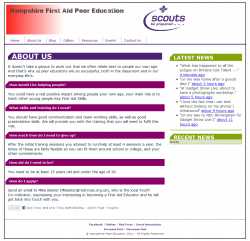
The red gradient does no favor to the overall look of your site. It just does not feel like it fits in well since you have solid colors everywhere else. I would do away with the gradient on the top and also work on the sizing of the header vs the part that says scouts be prepared. It would fit better if they are similar sizes and makes better use of the white space you have there.
Second thing, the about us and latest news do not match up perfectly on the top. You could have a margin or padding on the top of your div tag, just check the CSS. If you did this in photoshop just bring a line down from the ruler and make sure they line up nicely.
Third, I like your green and purple and darker purple color scheme. Its simple for now, but I would like to see you build up on that a bit. I just feel like the header needs something to tie the site together, but I feel a disconnect when I look at the header and then scroll down to the rest of your page.
Lastly you can do html mailto:youremail@mailaddress.com in the HTML to make sure your e-mail address can be clicked on.
Other than that I think you have a great solid start I can't wait till you build up on it and improve! I am positive you will")
Couple of things:
The red gradient does no favor to the overall look of your site. It just does not feel like it fits in well since you have solid colors everywhere else. I would do away with the gradient on the top and also work on the sizing of the header vs the part that says scouts be prepared. It would fit better if they are similar sizes and makes better use of the white space you have there.
Second thing, the about us and latest news do not match up perfectly on the top. You could have a margin or padding on the top of your div tag, just check the CSS. If you did this in photoshop just bring a line down from the ruler and make sure they line up nicely.
Third, I like your green and purple and darker purple color scheme. Its simple for now, but I would like to see you build up on that a bit. I just feel like the header needs something to tie the site together, but I feel a disconnect when I look at the header and then scroll down to the rest of your page.
Lastly you can do html mailto:youremail@mailaddress.com in the HTML to make sure your e-mail address can be clicked on.
Other than that I think you have a great solid start I can't wait till you build up on it and improve! I am positive you will
Hey!
Couple of things:
The red gradient does no favor to the overall look of your site. It just does not feel like it fits in well since you have solid colors everywhere else. I would do away with the gradient on the top and also work on the sizing of the header vs the part that says scouts be prepared. It would fit better if they are similar sizes and makes better use of the white space you have there.
Second thing, the about us and latest news do not match up perfectly on the top. You could have a margin or padding on the top of your div tag, just check the CSS. If you did this in photoshop just bring a line down from the ruler and make sure they line up nicely.
Third, I like your green and purple and darker purple color scheme. Its simple for now, but I would like to see you build up on that a bit. I just feel like the header needs something to tie the site together, but I feel a disconnect when I look at the header and then scroll down to the rest of your page.
Lastly you can do html mailto:youremail@mailaddress.com in the HTML to make sure your e-mail address can be clicked on.
Other than that I think you have a great solid start I can't wait till you build up on it and improve! I am positive you will
Hey,
How do you think i could build up the colors?
The trouble is i'm more of a developer than a designer, so although i can do it, i don't know what looks good/bad.
Here is an update with the changes...
Attachments

To be honest it is kind of hard to say because the content on this part of your site is pretty much all text based. It is hard to make text look exciting on a website unless you are doing some crazy css based touches.
For the purpose of this page I think you should make it as easy as possible to read and understand. Other things i would do:
- Remove the dark purple background treatment in the About Us header. I think repeating the same element in the header, the sub headers, and the recent news section is kind of overkill
- the recent news tab still does not line up with the about us. Maybe if you remove the dark purple background it wont be as noticeable? If you can fix it though it would be nicer.
- the font you are using for the page title does not make it any more exciting, I think perhaps you want to use a clean bold font like helvetica.
- Lastly, because this part of the page is simple in itself, it cant be very exciting. Instead of a white background try a light grey, or off white. I think it will compliment the colors a bit more.
My initial thoughts:
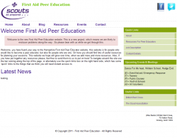
What does your Home page look like? This seems to be the design for an interior page, which, while boring and text heavy, can be fine if you add one strong graphical element. Trying putting an image in the header (instead of the line of text) which can be repeated on every page.
Also try creating a graphic/image-heavy home page that has image links to the key interior pages (in addition to the main navigation). If that front page is bold and interesting, in addition ot having some quality info, having a lot of explanatory (as long as it's relevant) text on the interior pages isn't as big a deal.
Also...it should be "lives" not "life's" ( said the Grammar Nazi)
Honestly, I think that the best thing to do is add some type of background. Whether it be on the header and main content area, and whether it be a color or gradient.
It would make the text pop and the site more attractive.
It would make the text pop and the site more attractive.
To be honest it is kind of hard to say because the content on this part of your site is pretty much all text based. It is hard to make text look exciting on a website unless you are doing some crazy css based touches.
I respectfully disagree about having to adding "CSS touches" to make text look good. A good design is much more than effects and graphics; its about presenting the information in an orderly way and making sure the important message is made.
Here are some examples of nicely designed web sites that are "text heavy"
http://bobulate.com
http://things.be
http://52weeksofux.com (great ready, too!)
Some keys to a great "minimalistic" site are:
* Great typography
* Grids!
* Smart use of color
* Generous use of white-space
* Knowing why white-space is good
HTH,
~ Jeremy
Good point.
When I said CSS I meant to say using CSS to stylize the text and use fontface or googlewebfonts or whatnot. Guess I should have been more clear.
Also thanks for the links! I love seeing great layout/typography
I would check out Smashing for ideas, I think I know where you're going with regards to direction, a simple typographic style though I think you might be better basing in upon a Wordpress theme.
From what I can see it doesn't seems to "click" to a grid, the logo seems to be isolated within the layout, there isn't enough padding while the typography doesn't seem to shine through strong enough.
Smashing 100 Best Wordpress Themes
Grid-Based
Grid Based Design
From what I can see it doesn't seems to "click" to a grid, the logo seems to be isolated within the layout, there isn't enough padding while the typography doesn't seem to shine through strong enough.
Smashing 100 Best Wordpress Themes
Grid-Based
Grid Based Design
Register on MacRumors! This sidebar will go away, and you'll see fewer ads.