Become a MacRumors Supporter for $50/year with no ads, ability to filter front page stories, and private forums.

designguy79

macrumors 6502
Original poster
Sep 24, 2009
306
2
Michigan
Juxtaposition is "the intercutting of two contrasting subject to point out the symbolic irony" and "placing close together for contrasting effect." Either/both of these interpretations is suitable.

Get out there and photograph some creatively juxtaposed subjects!

previous contests here:

https://forums.macrumors.com/threads/580184/

Rules:

1. You may enter only one photo.

2. Please do not comment on photos until after the judging has taken place.

3. The contest runs for exactly one week, starting NOW! (see time stamp)

4. At the end of the week, The Judge (last weeks winner) will choose a 1st, 2nd, and 3rd place photo, providing as much feedback as possible. (Judge has 24 hours to make decision)

5. The 1st place Winner will start a new thread with the topic/theme of their choice, and act as the Judge for that contest.
(Winner has 48 hours to create new theme)
 

sangosimo

Guest
Sep 11, 2008
705
0
4371746801_c5aac23f5f_o.jpg
 

panoz7

macrumors 6502a
Nov 21, 2005
904
1
Raleigh, NC
This image is part of a series of little orange house photos I've been shooting over the past two years. The little orange house is one of a few hundred identical houses that were originally part of an art installation on suburbia. I take one wherever I travel and try to photograph them in places that are the antithesis of suburbia. This shot was taken in lower antelope canyon earlier this summer.
 

Attachments

  • orangehouse.jpg
    orangehouse.jpg
    296.5 KB · Views: 170

designguy79

macrumors 6502
Original poster
Sep 24, 2009
306
2
Michigan
Results are in!

sangosimo - Very emotional shot, great capture. The title is fitting and nicely placed. Did you crop the one on the left that way, or is that all you had to work with? I am not 100% sure what you were going for with the theme, maybe that the photo on the right is a white guy? I kinda had in mind that the "juxtaposition" would be in the same photo. Sorry, I should have been more specific!

JDDavis - Cute... I hope the little one didn't get in too much trouble! Technically, it is a good photo but it feels quite a bit like a snapshot (and I am guessing it probably was), maybe because everything is centered? And the box of raisins keeps distracting me... was the child putting them in the water?

deep diver - Great concept, but something feels "off" to me. Was this flag painted on the wall? If so, whoever painted it did an amazing job... but my guess is that you photoshopped the flag in? Or it is a very translucent flag? Anyway, high marks for a great concept.

maddagascar - Ah-ha, photographic evidence that someone is breaking "the law"! (or at least, the sign). I would have liked to see more of the person's arm in the shot, and maybe the sign not directly in the middle of the photo.

LittleCanonKid - Solid interpretation of the theme. It would have been even better if the deer was even closer to the houses. But not much you can do about that, is there? Also, I think the background haze is a little distracting - I wonder if you could increase the contrast just a touch?

Designer Dale - Interesting shot, although I am not sure what I am looking at here. Is it a bell? The top piece has some cool patterns on it for sure, and I like the way that is contrasted with the bricks. Before I read your title, I thought that is what you were going for on the theme... but honestly, now I am confused on the juxtaposition you were going for. Isn't the moon suppose to be up there in the sky? :)

NathanCH - Very nice, I like it. Definitely on theme. If I had to nitpick, I think it would be better without the people walking in front of it.

flutegirl822 - Great sunrise/set photo, and I like the framing. My only critique is that the little trees in the lower left interrupt the flow of the electric lines toward the horizon.

Chappers - Intriguing photo, it makes me want to know more about what is going on here. The gentleman definitely looks uncomfortable holding the baby, and the baby is obviously not having a good time! The contrast between young/old and content/discontent is good. I think that it could be improved with a much tighter crop and maybe not having them centered in the frame.

acearchie - Nice silhouette photo! I see where you are going with nature vs man, but it doesn't seem very unnatural to me that a photographer is taking pictures of nature. Also, I think the cropping would look better with more of the lake in and more of the scene that she is looking at.

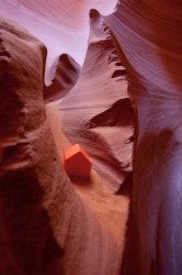
panoz7 - Cool, I like the idea here and the lines on the rocks are very interesting. Is this a macro or "semi-macro" shot? I assume that the house you carry around is on the small side? :) It is definitely on theme. I can't help but wonder what it would look like if the house was black or white or something that wouldn't blend in so much with the colors of the sand and rock.

Wow, this was a hard one to judge! Good job everyone.

Drumroll, please... and considering the olympics, I decided to award some medals ;-)

Bronze - flutegirl822

Silver - panoz7

Gold - NathanCH

Thanks again and I look forward to the next one. Take it away, NathanCH...
 

deep diver

macrumors 68030
Jan 17, 2008
2,693
4,468
Philadelphia.
Congrats to all. There were not many images here but the quality is great. designguy -- well done.

JDDavis & Chappers -- these are out standing images.

Thank you for the comment. This is 3 images layered together. The base is a section of the Wall at 100% opacity. The second is a separate section of the same slab of wall at (I think) 65% opacity. This slab of wall is at the John F. Kennedy Library in Boston. This flag hangs on the gym wall at my kids' school. It is the top layer at 75% opacity. I worked on this for a long time. I liked the concept from the beginning but am not entirely happy with the execution. I would love feedback from others.
 

Chappers

macrumors 68020
Aug 12, 2003
2,247
1
At home
Well done NathanCH - I thought this was a winner - it reminded me of the film "UP"

My photo - well it was meant to be a proud Grandfather and Grandson photo - but Grandpa was not quite sure what to do - hence the look. Just a snap really - capturing a moment.


deep diver - I've seen the images naked - I like what you were trying to do but prefer the singular shots and really the love the Berlin wall one. I felt to be honest that it carried the theme of this post the best, with its images of protest, joy and violence.
 

NathanCH

macrumors 65816
Oct 5, 2007
1,080
264
Vancouver, BC
Thank you DesignGuy for the gold medal. I hope it counts towards Canada'a overall gold medal count. :)

I've started up the new thread:https://forums.macrumors.com/threads/871101/

Hope to see everyone there!

Also, the main photo thread that we're suppose to link to hasn't been updated with the new contests since November. Just wondering if maybe we should link to the past contests like we use to instead?
 

JDDavis

macrumors 65816
Jan 16, 2009
1,242
109
JDDavis - Cute... I hope the little one didn't get in too much trouble! Technically, it is a good photo but it feels quite a bit like a snapshot (and I am guessing it probably was), maybe because everything is centered? And the box of raisins keeps distracting me... was the child putting them in the water?


Yeah, it was a snapshot for sure. I didn't even notice the sign in the back until I looked at all the photos at home. She wasn't dropping raisins in, she just wanted to touch the water.

Great job judging and thanks for the feedback.
 
Register on MacRumors! This sidebar will go away, and you'll see fewer ads.