Got a tip for us?
Let us know
Become a MacRumors Supporter for $50/year with no ads, ability to filter front page stories, and private forums.
Weekly Photo Contest: Apr 21 - Apr 28 (Theme: Black & White)
- Thread starter acearchie
- Start date
- Sort by reaction score
You are using an out of date browser. It may not display this or other websites correctly.
You should upgrade or use an alternative browser.
You should upgrade or use an alternative browser.


rossmadden
macrumors member


milbournosphere
macrumors 6502a


Neur0genesis
macrumors member


DirtySocks85
macrumors 65816
Crap. Was out of town and I missed the deadline. Anyway, I understand if this doesn't count since it's late, but I'll put my submission in anyway.

Lemur Bath by SnickerSnackClick, on Flickr
Lemur Bath by SnickerSnackClick, on Flickr
Hey guys,
Didn't wrap until 1:30am last light and have a full week of the same so I will pick a winner now so we can get on with the next theme and get feedback done on the weekend.
My winner is Pakyooh. I am a sucker for people shots and I really enjoyed the framing and "outside looking in" approach to this shot.
Hankster
macrumors 68020
Hey guys,
Didn't wrap until 1:30am last light and have a full week of the same so I will pick a winner now so we can get on with the next theme and get feedback done on the weekend.
My winner is Pakyooh. I am a sucker for people shots and I really enjoyed the framing and "outside looking in" approach to this shot.
Congrats to the winner.
@acearchie: It may be beneficial to selection a 2nd and 3rd place winner as well. Last week the winner wasn't online and from the winner's profile their post average is .15 a day (not a personal attach on the user, just want to keep this contest moving along in case people have real life items).
Congrats again.
Good point!
I'm only on my phone and some of the photos won't load but my second and third go to:
2nd ijohn.8.80
3rd someoldguy
Just to reiterate I'll hopefully he back on the weekend with some comments about all the other photos so don't worry just yet!
ijohn.8.80
macrumors 65816
Hey guys,
Didn't wrap until 1:30am last light and have a full week of the same so I will pick a winner now so we can get on with the next theme and get feedback done on the weekend.
My winner is Pakyooh. I am a sucker for people shots and I really enjoyed the framing and "outside looking in" approach to this shot.
Congrat's to Pakyooh for the win this week, thanks AceArchie for the runner-up. I think this was the hardest week so far in regard of judging that I've seen thus far here. With the playing field being levelled somewhat, so it makes it all about the topic, the framing, the lens choice, the light and shadow, the forms, etc... I think we got to see a bit more of peoples personalities this week too. 🙂
pakyooh
macrumors 6502
Thanks acearchie and great job everyone. There were definitely some great shots in this thread.
Trying to come up with the next topic which should be up tonight.
Trying to come up with the next topic which should be up tonight.
My winner is Pakyooh. I am a sucker for people shots and I really enjoyed the framing and "outside looking in" approach to this shot.
someoldguy
macrumors 68030
Congrats to Pakyooh and iJohn 8:80 . Also thanks to Acearchie for judging a contest with FAR too many excellent photos.
Hi guys,
As promised I have sat aside the last hour and got some critique down. Please don't take anything as fact as I am far from perfect myself but these are the bits that I would have changed and the bits that I like. I am a stickler for framing and sharpness so I might sound a but like a broken record with my rule of thirds and depth of field!
I think I have critiqued this one before on a previous competition! On thing that stuck with me is the apparent softness of the image. I do like the 'grading' on the image but I feel that the angle isn't quite as flattering as it could be but maybe that's because I have always been told to not point the camera up at a woman.
Really love this image. Framing is great and I love the voyeuristic feeling we have. The dark on the left to the bright on the right really tells a story for me and I think that black and white is the perfect compliment for this shot. The focus is spot on with not too much out of focus in the foreground that it becomes distracting.
A strong message and a strong photo. I like the gaze from the sign carrier but I don't really connect with the other subjects and they don't feel as though they are for the cause. Obviously this isn't your fault but it distracts from what could be a very strong image. Although the sign is centred I feel the crop is a little tight on the heads and cutting off on the feet isn't quite ideal. Great shot all the same.
Lovely image, still not entirely sure what the subject is but it was fun sending my mind wondering whether it was fish in the sea, sand on a beach, corn in a field or leaves on a tree. Please put me out of my misery and tell me what it is! I like the soft graduation from one side to the other and the contrast really is interesting.
Nice shot. I would have tried to frame the man more in between a pillar. This might have also placed him on the right third of the photo. The other aspects of the shot are framed very nicely and I agree that the B&W really helps to compliment this shot.
An interesting shot. Personally I am not sure about keeping the hint of colour. For me I don't see the reason as in fully B&W it works as a really nice gritty shot. The long exposure on the clouds really helps to focus on the tower but I think that the dodging/buring/vignette is a bit too strong round the edges of the shot.
A nice shot with nice tones. I would have framed the building slightly to camera right to match it up for the rule of thirds. The colour of the sky is also really appealing.
Nice shot with a some great tones in it. The few solitary trees are really nice and your path down the slope is nicely added into the shot. Looks like a really nice location to shoot in and well framed. I get the slight feeling that it's been pulled a little strongly in post or is an HDR image? Something feels a bit odd about the clouds.
Lovely expression. Exposure is perhaps a little under as the faces are all a bit dark and the background is pretty much black. Apart from the far right girl the others expressions are a little too closed off for me which makes it difficult to instantly find something to draw my eye too.
One car I am sure we would all like to be behind the wheel of, or even relaxing in the back seat! With this sort of shot I think it's important to get the framing dead on and straight. It appears that you are a little to the left of the centre logo and therefore everything feels a little a skew. I would have either cropped in tighter too or taken a step back to ensure that we aren't cropping half way through the lights.
Nice framing and an interesting vanishing point. A couple of tiny little distracting elements at the corners which might have been able to be cropped out? As it's quite a pleasingly simple image I wonder if shooting it on a clear day and with a flat coloured sky would offer a different element to the shot.
This looks like a great location and the vantage point you have chosen really gives a great documentary shot. Personally not a huge fan of frames so that is the only thing that instantly detracts from the image for me. I like the seemingly random placement of objects which probably made framing difficult but it looks like a pleasing image. I think the image has a slight green tint to it and I would be interested to know how you decided on this.
A confusing and intriguing image with some great contrast and tones. I feel that the shadows are a little too dark but it almost gives it a silhouette style appearance but I would have preferred a clear one or the other.
A framing I often have to shoot at for later cropping at 2.35:1 however, I feel for an image in this aspect ratio the head space is a little too much. If the camera was a little higher and pointing more downwards there would be less space lost in the blown out sky.
I like natural light like this. However I think it is the framing that lets this shot down. If you had been more straight one and at less of an angle you might have had something a little more compelling. The exposure is nice though as we haven't completely lost the outside and have some detail in the shadows.
A nice reflection in the water. I think the bird could have been better framed in the image though as it neither seems to be centred or on the lower third. The ripples are a nice touch.
A nice expression but I am a stickler for chopping bits of the image and it's a slight shame that we have lost his shoe bottom right. It may have helped to point the camera lower as he seems a little low in the frame. I like how the image flows from left to right and the black and white seems to complement the tones in the image.
A nice shot. It instantly strikes me as slightly soft but I think this is due to the thin wires and the haze which affects the buildings in the distance. The image is perhaps a little too busy with the wire lines that cut the frame at changing distances. A different angle on a famous landmark though which is interesting.
Great picture of the dog. Not quite as pleasing of your wife as her craning her head is causing the skin to budge up. It's often difficult to ensure that two subjects both look good in the frame so I can understand the predicament. When I take pictures of people I tell them to push their chins out to avoid the skin rolling together and I have to convince them that although it feels odd it does look better in camera.
An interesting shot. I like the lone figure leaving on the right and the sharpness of the bulbs. The dutch angle and the strong contrast between the light and dark really help make this a really compelling image.
A really nice image. Great expression and very candid in nature. I'm not cultured enough to know if this is normal attire or this is some sort of event. I would like to know more about the image and how it was captured. The b&w conversion is really nice as well. If I had to pick one thing to criticise it would be the depth of field which is a little too shallow meaning that the foreground woman is in focus but the lady with her eyes to the camera is slightly soft.
A nice shot. Perhaps a little too low framed for me and I would like to have seen more of the shadow. Traditionally with most people looking at a picture from left to right her positioning doesn't quite follow the flow of the eyes so I wonder if flipping the image would change it and it's aesthetics.
I love the contrast of this image. Both between the lights and darks but also the calm lake and the sprawling city behind. It looks almost like a paradise and escape in the middle of a busy city. I like the three three clear sections of lake,
trees and cityscape/skyline.
A nice texture to this image. Perhaps a little dark on the exposure and low in the frame with not much detail in the top section. As a still life shot I wonder there could have been the remnants of the bottles in the background to really show the end of a night or the history of the corks and what they were in.
An unconventional lighting angle and almost the reverse of a classic single light setup. The DOF feels a little too deep for me and there is maybe too much to focus on. If the eyes were in focus and we started to see softness around the nose and neck then it may have been more compelling. Some form of back light would have been nice as at the moment the subject simply disappears into the background.
Another really nice still life. I like the textures and low light source in this one. Is that a cobweb or some sort of weaving? I would have perhaps liked a little more context as it feels like there is a story to be told with this image but I am not entirely sure what it is.
I've had my fair share of broken lightbulbs this week! I like the lines across the ceiling contrasting with the centre framed bulb. It's mains power line is a little distracting and I wonder if it could have been framed in the shot better.
Forgive my ignorance but being a Brit I don't know the ins and outs of the importance of the constitution although I think I understand it is the formulation
of modern US law. I would have liked the DOF in this shot to be really deep so everything was crisp and detailed. The texture of this document looks great and it's slightly lost as we start to go soft.
A nice car and shot but unfortunately there are a few too many distracting elements for me. From the fire extinguisher under the tyre to the men in the background to the head popping over the body work on the right. The clouds are nice in the reflection of the car. Nicely framed and exposed but I would have maybe added 1/3 of a stop exposure to give a bit more detail in the bodywork.
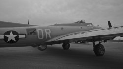
Great plane. For me it's too tight. I need to see more from a wider perspective. The wing also seems to obstructing a lot of the frame. I like the faded feel but it's just too close for me.
An interesting subject I don't often get to see. Pity about the jellyfish bottom right cutting the frame. I would be tempted to clone it out in PS. The contrast between the two main ones is great but I would have also been nice to get them more centred in the frame.
Another nice textured shot. I would have got more straight onto the mural as it seems skewed at the top of the frame. I would have cropped it more square as well as we are not seeing much information at the side of the frame.
A really great candid shot, especially difficult for non compliant subjects! The foot cropping the frame is a tiny distraction but the expression and dutch angle are great. Focus is spot on and it's nice to see him almost completely tack sharp and the background nicely soft. Tones are great with nothing too dark or too light!
As promised I have sat aside the last hour and got some critique down. Please don't take anything as fact as I am far from perfect myself but these are the bits that I would have changed and the bits that I like. I am a stickler for framing and sharpness so I might sound a but like a broken record with my rule of thirds and depth of field!

I think I have critiqued this one before on a previous competition! On thing that stuck with me is the apparent softness of the image. I do like the 'grading' on the image but I feel that the angle isn't quite as flattering as it could be but maybe that's because I have always been told to not point the camera up at a woman.

Really love this image. Framing is great and I love the voyeuristic feeling we have. The dark on the left to the bright on the right really tells a story for me and I think that black and white is the perfect compliment for this shot. The focus is spot on with not too much out of focus in the foreground that it becomes distracting.

A strong message and a strong photo. I like the gaze from the sign carrier but I don't really connect with the other subjects and they don't feel as though they are for the cause. Obviously this isn't your fault but it distracts from what could be a very strong image. Although the sign is centred I feel the crop is a little tight on the heads and cutting off on the feet isn't quite ideal. Great shot all the same.
Canon 1100D/T3, Canon 55-250mm IS II, ISO 100, 1/2000, f/5.6, 250mm, Handheld

Lovely image, still not entirely sure what the subject is but it was fun sending my mind wondering whether it was fish in the sea, sand on a beach, corn in a field or leaves on a tree. Please put me out of my misery and tell me what it is! I like the soft graduation from one side to the other and the contrast really is interesting.
Contemplative-looking dude near the Summer Palace in Beijing. I've really liked using B&W with a lot of my photos from there; it goes well, a bit morbidly I suppose, with the insane levels of smog.
Nikon D90 w/ Nikkor Micro 40mm f/2.8, 1/640, f/2.8, ISO 320
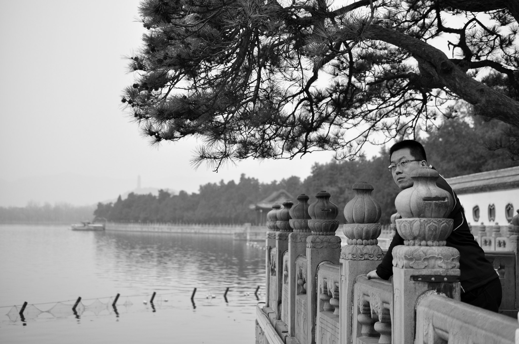
Nice shot. I would have tried to frame the man more in between a pillar. This might have also placed him on the right third of the photo. The other aspects of the shot are framed very nicely and I agree that the B&W really helps to compliment this shot.
B&W with a touch of colour 🙂

An interesting shot. Personally I am not sure about keeping the hint of colour. For me I don't see the reason as in fully B&W it works as a really nice gritty shot. The long exposure on the clouds really helps to focus on the tower but I think that the dodging/buring/vignette is a bit too strong round the edges of the shot.
Barcelona Olympic village
Nikon D5000, Nikkor 18-105 @18mm, ISO 200, f/9.5, 1/350
A nice shot with nice tones. I would have framed the building slightly to camera right to match it up for the rule of thirds. The colour of the sky is also really appealing.

Nice shot with a some great tones in it. The few solitary trees are really nice and your path down the slope is nicely added into the shot. Looks like a really nice location to shoot in and well framed. I get the slight feeling that it's been pulled a little strongly in post or is an HDR image? Something feels a bit odd about the clouds.

Lovely expression. Exposure is perhaps a little under as the faces are all a bit dark and the background is pretty much black. Apart from the far right girl the others expressions are a little too closed off for me which makes it difficult to instantly find something to draw my eye too.

One car I am sure we would all like to be behind the wheel of, or even relaxing in the back seat! With this sort of shot I think it's important to get the framing dead on and straight. It appears that you are a little to the left of the centre logo and therefore everything feels a little a skew. I would have either cropped in tighter too or taken a step back to ensure that we aren't cropping half way through the lights.

Nice framing and an interesting vanishing point. A couple of tiny little distracting elements at the corners which might have been able to be cropped out? As it's quite a pleasingly simple image I wonder if shooting it on a clear day and with a flat coloured sky would offer a different element to the shot.

This looks like a great location and the vantage point you have chosen really gives a great documentary shot. Personally not a huge fan of frames so that is the only thing that instantly detracts from the image for me. I like the seemingly random placement of objects which probably made framing difficult but it looks like a pleasing image. I think the image has a slight green tint to it and I would be interested to know how you decided on this.

A confusing and intriguing image with some great contrast and tones. I feel that the shadows are a little too dark but it almost gives it a silhouette style appearance but I would have preferred a clear one or the other.

A framing I often have to shoot at for later cropping at 2.35:1 however, I feel for an image in this aspect ratio the head space is a little too much. If the camera was a little higher and pointing more downwards there would be less space lost in the blown out sky.
From Inside.
I like natural light like this. However I think it is the framing that lets this shot down. If you had been more straight one and at less of an angle you might have had something a little more compelling. The exposure is nice though as we haven't completely lost the outside and have some detail in the shadows.
A nice reflection in the water. I think the bird could have been better framed in the image though as it neither seems to be centred or on the lower third. The ripples are a nice touch.

A nice expression but I am a stickler for chopping bits of the image and it's a slight shame that we have lost his shoe bottom right. It may have helped to point the camera lower as he seems a little low in the frame. I like how the image flows from left to right and the black and white seems to complement the tones in the image.

A nice shot. It instantly strikes me as slightly soft but I think this is due to the thin wires and the haze which affects the buildings in the distance. The image is perhaps a little too busy with the wire lines that cut the frame at changing distances. A different angle on a famous landmark though which is interesting.
Here's my addition - my wife with our daughter's new puppy Bronx...just too cute.
Great picture of the dog. Not quite as pleasing of your wife as her craning her head is causing the skin to budge up. It's often difficult to ensure that two subjects both look good in the frame so I can understand the predicament. When I take pictures of people I tell them to push their chins out to avoid the skin rolling together and I have to convince them that although it feels odd it does look better in camera.

An interesting shot. I like the lone figure leaving on the right and the sharpness of the bulbs. The dutch angle and the strong contrast between the light and dark really help make this a really compelling image.

A really nice image. Great expression and very candid in nature. I'm not cultured enough to know if this is normal attire or this is some sort of event. I would like to know more about the image and how it was captured. The b&w conversion is really nice as well. If I had to pick one thing to criticise it would be the depth of field which is a little too shallow meaning that the foreground woman is in focus but the lady with her eyes to the camera is slightly soft.
A nice shot. Perhaps a little too low framed for me and I would like to have seen more of the shadow. Traditionally with most people looking at a picture from left to right her positioning doesn't quite follow the flow of the eyes so I wonder if flipping the image would change it and it's aesthetics.
I love the contrast of this image. Both between the lights and darks but also the calm lake and the sprawling city behind. It looks almost like a paradise and escape in the middle of a busy city. I like the three three clear sections of lake,
trees and cityscape/skyline.
A nice texture to this image. Perhaps a little dark on the exposure and low in the frame with not much detail in the top section. As a still life shot I wonder there could have been the remnants of the bottles in the background to really show the end of a night or the history of the corks and what they were in.
An unconventional lighting angle and almost the reverse of a classic single light setup. The DOF feels a little too deep for me and there is maybe too much to focus on. If the eyes were in focus and we started to see softness around the nose and neck then it may have been more compelling. Some form of back light would have been nice as at the moment the subject simply disappears into the background.
Another really nice still life. I like the textures and low light source in this one. Is that a cobweb or some sort of weaving? I would have perhaps liked a little more context as it feels like there is a story to be told with this image but I am not entirely sure what it is.
I've had my fair share of broken lightbulbs this week! I like the lines across the ceiling contrasting with the centre framed bulb. It's mains power line is a little distracting and I wonder if it could have been framed in the shot better.
Forgive my ignorance but being a Brit I don't know the ins and outs of the importance of the constitution although I think I understand it is the formulation
of modern US law. I would have liked the DOF in this shot to be really deep so everything was crisp and detailed. The texture of this document looks great and it's slightly lost as we start to go soft.
Cord

A nice car and shot but unfortunately there are a few too many distracting elements for me. From the fire extinguisher under the tyre to the men in the background to the head popping over the body work on the right. The clouds are nice in the reflection of the car. Nicely framed and exposed but I would have maybe added 1/3 of a stop exposure to give a bit more detail in the bodywork.
Before Takeoff
Great plane. For me it's too tight. I need to see more from a wider perspective. The wing also seems to obstructing a lot of the frame. I like the faded feel but it's just too close for me.
An interesting subject I don't often get to see. Pity about the jellyfish bottom right cutting the frame. I would be tempted to clone it out in PS. The contrast between the two main ones is great but I would have also been nice to get them more centred in the frame.
Another nice textured shot. I would have got more straight onto the mural as it seems skewed at the top of the frame. I would have cropped it more square as well as we are not seeing much information at the side of the frame.
Crap. Was out of town and I missed the deadline. Anyway, I understand if this doesn't count since it's late, but I'll put my submission in anyway.
Lemur Bath by SnickerSnackClick, on Flickr
A really great candid shot, especially difficult for non compliant subjects! The foot cropping the frame is a tiny distraction but the expression and dutch angle are great. Focus is spot on and it's nice to see him almost completely tack sharp and the background nicely soft. Tones are great with nothing too dark or too light!
Nice shot with a some great tones in it. The few solitary trees are really nice and your path down the slope is nicely added into the shot. Looks like a really nice location to shoot in and well framed. I get the slight feeling that it's been pulled a little strongly in post or is an HDR image? Something feels a bit odd about the clouds.
Thanks for the comments, Acearchie! I ran my photo through Topaz Adjust 5 to apply adaptive exposure to it. The sun was blinding that day so most of the snow was a solid bright white... I wanted to bring out some of the texture in the snow but you're right that it also significantly affects the cloud appearance. Maybe next time I'll use a 10-stop neutral density filter to smooth the clouds out.
Original:

+ LR4 clarity adjustment:

+ Topaz Adjust 5 adaptive exposure + LR4 selenium tone:


someoldguy
macrumors 68030
ijohn.8.80
macrumors 65816
Lovely image, still not entirely sure what the subject is but it was fun sending my mind wondering whether it was fish in the sea, sand on a beach, corn in a field or leaves on a tree. Please put me out of my misery and tell me what it is! I like the soft graduation from one side to the other and the contrast really is interesting.
First off acearchie, a hearty thanks for the huge effort you put in here with individual feedback again.
My shot was a close up of a pelican, the part just at the base and side of the neck. To me it could easily have been a mass of fish schooling too. I loved the gradation from light to dark when I saw it in the viewfinder and twisted awkwardly to achieve the shot, semi-clambering over a fence to get as close as I possibly could.
Thanks for getting me to think whilst out with camera in hand about B&W possibilities too. 🙂
Register on MacRumors! This sidebar will go away, and you'll see fewer ads.