Got a tip for us?
Let us know
Become a MacRumors Supporter for $50/year with no ads, ability to filter front page stories, and private forums.
Weekly Photo Contest (July 22-July 29) - Black & White
- Thread starter pdxflint
- Start date
- Sort by reaction score
You are using an out of date browser. It may not display this or other websites correctly.
You should upgrade or use an alternative browser.
You should upgrade or use an alternative browser.
NeverhadaPC
macrumors 6502
A day at the pool
Hi all,
I am an amateur who loves to learn. So bear with me 🙂
This is my wife after a trip to our pool.

Hi all,
I am an amateur who loves to learn. So bear with me 🙂
This is my wife after a trip to our pool.
stiffcrumb
macrumors newbie
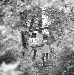
Framed
Hi, Archie ( Acearchie) is cycling for charity ( www.twoboystwobikes.tk) this week from John O ' Groats to Lands End ! and has asked me to send this photo for the contest.
The rest can be seen at http://www.flickr.com/photos/acearchie/4716487237/
Many thanks.
Stephen
Hi, Archie ( Acearchie) is cycling for charity ( www.twoboystwobikes.tk) this week from John O ' Groats to Lands End ! and has asked me to send this photo for the contest.
The rest can be seen at http://www.flickr.com/photos/acearchie/4716487237/
Many thanks.
Stephen
Attachments
NoNameBrand
macrumors 6502


Mistershark
macrumors regular


luminosity
macrumors 65816
STOP POSTING SUCH GOOD ENTRIES! 😡 (not really; great to see so many great entries again this week)
Designer Dale
macrumors 68040

Thanks, results later today...
I just got home (long night... don't ask 😛 ) and will begin the process of picking someone to take over the next contest, but... it looks like everyone's a winner this week! Holy macaroni, it'll be tough to pick one-- maybe I'll just toss a dart at the board and that will be the one. 😉
Anyway, thanks everyone, for bearing with my slight delay on judging.
-phil
comments/critiques for this week-part 1 (1-10)
Here are my comments on the entries for this week for 1-10. Because of smilies, I have to reduce my post size, so I have put the comments in three different posts... Please take them for what they're worth... $0.02. 😉
I'll have the winner(s) posted shortly.
bsamcash - this is a timeless baby shot... it actually looks like an old snap from the 50s with the flashbulbs popping and all, contrasty in nature, but now with the blacks looking a bit faded over time. I'm not sure if this was intentional, but that's just what comes to mind. I'm a bit torn on the overall softness... but it's appropriate considering the subject. 😉 I might have also tried this by 'burning' or slightly decreasing the exposure on the child by half a stop or so, maybe burning parts of the arm and hand and throwing in some vignetting... but, nice start to the b/w contest.
emorydunn - I like the idea here, but there's a bit too much empty black space (for me...) It does help convey the sense of being out in the wild beyond the campfire light, but cropping it a bit to bring us closer to the subject while not losing the overall effect might work better. And a minor comment on the plane of focus, it is more focused on the rocks around the fire than on the girl who appears to be the main subject. I also want to say I appreciate anyone who still shoots medium format film with an older twin-lens reflex-- that's doing it the old school way, and I love seeing the results. Cheers.
deep diver - The one works a lot better large, and you've got some really nice tones going on... depth of field makes it look as if the cat is emerging into this world from another one, with half its body still in between... I also like the bit of motion blur with the back leg. This cat (he or she??) looks like she's making a beeline to the viewer, while her ears are alert to any danger.
Xander562 - Nicely exposed, good tones... at first I didn't linger too long, and it seemed a bit centered, and not too much to really look at... but, as I looked more I started to wonder how exactly this was done. Then, I started seeing things reflected in the drop/bubble/sphere/crystal paperweight... whatever it actually is. I started seeing things, like I'm going a bit crazy. some guy, maybe with glasses and pulled back hair, and a cute, very furry dog of some kind, staring right back at me... So... am I seeing things? 😉
Phrasikleia - an image that I both like to look at, and don't like looking at...a beautiful picture of something not generally seen as beautiful-- which is actually... great! The way the light almost appears to be filtering down and surrounding the dead cow seems a bit eirie. I don't know how much 'dodging' and 'burning' was done in PP besides the vignetting, which works to strengthen this effect. I really like the tonal qualities here. Also, there is a underlying question of "what happened here..?" Cows don't usually just die--they are usually killed, and eaten by humans (there's an irony there, too.) Was this some rural vandalism/animal cruelty, or predator related? So, the fact that this is dead livestock brings a slightly disturbing aspect to the image, it doesn't seem as natural as finding a wild animal carcass. Would this image encourage eliminating predator animals (if used that way?) There are lots of things that start to come to mind, and I'm not sure how I feel about them, so in that sense it's a provocative image-- and kudos for that!
Maxxamillian - Beautiful tonal qualities, gauze-like softness, lovely backlighting... was this converted from color PP to b/w? I'd like to see just a bit more light on the girl's face... I've found that what looks great in warm color on these kinds of shots needs a bit of a boost when straight converted to b/w... mainly the skin tones. It's a matter of degrees here, because the whole image is beautiful as it is. The rim outlining her profile and the ethereal glow she appears to be emerging from have a slightly mystical quality. Overall excellent shot!
nicque - Wow, you were there the day the young Bjorn Borg tried his hand at drums?? I bet that was a sight! 😉 Overeall, pretty well executed, but a few things I'll mention for improvement. Something is blocking part of the view on the left side... and it's a bit frustrating as I view the picture, much like it would be in real life... so crop, or move slightly forward or to the right as you take the shot. The subject's face is a bit blown out, so I'd burn that down just a bit so it doesn't go completely white (as long as some detail exists in the file. I'll admit, concert lighting is really tough. I do like the fact that you appear to have captured the drummer looking right into the camera... overall, nice effort, I'd like to see more of the shots from this concert.
Schtumple - Aahhh! I just love these old rangefinders. This is a simple photo, and I enjoy looking at it. Definitely works better as a black and white photo.
johnnyfiive - this shot has a melancholy aura to it, and it reminds me of my old, faithful best dog ever, who would sometimes go sit by the sliding glass door where the blinds were slightly open... just like this. I like the dog almost lost in the shadow, with the window lighting gently painting his or her outline. I like the way this photo touches my emotional side... 🙂
genshi - This actually works much better small than bigger, because it's slightly soft overall, and there doesn't appear to have a primary subject-- it's just sort of a picture of what being the next person in line to order espresso or a bagel would be like... so in that sense it's not terribly interesting...or at least I couldn't figure out what the "intention of the photographer" was. But, if you had a barrista doing something or interacting with someone and it were sharper, that could make all the difference in the world. Keep working on the "slice of life" shots, because there is a lot of potential in them! 🙂
comments/critiques - part 2 (11-20)
Here are comments for entries 11-20...
mynewromantica - this shot grabbed me when I first saw it - it's seriously fun and just plain cool! I won't really critique it so much as just say it's a nice mix of effects and I'd like a framed copy, thanks! Killer image by my standards!
raxafarian - this is well exposed and has some nice detail to it-- an interesting building, looks a bit like an older, federal building of some kind. If I knew more about architecture, I'd probably like it even more. The only thing is... this shot makes me want to see more of the building....like from the street level all the way up to the eaves, with this same amount of detail, and you'd have to have a super wide angle lens on a 4x5 view camera to do that... 😉
someyoungguy - I'm always fascinated by the details on the old, New York skyscrapers, especially the often-photographed Chrysler building... but I don't think I've seen a shot from this perspective before. I like it a lot. It could be straightened a bit, but I like the glint of light bouncing off the eagle heads and what appears to be a fierce, defensive posture from this angle, almost like fists or battering rams appearing from the 'body' of the building--- almost robotic in theme. I love the bricks, too. They could never build anything like this today...can you imagine the bricklayers who put them all in place, one at a time? So, lots of thoughts enter my mind when I look at this photo, which to me makes it a great picture! Cheers! 🙂
JDDavis - Whew! Another iconic building... and this would be gorgeous HUGE!. Maybe a very, very slight burning down the highlights right on old Abe, but otherwise I absolutely love the tones here. The lighting sure helps when they do it right.
a.jfred - I have spent a little time trying to "get" this shot, thinking maybe I missed something, but I plead my ignorance here... what is it? Is it a leaf? A windsock? 😉 Anyway, I'm just a bit unclear what you're trying to convey here, so sadly I have to say that it doesn't work for me... so to be constructive... Think about your subject. What are you trying to say, or show? Give the viewers of your photo some reason to linger for a bit... some 'recognition' of what they're looking at (unless it's abstract art, of course. 😉) I think technically you've got the tools, and the tonal range in the shot is actually pretty decent. The problem in this particular photo is that most of the tones fall into a similar, dark gray area, which can make a shot look flat, even when it's not. So not all shots work in black and white as well as in color, and vice-versa... Anyway, I'm interested to hear from you what your thinking was on this shot... cheers. 🙂
MSUSpartan - this is another shot that initially stood out for me... I love your caption, because often it's the words combined with an image that make them really compelling. I felt a bit voyeuristic, and as if I was invading this young woman's privacy, but it does also make the shot interesting. She looks either sad as she talks on the phone, or could just be seeking privacy. She appears to be having a serious converation, and I feel a bit guilty peeking... although that's the element that give the picture it's power.. her reflection in the polished marble wall, the detail in the railing and background arch and lobby all tell the story. Nice!
pukifloyd - this is an old-fashioned, high contrast black and white photo...That stylistic quality of this image works here... we don't need all the shadow details, this is a city... it's gritty, it's grainy, it's huge, it's stylish, it's iconic... and things are usually pretty clear, and not burdened with "shades of gray," so to speak. 😉 This would be a cool, stylish big framed print...
gatepc - I've got one word for this shot - jenga! 😉 Actually, I don't really know what I'm looking at, but I like the tunnel-like effect and the limited depth of field. The texture of the wood works well in black and white with the angled light angling in from the side. The tones are good... I'm just not sure what the main point is, other than as a photographic exercise in limited depth of field... maybe you could tell us what you were thinking on this one. 🙂
TH3D4RKKN1GH7 - dang, your name is hard to type...😉 Okay, I like this a lot. It reminds me of a movie (can't remember the name, maybe Smoke) where the smoke shop owner takes a picture of his corner every day of the year from the same spot... This is another of those shots that has a bit of high contrast, but for me it works. I'd rather see the edginess of the highlights, stripes, window frames, etc than shadow detail here. It makes the picture pop more this way. I think in black and white there's a lot more latitude in whether to go higher contrast, blown highlights, dark shadows than there is in color, while you can also do the zone system/Ansel Adams kind of thing, too. Tonally, at least for me, black and white lends itself to more tonal variations than color... so this might not work for me in color nearly as well... but it's great here!! Love it! 🙂
luminosity - I really love this one, also! it's another example of what I was referring to with darkknight's (my spelling) and several other shots above - high contrast, gritty black and white. In this case, the subject is ideal... we focus on the pick between the finger and thumb, and the strings/pickup of this instrument. The outline of the guitar is all you need here... much like neon art, it's about the suggestion of detail, and all about attitude. The only detail we need is the intersection of human and instrument -- right there... the point of contact, where all the music emerges from. BTW, the grain kicks some serious, old-timey butt. Another one I'd frame and hang! Awesome image! 🙂
notw618 - cute image... nice tones, sharp and well exposed. My one thought is that this shot might look better in color, depending on the color of those shoes. If they are bright red, or lime green or hot pink... they'd just pop right off that gray pavement. As it is, they just sorta, kinda... don't do the same thing as well. So, I'm thinking this could still be cool in color, but not as cool in black and white. cheers! 🙂
comments/critiques - part 3 (21-30)
And, here are the last 10 comments on entries...
flutegirl - great use of light here. I completely see what you were doing here, and what you were going for... because it worked! The tonal details in the sunlit pavement and the shadows (in this case) are very good, and compositionally the girl's shadow mirroring her is strong. The backlighting makes the shot here, and she's obviously blessed with a great head of hair... which is the "pow" part of the shot. But...as I spend more time looking at this picture, I'm beginning to think I'd like it even more if you'd delicately try to darken the shadows in only the upper part of the image... she could even be highlighted against an empty, black space for more drama. I love the texture in the pavement shadow in the lower half of the picture, but the building and corrugated wall begin to ever-so-slightly compete with the main subject, and I imagine them 'gone.' But, overall, great!
Presha - I always like black and white desert southwest and grand canyon shots because of all the tonal qualities available from the sky to the rock formations... and there's always the light. I have mixed feelings about this shot... I like the detail and tones of the old, knarled pine root, but not the tree or brush to the right of it, it is blocking my view of that amazing canyon over yonder... 😉 It tends to make the picture look cluttered to me, and somewhat confusing as to what I'm supposed to be looking at... too many competing elements. I wouldn't mind seeing more shots from this trip, so post them here in the POTD thread. 🙂
Jennx143 - I really like this shot. It's simple, and effective. The subject is clear, and I like that I can see the pretty face in the background -- it adds a personal element to this picture. This would be a definite keepsake between close friends. It's less successful as a "general interest" photograph, but is very pleasing, technically well done, and I'd print and mount it if I knew the person in the picture, without hesitation. It's a cute, sentimental and fun shot. Nice!
CK Williams - So you had to go and make this even harder on me...huh? I'll just be brief here-- this is an exemplary image in black and white. I love every single thing about it, from tonal range, tonal smoothness (thanks, D700 😉) and detail. It's easy to look at for a long time... I'm wanting to find something I can downgrade you on... hmmm... is the horizon a little too centered...? Naaah! This is just perfect. What am I going to do to pick a winner this week? Help!!
BTW: can I have a copy as a desktop wallpaper???
NeverhadaPC - I'm sure anyone who knows your wife would recognize her in an instant! 😉 Nice closeup shot of skin patterns and beads of water... I get a little nervous being this close to your wife when I don't know exactly what "parts" I'm looking at. 😉 But, this is well done.
stiffcrumb - this is a very creative idea, and you've got a couple of cute-as-a-button models. Nice concept, well pulled off. My only thing is maybe to have moved slightly to the right to get that big, out of focus leaf in the lower left corner less obvious, or burn that corner down... or vignette... that's basically what you've done with the opening in the leaves anyway... 🙂 I like this one a lot!
NoNameBrand - Another case where the darker shadows works for me... it helps give the shot a somewhat dated, or timeless quality... This shot makes me want to know what happened here? Why is this old fishing boat up out of the water this way? I like the overall detail in the background, too. the industrial works/refinery give a sense of place, and the puffy clouds scream "summer!" This is a neat shot, that has stuff in it to look at for a while...
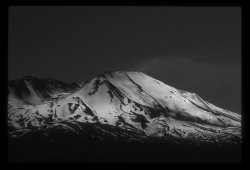
HBOC - This is definitely moody. I'm not sure what mountain it is, but the darker tones here seem a bit foreboding as if this thing is gonna rumble sometime soon... there's a beauty, and a lurking danger here. It seems emphasized in this image, maybe because the tones of the sky nearly match the tones of the forest... isolating the snowy mountain. It would look completely different in color, and the mood would be so different. That's what I love about this artform - photography. It's has so many creative possibilities, and black and white is one of the more interpretive genre's of photography...
pakyooh - I really like this one. I've got a soft spot for bicycle racing...and am looking to do some more photographing of it this fall when cyclocross gets going. Nice actions shot, isolating on the front two pace-setting riders with the pelaton right behind. This might be better in color, too, because of all the color in bike racing, but it's also good in b/w.
TheReef - Alright, another piece of art. I can't critique it, because it's stunning! The changing of waves into mist and smoke is very ethereal. I especially like the mini-hurricane in the lower center of the image.. 😉 You create new worlds with your images, and they become magical places of imagination. Period! 🙂
mtbdudex - I think I saw this or a similar shot before in color... but this works extremely well in black and white. The mist making the background fade and the kayaker's bright 'pop' gives such dimension to this image. It's another beauty this week. Incredible tonal qualities here. Awesome! Frame this! 🙂
Mistershark - Interesting angles here, suggesting more than showing. The light and shadows seem oddly in the wrong places, which is part of what gives this shot a puzzling, yet familiar quality. It's kind of cool...
NeGRit0 - Yeah... I'd be hard pressed to take my eyes off of her, all that attitude and sass! Not to mention great hip bones. Oh yeah... the rest of the picture. 😉 Nice black and white usage here. You did a good job exposing this considering you were staring right into some serious stage lighting. I like that I can see another musician in the background to give some context here, which is one of those subtle things that makes the picture better. 🙂
Designer Dale - I just gotta love sportsfishermen... it's such tough work for them. 😉 Technically, nothing really wrong with this shot, but nothing really jumps out, either. I think it could be better if it were much tighter, in-your-face tighter. Also, there is a lot of water, which takes on a very gray tone in black and white, which tends to dull down a picture's effect. The part that catches my eye, actually, is the part of the boat reflecting all the light off the water, but from a distance it's not immediately apparent that that's what it is-- it could just be the paint scheme, maybe.. so, if you shot this nice and tight, bringing out the reflective movement and play of light on the metal boat, this would kick some serious patootie! 🙂
And, whew I'm done. Next! Picking a winner! That will take a few more minutes and I'll post it right away..
And, here are the last 10 comments on entries...
flutegirl - great use of light here. I completely see what you were doing here, and what you were going for... because it worked! The tonal details in the sunlit pavement and the shadows (in this case) are very good, and compositionally the girl's shadow mirroring her is strong. The backlighting makes the shot here, and she's obviously blessed with a great head of hair... which is the "pow" part of the shot. But...as I spend more time looking at this picture, I'm beginning to think I'd like it even more if you'd delicately try to darken the shadows in only the upper part of the image... she could even be highlighted against an empty, black space for more drama. I love the texture in the pavement shadow in the lower half of the picture, but the building and corrugated wall begin to ever-so-slightly compete with the main subject, and I imagine them 'gone.' But, overall, great!
Presha - I always like black and white desert southwest and grand canyon shots because of all the tonal qualities available from the sky to the rock formations... and there's always the light. I have mixed feelings about this shot... I like the detail and tones of the old, knarled pine root, but not the tree or brush to the right of it, it is blocking my view of that amazing canyon over yonder... 😉 It tends to make the picture look cluttered to me, and somewhat confusing as to what I'm supposed to be looking at... too many competing elements. I wouldn't mind seeing more shots from this trip, so post them here in the POTD thread. 🙂
Jennx143 - I really like this shot. It's simple, and effective. The subject is clear, and I like that I can see the pretty face in the background -- it adds a personal element to this picture. This would be a definite keepsake between close friends. It's less successful as a "general interest" photograph, but is very pleasing, technically well done, and I'd print and mount it if I knew the person in the picture, without hesitation. It's a cute, sentimental and fun shot. Nice!
CK Williams - So you had to go and make this even harder on me...huh? I'll just be brief here-- this is an exemplary image in black and white. I love every single thing about it, from tonal range, tonal smoothness (thanks, D700 😉) and detail. It's easy to look at for a long time... I'm wanting to find something I can downgrade you on... hmmm... is the horizon a little too centered...? Naaah! This is just perfect. What am I going to do to pick a winner this week? Help!!
BTW: can I have a copy as a desktop wallpaper???
NeverhadaPC - I'm sure anyone who knows your wife would recognize her in an instant! 😉 Nice closeup shot of skin patterns and beads of water... I get a little nervous being this close to your wife when I don't know exactly what "parts" I'm looking at. 😉 But, this is well done.
stiffcrumb - this is a very creative idea, and you've got a couple of cute-as-a-button models. Nice concept, well pulled off. My only thing is maybe to have moved slightly to the right to get that big, out of focus leaf in the lower left corner less obvious, or burn that corner down... or vignette... that's basically what you've done with the opening in the leaves anyway... 🙂 I like this one a lot!
NoNameBrand - Another case where the darker shadows works for me... it helps give the shot a somewhat dated, or timeless quality... This shot makes me want to know what happened here? Why is this old fishing boat up out of the water this way? I like the overall detail in the background, too. the industrial works/refinery give a sense of place, and the puffy clouds scream "summer!" This is a neat shot, that has stuff in it to look at for a while...
HBOC - This is definitely moody. I'm not sure what mountain it is, but the darker tones here seem a bit foreboding as if this thing is gonna rumble sometime soon... there's a beauty, and a lurking danger here. It seems emphasized in this image, maybe because the tones of the sky nearly match the tones of the forest... isolating the snowy mountain. It would look completely different in color, and the mood would be so different. That's what I love about this artform - photography. It's has so many creative possibilities, and black and white is one of the more interpretive genre's of photography...
pakyooh - I really like this one. I've got a soft spot for bicycle racing...and am looking to do some more photographing of it this fall when cyclocross gets going. Nice actions shot, isolating on the front two pace-setting riders with the pelaton right behind. This might be better in color, too, because of all the color in bike racing, but it's also good in b/w.
TheReef - Alright, another piece of art. I can't critique it, because it's stunning! The changing of waves into mist and smoke is very ethereal. I especially like the mini-hurricane in the lower center of the image.. 😉 You create new worlds with your images, and they become magical places of imagination. Period! 🙂
mtbdudex - I think I saw this or a similar shot before in color... but this works extremely well in black and white. The mist making the background fade and the kayaker's bright 'pop' gives such dimension to this image. It's another beauty this week. Incredible tonal qualities here. Awesome! Frame this! 🙂
Mistershark - Interesting angles here, suggesting more than showing. The light and shadows seem oddly in the wrong places, which is part of what gives this shot a puzzling, yet familiar quality. It's kind of cool...
NeGRit0 - Yeah... I'd be hard pressed to take my eyes off of her, all that attitude and sass! Not to mention great hip bones. Oh yeah... the rest of the picture. 😉 Nice black and white usage here. You did a good job exposing this considering you were staring right into some serious stage lighting. I like that I can see another musician in the background to give some context here, which is one of those subtle things that makes the picture better. 🙂
Designer Dale - I just gotta love sportsfishermen... it's such tough work for them. 😉 Technically, nothing really wrong with this shot, but nothing really jumps out, either. I think it could be better if it were much tighter, in-your-face tighter. Also, there is a lot of water, which takes on a very gray tone in black and white, which tends to dull down a picture's effect. The part that catches my eye, actually, is the part of the boat reflecting all the light off the water, but from a distance it's not immediately apparent that that's what it is-- it could just be the paint scheme, maybe.. so, if you shot this nice and tight, bringing out the reflective movement and play of light on the metal boat, this would kick some serious patootie! 🙂
And, whew I'm done. Next! Picking a winner! That will take a few more minutes and I'll post it right away..
and the winner...
first, it was incredibly difficult to choose a "winner." Even picking the top 50% bracket was so hard, because there were so many delightful, and seriously unique images that had their own unique qualities and appeal... so with that in mind... here are this weeks results:
The 7 finalists are:
and the winner is.....
Luminosity. Congratulations! Now, it's your turn! 🙂
first, it was incredibly difficult to choose a "winner." Even picking the top 50% bracket was so hard, because there were so many delightful, and seriously unique images that had their own unique qualities and appeal... so with that in mind... here are this weeks results:
The 7 finalists are:
(compelling)

(just quirky cool)
Shot on a She Hao 4x5
(crystal sharp architechtural icon, well done)

(classic, great sense of place)

(perfection... pure and simple)Texas Canyon

(again, perfection... art in the finest sense)Last minute entry (It's actually July 30 here 😛 )

(simply beautiful)Solitude....

and the winner is.....
Luminosity. Congratulations! Now, it's your turn! 🙂

luminosity
macrumors 65816
Well, I must say I'm truly honored, because there were some great entries this week. Some of those last-minute entries are spellbinding.
TheReef and mtbdudex, both of your images would have been who I would have tried to choose between. After seeing yours, I didn't really think mine was the best.
Phrasikleia- Yours is a very stark and haunting image. I liked it a lot.
pukifloyd- Great skyline image. Very well done.
Presha- I liked the desert scene 🙂.
CK- Great desert vista again. I like this a lot.
NoName- Definitely not a no name image. Great work 🙂.
The Reef- Just outstanding. I love this shot. Easily and maybe should have been the winner.
mtbdudex- Equally as outstanding. Also easily could have and maybe should have been the winner.
Absolutely terrific work, both of you. I'd gladly frame both of your images and consider myself fortunate to have them on my wall.
NeGRit0- A very "happening" image with energy 🙂.
Many, many thanks to Phil for choosing my work, and for the chance to redeem myself for my hideous first attempt at choosing a weekly contest topic. I'll have something up soon, and I want it to be similarly inclusive so we get just as many outstanding entries.
A word of explanation about my image: The original shot is actually very ordinary, and was taken during one afternoon when I shot some images of a guitarist I know while he was doing some studio work. I had a trial of Color Efex Pro, and I used it with NX 2 to get a more interesting image. I used both the Portra 400 NC film effect and the NX 2 B/W conversion filter. I took the brightness way down and upped the contrast a lot. If anyone's curious, there was no cropping done, and that part of the image was unchanged from start to finish.
JDDavis
macrumors 65816
Congrats Luminosity. A very classic image.
Phil...outstanding level of effort for providing comments for everyone. It was much appreciated and well done. Great job judging a difficult contest.
Unreal set of images this time. After the first few showed up I was already glad I wasn't judging. Looking forward to the next one!
Phil...outstanding level of effort for providing comments for everyone. It was much appreciated and well done. Great job judging a difficult contest.
Unreal set of images this time. After the first few showed up I was already glad I wasn't judging. Looking forward to the next one!
CK Williams
macrumors 6502a
Congratulations luminosity!! Great image! Kinda reminds me of shooting with Tri-X. Looking forward to the next topic.
Phil, fantastic job on the C&C for all those who entered!! I wholeheartedly agree with your choice and am very glad I didn't have to pick just one from the collection submitted.
To all: great job on posting a terrific collection of B&Ws!!
Phil, fantastic job on the C&C for all those who entered!! I wholeheartedly agree with your choice and am very glad I didn't have to pick just one from the collection submitted.
To all: great job on posting a terrific collection of B&Ws!!
thanks guys. Yes, I was really impressed and very happy with the submissions this week, and it was fun studying them and I could have probably said a lot more... but...😀
I'm still blown away at how beautiful really nice black and white photographs can be. And you guys here on this forum are some of the best at working in this medium.
I'd love to see a lot more black and white action here on the forum, because it makes people think a bit differently when you take away the color... and that's when other factors come into play... and I think it helps the creative side loosen up a lot...
Maybe we could consider adding a thread for black and white, much like the HDR thread, with fewer restrictions than the POTD thread, maybe 3 or 4 image limit/daily. I'd like to see that, and based on what I've seen here this week, could become a really popular and creative thread.
Anyway, I'm glad the topic worked out this week. I'm pleased with it!
mtbdudex
macrumors 68040
Another congrats Luminosity!
I showed my wife your entry and both us loved it.
So many great shots in this contest.
PdxFlint, you've raised the judging bar here....
Good memory, my entry here is from same series as post #3 in "Weekly Photo Contest (March 8 - 15) - emptiness", different shot https://forums.macrumors.com/threads/875367/
This contest helped me re-do PP on those series, always learning, I like these contests.
(and Aperture is much better workflow than iPhoto/PSE8 for PP)
luminosity
macrumors 65816
Thanks a great deal, everyone. I'll have a contest up tomorrow. I may wait just a bit, so as to make sure there's time a week from then for last-minute entries to go up. This time of night (for me) is not necessarily the best time for the time stamp 🙂.
Register on MacRumors! This sidebar will go away, and you'll see fewer ads.