Thanks to all who submitted photos for the contest. It was very difficult to try to select only the top 3. I struggled with 3 or 4 for the number 3 position. I tried to give everyone some input from my perspective after really trying to examine the picture from various objectives. I imagined that I took the photo myself and, being the hyper-critical creatures that we photographer's are, began to think about ways I could have tried to make the picture even better. So with that in mind, here goes:
ijohn Your picture got me reading about wicking bed gardens and how they are set up. Your main plant drew my eye immediately by its position in the composition. It would have been nice to have some contrasting colors, but hey, its a wicking garden. Not sure how to improve the picture. Maybe shot from a lower perspective?
Barryj My eyes immediately went to the fishnet full of fish then the trail of washed up fish along the waterline. This got my eyes to follow them off to the distant shoreline. You might try cropping the picture and removing the two white buckets on the right side of the photo. This would move the fisherman more towards the lower right intersection lines of the rule of thirds and draw more attention to him.
Zaphotheprez I just love this picture. I love the colors of the tomatoes and the leading lines of the composition drawing your eyes up to the basket. Only then did my eyes wander and discover the slightly out of focus female shopper and finally the nice touch of the hand reaching into the scene to grab a tomato from the lower left side of the frame. Nicely done.
milbournopshere I liked the way you created the diagonal lines by the layout of the boxes by the positioning your camera. It creates a flow to the composition. That coupled with the variety of berries contained within the boxes adds color and texture to the picture and makes for an interesting picture out of something so simple as a fruit stand.
keleko A great example here of both DOF and leading lines, with the two hands reaching in from opposite ends of the top of the frame, just driving your eyes towards the lower right intersection in the rule of thirds (sorry, Ill try not to get too hung up on that rule). Really nice composition and zoning in on the main subject with a really narrow DOF. 70-200 f/2.8 IS (not the IS II) at 140mm makes for a great shot. Handheld at 1/30s???
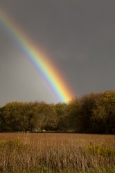
GT41 A really nice capture of a beautiful rainbow against a dark sky. And a nice interpretation of the theme. Maybe next time (ha, like we get moments like this one often) maybe take a step or two to the left or angle your camera more towards the left so that the bottom of the rainbow falls more closely towards the right hand side of the composition. That way we get to see more of that beautiful rainbow and it would dominate the scene even more (my opinion).
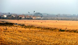
cambookpro Very nice capture of the birds (? crows) over what looks like a recently harvested field. It took me a while to notice the car with the 3 people in it . There is a nice layering effect to the composition.
genshi I like the B&W treatment to this cornucopia-like presentation. Some of the basket contents are cut off on the left-hand side of the picture. I would have liked to see them in the photo, but overall an appealing composition.
Chesse&Apple I love the colors in this picture. The blue-purple of the grapes offset by the green bokeh. I also like the composition with the positioning of the grapes in the frame. Nicely done.
Ipos This is a very simple yet effective photo with the backlit presentation of the shoots of grass (wheat maybe ?). I like how the sun does not over power the photo.
NeGrit0 The layering combined with the DOF in the middle third of the frame is very well done. I love the coloring in this photo.
fireman32 I like your interpretation of the theme. Indeed, busy little bees do a whole lot of harvesting. Honey goes so well with so many things! I like your close up here. You can see the bees proboscis (tongue) in position to harvest the nectar of the flower. In an ideal world the bottom petal would not be cut off, but then you may not have been able to capture this shot at all or be as close. The tail end of the bee is a little out of focus, but with this shallow DOF and a relatively short window of opportunity, short of focus stacking, I dont know if that could have been overcome.
h1r0ll3r Nice capture of the butterfly on the purple flowers. Id think maybe cropping down on the butterfly more would highlight it better and make it stand out more. It seems to be lost in a sea of purple flowers.
Dhelsdon Minimalistic picture with an orange against a white background. The color contrast draws your eye straight to the subject. I am assuming that the slight amount of darkening to the corners is a deliberate treatment and to me acts like a frame or a vignette-like effect.
The results:
3rd place: fireman32
2nd place: keleko
1st place: zaphodtheprez
Congrats to all! Z, you're up!