Become a MacRumors Supporter for $50/year with no ads, ability to filter front page stories, and private forums.
I agree about the 'wandering trashcan'. In Photos sometimes it's in the upper right, sometimes it's in the lower right, and sometimes it's simply not available. And I swear I found it in the lower left once but I can't find it there now.

Editing an iMessage thread.

In both the Video and the Music app? I'm running 7.0.4 and I only have it in the Music app... But yeah, I think I even started a thread about it. Or at least I've commented on it before ;)

lol - Yes, both!
 
I hate that when charging, the icon no longer changes when device has reached full charge. Originally the lightening bolt would pulsate and a solid one would = full charge. So confused why they got rid of this.
 
I hate that when charging, the icon no longer changes when device has reached full charge. Originally the lightening bolt would pulsate and a solid one would = full charge. So confused why they got rid of this.

i know right
 
everything about the phone dialer. from the color (which was introduced before) and the round buttons and the reorganization of buttons (namely delete and + contact)
 
everything about the phone dialer. from the color (which was introduced before) and the round buttons and the reorganization of buttons (namely delete and + contact)

But how many people really use the phone dialer regularly?

At first I didn't like many of the icons which came with iOS 7. But now I like almost all of them besides Voice Memo (Is it called so in the English version?) and Safari. Even if they don't bother me so much, I'd call that a bad design decision.

All in all, I like the update pretty much.

no idea. obviously a dialer is not as used as in previous generations but no reason to make it worse (my view). round buttons vs square is just a waste of space and the delete and + buttons are way too small instead you get a gigantic call button. ive must have received quite a lot of complaints from people who couldnt dial or find the old dial button.
 
Maybe I haven't found it yet but is there an automatic timer for the camera? Sometimes I think that would be handy. In the mean time I am using another app to take delayed photos.

As soon as a jailbreak is available, this feature may also become available - see the absolutely essential CameraTweak (review). Assuming it won't have non-fixable compatibility problems.
 
But how many people really use the phone dialer regularly?

At first I didn't like many of the icons which came with iOS 7. But now I like almost all of them besides Voice Memo (Is it called so in the English version?) and Safari. Even if they don't bother me so much, I'd call that a bad design decision.

All in all, I like the update pretty much.

Why wouldn't you use the dialer regularly? I use it all the time.
 
no idea. obviously a dialer is not as used as in previous generations but no reason to make it worse (my view). round buttons vs square is just a waste of space and the delete and + buttons are way too small instead you get a gigantic call button. ive must have received quite a lot of complaints from people who couldnt dial or find the old dial button.

Well, what I know is, that I was uncertain about the big round buttons, which come up if you have a passcode set up. I thought it'd be very hard to hit the upper buttons, but after using it for a while now I can say: It's not as hard as I though it'd be and I realized how I don't miss the right digits as often as on iOS 6, so I'm very happy about this.

Just took a closer look at the dialer and saw that the dialer is higher than the passcode interface, so it's harder to hit the upper buttons, but still like the fact that it's less probable to hit wrong numbers.

----------

Why wouldn't you use the dialer regularly? I use it all the time.

Why would you? Are you calling new numbers so often? Seems like I'm not meeting new people that much.. ;)

My order of regular calling methods:

1. Siri 2. favorites 3. Contact List 4. out of Messages WhatsApp 5. Dialpad
 
The white on off white scheme is such a horrible decision, how do you use your phone at night, in the dark, etc? It's also hard to distinguish some of the white versus the off white items.

Another horrible design is the calendar app. What good does a screen full of dots do me? I need to see what my appointments are, even if only the first word. What good is all the "retina" display if they can't even use that extra resolution?
 
Why would you? Are you calling new numbers so often? Seems like I'm not meeting new people that much.. ;)

I probably shouldn't admit this while talking about iPhones, but I rarely make calls and usually not to a contact. Almost everything done daily is via SMS and the infrequent e-mail. My favorites have three people on it and putting the third one on was a tough decision. :)
 
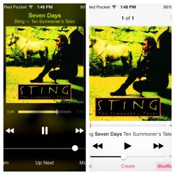
Now playing display in the music app

I don't like the display of the the now playing screen on the music app. Look at it compared to the now playing screen on the remote app. (Remote on the Left, Music app on the right) C'mon apple!!!
 

Attachments

  • photo.jpg
    photo.jpg
    245.2 KB · Views: 97
Thanks for the tip! I never thought of using iPhoto. It looks much better and there doesn't seem to be several different options with different UIs. Even the black background is preferable.

The Photos app has been relegated to my Junk folder.

Glad you like it :) !
 
everything about the phone dialer. from the color (which was introduced before) and the round buttons and the reorganization of buttons (namely delete and + contact)
Apple's dialer sucks.... Needs a smart dialer like HTC has.... Too many steps to find who you want to call. The look of the dialer is a bit distracting and childish IMO.
The rest of iOS 7 I rather like.
My only wish, other than the dialer set up, is that they offered a dark theme that goes system wide.
 
Last edited:
Can't we just accept iOS 7 the way it is and move on?
What would be the point of a forum like this one?

People can accept a lot if things and move on, but if there's actually something that can be better or is actually bad what would be the point of not discussing it, especially in a place that is set up for those kinds of discussions?
 
- Music App, simply terrible in many ways.
- Calendar App, dumbed down and too simplistic.
- Awfully excessive transparency in Video App, I made a thread about it.
- 3X3 folders.
- Crappy little vertical line scrubber for music in CC, it so hard to grab.
- Non customisable controls in CC.
 
Interesting thread.

Reading thru the posts was very helpful. I was unaware of the specifics.

I wanted an iPad and was waiting for the Air. I went to see it on launch day and liked everything about it except the UI.

I love the weight, balance and the feel in my hands so I went back to visit two more times. The UI was the turnoff for me. I don't want to see that why light again until the moment of death, period.

I hope Apple makes some adjustments. So for now I will stay with my iPad mini. It's not upgraded to iOS 7.

Years ago the first computer we bought was a Mac. We didn't have a clue about computers. We chose the Mac for the aesthetics. Now I passed on the iPad Air because of aesthetics.
 
Register on MacRumors! This sidebar will go away, and you'll see fewer ads.