Got a tip for us?
Let us know
Become a MacRumors Supporter for $50/year with no ads, ability to filter front page stories, and private forums.
What are your favorite logos of all time?
- Thread starter Unspeaked
- Start date
- Sort by reaction score
You are using an out of date browser. It may not display this or other websites correctly.
You should upgrade or use an alternative browser.
You should upgrade or use an alternative browser.


Once I found out what the Audi logo meant, I appreciated it more.

The four-ring logo:
The Audi emblem is four overlapping rings that represent the four marques of Auto Union. The Audi emblem symbolizes the amalgamation of Audi with DKW, Horch and Wanderer: the first ring represents Audi, the second represents DKW, third is Horch, and the fourth and last ring Wanderer.


For me, its always the old British Rail logo:

Doesnt look like much now, but in 1965 this was futuristic branding for a Railway. This modern style was copied by other railways (like the Dutch railways logo). Now for me it represents a past age when Britain was a proud engineering nation.
More about this on the Guardian
Doesnt look like much now, but in 1965 this was futuristic branding for a Railway. This modern style was copied by other railways (like the Dutch railways logo). Now for me it represents a past age when Britain was a proud engineering nation.
More about this on the Guardian
<da Google logo>

I would politely disagree about the Google logo - when it's desaturated it becomes, simply, an ugly serif font. Google is a logo that doesn't work in B&W. It's recognizable but by standards of design it's pretty dang bland.


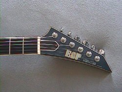
This logo. ESP guitars.
I have a cheaper ESP mass produced guitar which they call their LTD line.
The more famous logos were Fender, of course, and Gibson and Ibanez but I got a little tired of seeing them too much on most guitars, so when ESP came out with an instrument after having been a top of the line guitar parts company, it really made a statement to match their great quality of their full package.
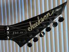
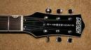
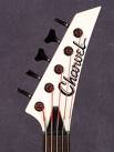
Jackson guitars are a close second for coolness and defined '80s heavy metal as much as the mullet . And for the vintage look, I like Gretsch with the "long" T and are popular guitars among the Rockabilly set.
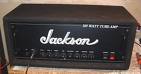
Also Jackson briefly made amps, and when they bought out rival guitar company Charvel, the Jackson logo look followed. Too cool. I had a Jackson amp cabinet and a Charvel acoustic with those logos long ago. I miss them.
I have a cheaper ESP mass produced guitar which they call their LTD line.
The more famous logos were Fender, of course, and Gibson and Ibanez but I got a little tired of seeing them too much on most guitars, so when ESP came out with an instrument after having been a top of the line guitar parts company, it really made a statement to match their great quality of their full package.
Jackson guitars are a close second for coolness and defined '80s heavy metal as much as the mullet
. And for the vintage look, I like Gretsch with the "long" T and are popular guitars among the Rockabilly set.Also Jackson briefly made amps, and when they bought out rival guitar company Charvel, the Jackson logo look followed. Too cool. I had a Jackson amp cabinet and a Charvel acoustic with those logos long ago. I miss them.
Attachments
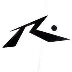
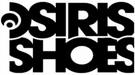
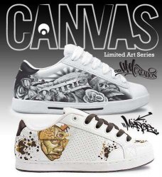
And besides my love of guitar logos, I love skate/skatewear logos
Osiris Shoes are one of the nicer skateboard shoe brands and totally trumps Nike or Converse in that department.
Tensor trucks and bearings have a simple, but striking logo.
And no skater can ignore Hubba Wheels and their NSFW ads.
Osiris Shoes are one of the nicer skateboard shoe brands and totally trumps Nike or Converse in that department.
Tensor trucks and bearings have a simple, but striking logo.
And no skater can ignore Hubba Wheels and their NSFW ads.
Attachments


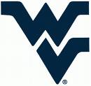
I'd have to go with the flying WV, for West Virginia University. However, I'm extremely biased.
As a kid, I never knew what school that was, especially being out in California, but I thought it was the coolest of all college logos, hands down. I went to two junior colleges, three universities, and a foreign university and none of them had logos anywhere near as cool as WV.
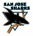
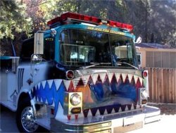
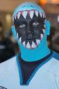
But one university I went to, who didn't do NCAA sports, got some alums together and with the school and came up with a "hypothetical" logo for a possible hockey team in the SF Bay Area region that would be an upstart in San Francisco or San Jose. That logo would become the world's biggest selling sports logo, outselling the NY Yankees and the Oakland Raiders. People like the SJ Shark image and whether one is a hockey fan or not, there is a visceral effect of the shark and the colors. I don't even think the makers of that logo would ever predict in their wildest dreams just how far that logo would go. Below is an actual San Jose fire department engine with a full on Sharks logo.
Attachments


Logos for a down economy:
Logo Images.....
Those really made me LOL.
That logo would become the world's biggest selling sports logo, outselling the NY Yankees and the Oakland Raiders. People like the SJ Shark image and whether one is a hockey fan or not, there is a visceral effect of the shark and the colors. I don't even think the makers of that logo would ever predict in their wildest dreams just how far that logo would go. Below is an actual San Jose fire department engine with a full on Sharks logo.
For real? The world's biggest selling sports logo? Do you have a reference for that?
I've never heard that before.....
Very cool if that's true....
I have always been a huge fan of company logos. Here are a few I didn't see posted that I really like.


Probably the reasons these stand out for me is I remember seeing the Motorola logo growing up on the Microphone of my dad's radio when I was a kid. I am not an amateur radio operator. Also growing up there was a Texaco station that we went to all the time and I remember having a little mug from there when I was a kid that had the logo on it. As for the Cisco and 3Com logos, I work in IT so I see them all the time. And they are great companies with great logos.
There are a lot of others I like already pointed out (Apple, Sun, RCA, BMW, Google)

I really want a Next Cube.
Probably the reasons these stand out for me is I remember seeing the Motorola logo growing up on the Microphone of my dad's radio when I was a kid. I am not an amateur radio operator. Also growing up there was a Texaco station that we went to all the time and I remember having a little mug from there when I was a kid that had the logo on it. As for the Cisco and 3Com logos, I work in IT so I see them all the time. And they are great companies with great logos.
There are a lot of others I like already pointed out (Apple, Sun, RCA, BMW, Google)
I really want a Next Cube.
Apple Logo:

Always admired the Lufthansa logo:

Google Logo:

NBC logo (even though they're doing pretty bad right now:

Xbox 360 one is awesome:

Also like the Playstation icon:

Blackberry logo: (even though I love my iPhone)

Always admired the Lufthansa logo:
Google Logo:
NBC logo (even though they're doing pretty bad right now
:Xbox 360 one is awesome:
Also like the Playstation icon:
Blackberry logo: (even though I love my iPhone)
For real? The world's biggest selling sports logo? Do you have a reference for that?
I've never heard that before.....
Very cool if that's true....
In my school's alumni magazine, when they touted their alums who put the Sharks together along with a very planned out and researched logo, it soon became the world's top selling sports logo. Of course, I am sure the NY Yankees logo outsells it in New York, or I would hope so.
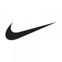
When I looked up what is the world's top selling "sports" logo, of course it came up with the Nike logo, and being a sports company around pro sports and everything including leisure wear, that makes sense. That logo is everywhere. When I think of it, for every time I see a Sharks logo, I must see two or three Nike swooshes. I better contact my school and see what source they used. The internet is definitely with Nike all the way though I know they are not a team, but they represent everything that professional sports has become which is highly visible, rich, and corporate.
Attachments


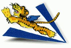
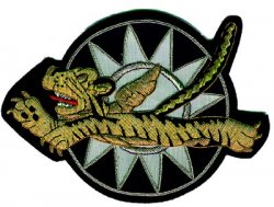
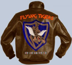
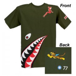
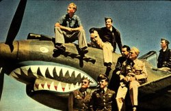
Here's a famous one. US pilots, before the entrance into world war II, flew against Japan in this squadron, the Flying Tigers. This logo would go on to influence many a motor cycle club after the war.
Attachments


Register on MacRumors! This sidebar will go away, and you'll see fewer ads.