Become a MacRumors Supporter for $50/year with no ads, ability to filter front page stories, and private forums.
There's been a necro here, but I feel I might as well respond to this.

You can hold down alt while clicking the green button to get the old "expand until contents fit" maximize. While I agree fully that full screen has little use on a desktop, it's a very, very nice feature on the laptop. I use a 15" MacBook Pro from 2011, and being able to full screen Safari, for example, is a bloody godsend. So much clutter goes away and I am just left with the web and a tiny, tiny bar at the top. It's awesome.

Nobody is forcing you to use full screen. If you don't like full screen, just don't click the maximize button unless you're holding down alt. Simple.

Nice - I didn't know about holding alt and hitting green. Useful feature on a laptop.
 
The most boneheaded decision by apple, after all of their pathetic mouses of course, has to be changing the green button to full screen (useless on desktops, how does one multitask?!). Cherry on top; they close the API on the green button and dont allow 3rd party developers to release software that can change it to a users own PREFERENCE. Oh and as if it wasnt bad enough that it goes full screen, we also have the pleasure of watching this dumbass feature work in super slow motion as applications expand... and then watch it in slow motion AGAIN when it exits full screen. WTF?!

Who's the idiot at apple that thought 'hey! let's force everyone to get used to a tablet experience, even if they're on 24+ inch monitors running photoshop/illustrator/indesign with finder windows, lightroom, chrome, etc.'

Isolating the screen to ONE app is ridiculous. YEAH YEAH, I know, some people for some reason like it. That doesn't change the fact that there needs to be an option to turn this crap off and make it maximize windows instead.
I agree OS X is becoming an OS more oriented at laptops like my 13" rMBP where I use fullscreen mode all the time.

However, nobody is forcing you to use it. You can always Option-click the green button or double-click the title bar to get the old behavior back.

If you want a setting to reverse the default behavior of the green button added, which would certainly be a nice convenience for me on my 27" iMac as well, the best you can do is submit feedback to Apple.

Also, the fullscreen animation is slightly faster on 10.11.
 
Nobody is forcing you to use full screen. If you don't like full screen, just don't click the maximize button unless you're holding down alt. Simple.

Not so simple. I'm human, and occasionally I slip up and hit the green button when I meant to hit the yellow button. That smooth animated fullscreen transition is pretty, but slow, and then I have to get out of fullscreen, which means another smooth, animated out-of-fullscreen transition. Say what you will about the old green button, it snapped to size instantly.

Yes, it's my fault for hitting that button by mistake.

And yes, it's only a couple of seconds of interruption when it happens.

But damn is it ever annoying.

I actually like fullscreen. It's useful. I just don't like the green button being the way to activate it.
 
  • Like
Reactions: thejadedmonkey
I loved the Mac OS X Human Interface Guidelines (HIG) before Yosemite. I love Mavericks.

I dislike the lack of support for modern file systems.

I dislike the inflexible, closed nature of the storage system (Core Storage).

I deplore the pretences that are associated with Yosemite.
 
Completely Mac

I love the clean lines of Mac OS X 10.0 – 10.9.5.

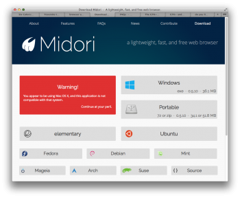
Here, a GTK+ -oriented app that's not intended to be compatible with Mac OS X can appear neatly integrated, reasonably consistent with Mavericks:

caution.png


The future?


Yosemite toolbars | Manton Reece (2014-10-26) highlights an inconsistency that was observed by Jason Snell. From Taking Apple's Lead:

titlebars2.jpg


I simply can't see, in Yosemite, the combination of cleanliness and consistency that became hallmarks of Apple in the decades before 2014. The 'Completely new. Completely Mac' slogan was not persuasive. I see a mash.

Refined, but it is a mash.

With most types of mash I can work – happily – but Apple's mash-by-design troubles me.
 
I'm probably in the minority, but this is one thing I loved about Mac OS X:

macosx101.png


Buttons took up a lot of space, and the depression around the iTunes navigation could be thinner, but just bloody look at them. I found the scrollbars especially beautiful.

I'd been holding on to Mavericks until quite recently but updated to Yosemite in preparation for El Capitan. From what I saw, I really disliked the new UI and… frosted/burring menu backgrounds, but after updating, I must say, I quite like it. Aesthetically, it works on my non-retina monitors much better than I anticipated.
As I've mentioned before, when I talk about the iOS-ification of OS X I almost certainly have the Lion scrollbars in mind. The scrollbars are one of my favorite aspects of Aqua, and I enjoy them whenever I use one of my old PPC Macs or late 2008 MBA running Snow Leopard.

In Yosemite, Aqua is gone. But I still like the look, in a different Retina-minded way.
 
  • Like
Reactions: grahamperrin
Not so simple. I'm human, and occasionally I slip up and hit the green button when I meant to hit the yellow button. That smooth animated fullscreen transition is pretty, but slow, and then I have to get out of fullscreen, which means another smooth, animated out-of-fullscreen transition. Say what you will about the old green button, it snapped to size instantly.

Yes, it's my fault for hitting that button by mistake.

And yes, it's only a couple of seconds of interruption when it happens.

But damn is it ever annoying.

I actually like fullscreen. It's useful. I just don't like the green button being the way to activate it.
Ah, I see. Well, you'll be happy to hear that El Capitan increases the animation speed of that animation very significantly.
 
Register on MacRumors! This sidebar will go away, and you'll see fewer ads.