I personally prefer Lucida Grande as UI font on non-hidpi Mac.
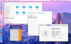
What do you think of Lucida Grande + OS X Yosemite?
(Screenshot of Lucida Grande as UI Font on Yosemite is attached below)
schreiberstein created a script that automates the process of using Lucida Grande as Yosemite's default UI font. A huge thank you to him!
What do you think of Lucida Grande + OS X Yosemite?
(Screenshot of Lucida Grande as UI Font on Yosemite is attached below)
schreiberstein created a script that automates the process of using Lucida Grande as Yosemite's default UI font. A huge thank you to him!
Download : https://drive.google.com/folderview?id=0B_u6AjwB3JxSR19USk9CSWhMTnM&usp=sharing
Navigate to the top of the site. You should find 'Download' in its very center.
This is an Automator script which patches the default Lucida Grande font and copies it to /Library/Fonts. No system files are changed. The original font isn't included in this package, hence it's not redistribution of copyrighted Apple content.
Use with caution! I'm not liable for any damages, as stated in the license (BSD).
You can use the Automator.app to see the source code (Apple Script + Shell with embedded Apple Script) .
I'm planning to publish this thing on GitHub, too.
Let me hear whether or not this works for you (especially people using the Developer Previews).
I tested it on my Yosemite Public Beta 2 system.
The patch was created using 'bsdiff', a binary patch creation tool.
I ran 'bsdiff' to create a binary patch containing the difference between the original Lucida Grande font and vista980622' patched font.
'bspatch' is used in the script to apply the patch and move the newly created font to '/Library/Fonts'
Thank you very much, vista980622!
Best regards,
schreiberstein
EDIT: Download directly from my website (online most of the time) : https://schreiberstein.co.uk/wp/wp-content/uploads/2014/08/Lucida-Grande-Yosemite-1.0.zip
I just tested it on a fresh Yosemite Public Beta 2 installation. Works fine for me.
EDIT2: GitHub : https://github.com/schreiberstein/lucidagrandeyosemite
Attachments
Last edited:

 content.