Got a tip for us?
Let us know
Become a MacRumors Supporter for $50/year with no ads, ability to filter front page stories, and private forums.
What do you think of the new dock?
- Thread starter ionjohn
- Start date
- Sort by reaction score
You are using an out of date browser. It may not display this or other websites correctly.
You should upgrade or use an alternative browser.
You should upgrade or use an alternative browser.

Uhhh where?
He is saying what he would like to have, not what exists now.
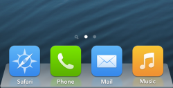
As much as I like the Beta 2 dock, I've always wanted the Mountain Lion dock. It has that frosty look to it, and I think it would look quite nice on the OS.
As much as I like the Beta 2 dock, I've always wanted the Mountain Lion dock. It has that frosty look to it, and I think it would look quite nice on the OS.
Mountain Lion Dock would look like crap on iOS 7 IMO...Someone should create a Photoshop of it.
I like the dock. I think if it was more transparent, it would look weird. All speculation though, I would have to see it first hand.
Mountain Lion Dock would look like crap on iOS 7 IMO...Someone should create a Photoshop of it.
someone did
I wish they'd do that
(Was created before June 10th, unknown designer)
Attachments
someone did
I wish they'd do that
(Was created before June 10th, unknown designer)
That looks really nice, and, as usual, the re-imagined icons look way better than the ones Apple came up with.
That looks really nice, and, as usual, the re-imagined icons look way better than the ones Apple came up with.
Yeah, they seem even more professional than the ones in iOS 6 and lower
Whoever made this should work for Apple to get rid of the current childish design
someone did
I wish they'd do that
(Was created before June 10th, unknown designer)
No, I mean with the current home screen and icons...
Maybe it is just me, but I don't see what the big deal is about the dock. It has no added or subtracted functional value when the UI is changed there. I understand the concern around the style changes for buttons and navigation elements, but not for static background images that you don't really interact with.
Maybe it is just me, but I don't see what the big deal is about the dock. It has no added or subtracted functional value when the UI is changed there. I understand the concern around the style changes for buttons and navigation elements, but not for static background images that you don't really interact with.
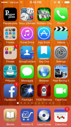
Part of the problem is that the current "frosted glass" dock can take on an ugly color, depending on your wallpaper. I had to quit using my favorite wallpaper because it made the dock an ugly salmon color:
Attachments
someone did
I wish they'd do that
(Was created before June 10th, unknown designer)
The icons that should've been there from the start!
No, I mean with the current home screen and icons...
well, let's hope somebody make one lol
Although I see that the dock takes on the properties of the wallpaper underneath it, I don't mind it personally.
I am used to it so far.
----------
What is intense to me is when I double-tap the home button, as in previous iOS'es and get that search-dock-thing? I'm a bit taken aback to see all my apps' info open, while scrolling horizontally.
It is different and I can see why it was done for sure, but it is still something I am still getting used to.
I have to agree, the Frosted Glass looks nice with MOST wallpapers, I don't see how the OS X dock could possibly add to it. The previous glass dock doesn't interfere too much with the wallpaper, but an all metal OS X dock you can't even see your wallpaper beneath it. At least with iOS 7 you see the wallpaper underneath and it has some type of depth. Hence why I stand by what I say (for now) that the OS X dock should stay in OS X. I even wanted the Glass one back BTW.
someone did
I wish they'd do that
(Was created before June 10th, unknown designer)
GoGa from Macrumors created that in this thread: https://forums.macrumors.com/threads/1585895/
Register on MacRumors! This sidebar will go away, and you'll see fewer ads.