Got a tip for us?
Let us know
Become a MacRumors Supporter for $50/year with no ads, ability to filter front page stories, and private forums.
What does Notes look like?
- Thread starter Vertigo50
- Start date
- Sort by reaction score
You are using an out of date browser. It may not display this or other websites correctly.
You should upgrade or use an alternative browser.
You should upgrade or use an alternative browser.
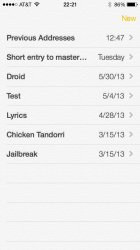
Any brave souls running iOS7 want to post a few screens of the new Notes app? I'm really curious what it looks like now that they're banishing skeumorphism.

Looks terrible IMO. Very subjective of course but its waaaaay to plain for my taste. I actually didn't mind the look of the old notes app.
Attachments
Thanks bgro!
Would you mind posting one of the inside of a note too?
I see what you mean about it being very plain, but I actually kind of like it myself.
Yeah it's definitely plain. I am not a fan of the redesign at all but I'm side many people will like it. Here's the inside:
Attachments
S
syd430
Guest
Yeah it's definitely plain. I am not a fan of the redesign at all but I'm side many people will like it.
Yeah i've also been complaining since at least 450 AD that plain piece of paper is too plain to write notes on. The whole experience of writing simple notes on a white piece of paper has been so boring and dull, I wish my pen would at least light up with bright neon colours every time I finish a sentence and that my paper was yellow to at least throw some jazz in to the mix.
Honestly a lot of complaints about an app that is supposed to be the mobile equivalent of Notepad.
I loved the yellow personally. I miss it a lot. I typed so many notes on that simple yellow app that it really grew on me. That was one thing I missed a lot during my brief trial of Android. The stock Notes app.
I guess I'm in the minority, but I would have preferred more features than a new look for iOS 7. I never thought the look was main problem.
I guess I'm in the minority, but I would have preferred more features than a new look for iOS 7. I never thought the look was main problem.
This is awful. Texture reminds me of Letterpress – I hate it, I don't know why. I thought they wanted to get rid of skeumorfism, why is this paper texture? I also don't like that every app is white. This is is white and that is white… I'm going to get seek of white! What was wrong with yellow color?
And how cool is the toilet paper texture? Reminders has it too.
One cool thing though is that the texture is fixed in relation to the text. That's one thin that always annoyed me about the paper texture in Notes - the text always moved independent of the texture. Now, it doesn't. Yay
Register on MacRumors! This sidebar will go away, and you'll see fewer ads.


