Got a tip for us?
Let us know
Become a MacRumors Supporter for $50/year with no ads, ability to filter front page stories, and private forums.
What happened to Finder icon?
- Thread starter Moka Akashiya
- Start date
- Sort by reaction score
You are using an out of date browser. It may not display this or other websites correctly.
You should upgrade or use an alternative browser.
You should upgrade or use an alternative browser.
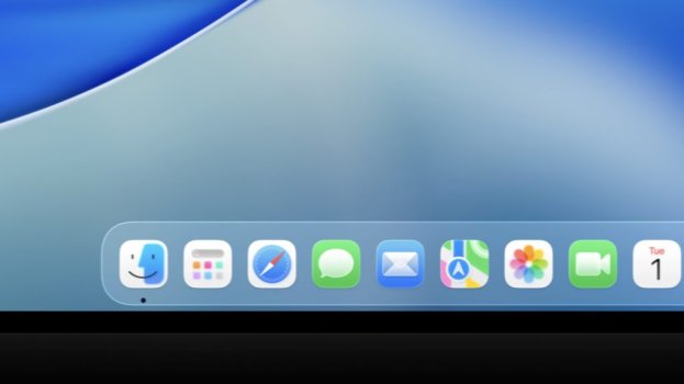

The first impression of macOS Tahoe is that the design is not finished. In some UI elements, there is clearly outlines.
For example:


You see clear outline around controls, Folder sidebar. But some outlines were grouped based on functionalities, but other outline just lump everything together
Then when you goes to control centre, there is no outline. Every icon is flowing in top a blurred area.

The control centre mimics the iOS control centre, which is much larger than one on pervious version of macOS.
The transparency is everywhere. Animation is also feels unpolished. I don't know if Apple wants people feel macOS being responsive or not, application just pops suddenly.
Icons are too colourful, too much bright colours. Maybe it is just me.
For example:
You see clear outline around controls, Folder sidebar. But some outlines were grouped based on functionalities, but other outline just lump everything together
Then when you goes to control centre, there is no outline. Every icon is flowing in top a blurred area.
The control centre mimics the iOS control centre, which is much larger than one on pervious version of macOS.
The transparency is everywhere. Animation is also feels unpolished. I don't know if Apple wants people feel macOS being responsive or not, application just pops suddenly.
Icons are too colourful, too much bright colours. Maybe it is just me.
That’s normally what we see in the early developer previews, this is not at a public beta stage yet.
Everything about it looks fine to me.
Always forgets to redesign scrollbars.The first impression of macOS Tahoe is that the design is not finished. In some UI elements, there is clearly outlines.
For example:
View attachment 2517968
View attachment 2517971
You see clear outline around controls, Folder sidebar. But some outlines were grouped based on functionalities, but other outline just lump everything together
Then when you goes to control centre, there is no outline. Every icon is flowing in top a blurred area. View attachment 2517978
The control centre mimics the iOS control centre, which is much larger than one on pervious version of macOS.
The transparency is everywhere. Animation is also feels unpolished. I don't know if Apple wants people feel macOS being responsive or not, application just pops suddenly.
Icons are too colourful, too much bright colours. Maybe it is just me.
Where is close/minimize/fullscreen buttons in finder top panel? Looks pretty bad too.The first impression of macOS Tahoe is that the design is not finished. In some UI elements, there is clearly outlines.
For example:
View attachment 2517968
View attachment 2517971
You see clear outline around controls, Folder sidebar. But some outlines were grouped based on functionalities, but other outline just lump everything together
Then when you goes to control centre, there is no outline. Every icon is flowing in top a blurred area. View attachment 2517978
The control centre mimics the iOS control centre, which is much larger than one on pervious version of macOS.
The transparency is everywhere. Animation is also feels unpolished. I don't know if Apple wants people feel macOS being responsive or not, application just pops suddenly.
Icons are too colourful, too much bright colours. Maybe it is just me.
Is control centre looks like this with disabled glass effects, or is this normal look? I wonder if there is checkbox to opt-out glass look, just like reduced transparency in accessibility settings (or maybe it will disable both things now). Wonder how good system will look with disabled transparency after redesign.
Upd: i guess this is default centre look, it's just so gray because it tries to get some contrast with white background to render white text on glass button. Maybe it looks better in dark mode at least x)
Last edited:
Where is close/minimize/fullscreen buttons in finder top panel? Looks pretty bad too.
Is control centre looks like this with disabled glass effects, or is this normal look? I wonder if there is checkbox to opt-out glass look, just like reduced transparency in accessibility settings. Should be optional for sure.
The screenshot I have didn't include the close/minimize, full screen buttons.
For visual reason, the three dots on Safari feel very cramped.The sidebar button is right next to three dots.
Open/Close the sidebar on Safari feels laggy.
Control Center on iPhone feels even worse. The whole transparency sit on top of your Home Screen where everything is visible underneath.
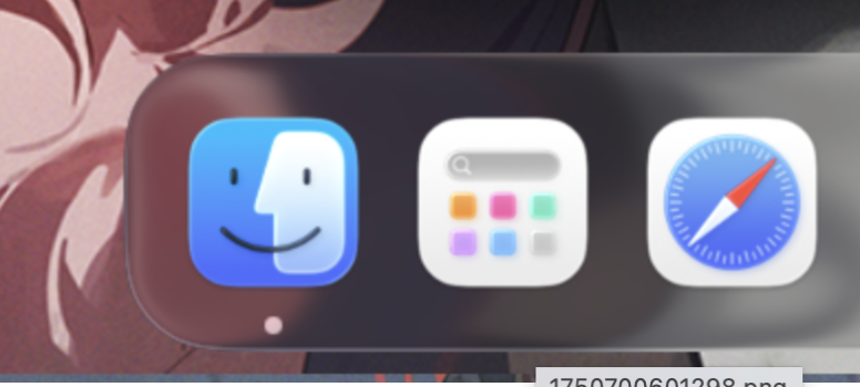
I can’t believe they inverted the Finder icon colors, it’s been this way since the first release of OS X, why Apple ?
Indeed, what a disaster. Looks nothing like the originalI can’t believe they inverted the Finder icon colors, it’s been this way since the first release of OS X, why Apple ?
I was literally about to type out this exact same thing.They massacred my boy.
he ran into a window pane and smashed up his face
For visual reason, the three dots on Safari feel very cramped.The sidebar button is right next to three dots.
and you can't remove the sidebar button !
The outline doesn't bother me but the fact that they swapped the position of the face colors massively bothers me. Changing a 30+year design for no reason.
See https://forums.macrumors.com/threads/did-dark-mode-icons-make-it-to-tahoe.2458701/post-33954502
It actually looks different depending on which icon theme you select.
(I actually don't mind what they did, they seem to be picking the color combination that makes the "left-facing person" part of the icon stand out properly.)
It actually looks different depending on which icon theme you select.
(I actually don't mind what they did, they seem to be picking the color combination that makes the "left-facing person" part of the icon stand out properly.)
I feel like the right face has the top/bottom of its head cut off. It's a side-on view and was fine when it reached to the edges of the icon, but now that it doesn't I find it jarring.They must swap the colours back. The design itself is fine.
given that the original design of it was supposed to be a person's face in front of a computer screen, the reversed colors seem not only like a pointless break from tradition, but an actual misunderstanding of the visual composition
luckily, it's only dev beta 1, so there's plenty of time to fix it
luckily, it's only dev beta 1, so there's plenty of time to fix it
Not really. The Mac dude is now sitting in front of a screen of frosted glass.given that the original design of it was supposed to be a person's face in front of a computer screen, the reversed colors seem not only like a pointless break from tradition, but an actual misunderstanding of the visual composition
luckily, it's only dev beta 1, so there's plenty of time to fix it
Pretty much the whole theme of macOS Tahoe
Apple Shock Therapy™I can’t believe they inverted the Finder icon colors, it’s been this way since the first release of OS X, why Apple ?
Register on MacRumors! This sidebar will go away, and you'll see fewer ads.