Become a MacRumors Supporter for $50/year with no ads, ability to filter front page stories, and private forums.
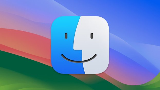
I guess this border will stay since this is part of new design language... In close-ups it still looks pretty bad for me in comparison. Floating glass panels seems verbose and unnecessary in general in Finder UI and dark glass eyes / smile of this icon looks like toothpaste and kinda cheap. Current icon design is just cleaner imo.

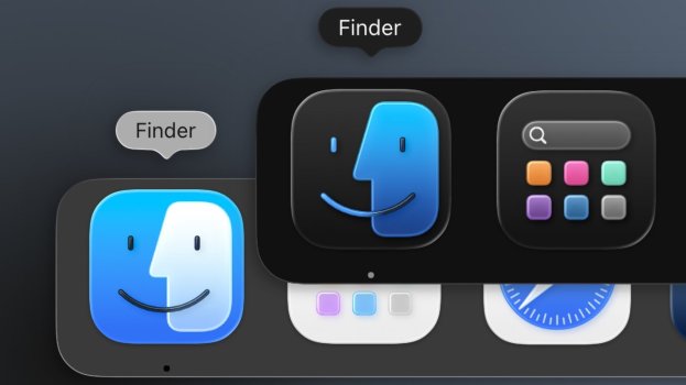
Dark version is not updated in beta 2, but black outline doesn't feel like app icon is in some selected state at least.
 

Attachments

  • 20250627_071227.jpg
    20250627_071227.jpg
    69.4 KB · Views: 35
  • 64121-133498-Finder-light-vs-dark-xl.jpg
    64121-133498-Finder-light-vs-dark-xl.jpg
    59 KB · Views: 27
The outline doesn't bother me but the fact that they swapped the position of the face colors massively bothers me. Changing a 30+year design for no reason.
Some worthless ******* wasted the time of at least a dozen team members and who knows how much money in company resources to make this "innovative contribution" to "freshen up" the design.
 
  • Haha
Reactions: fisherking
Register on MacRumors! This sidebar will go away, and you'll see fewer ads.