For me on the 360.
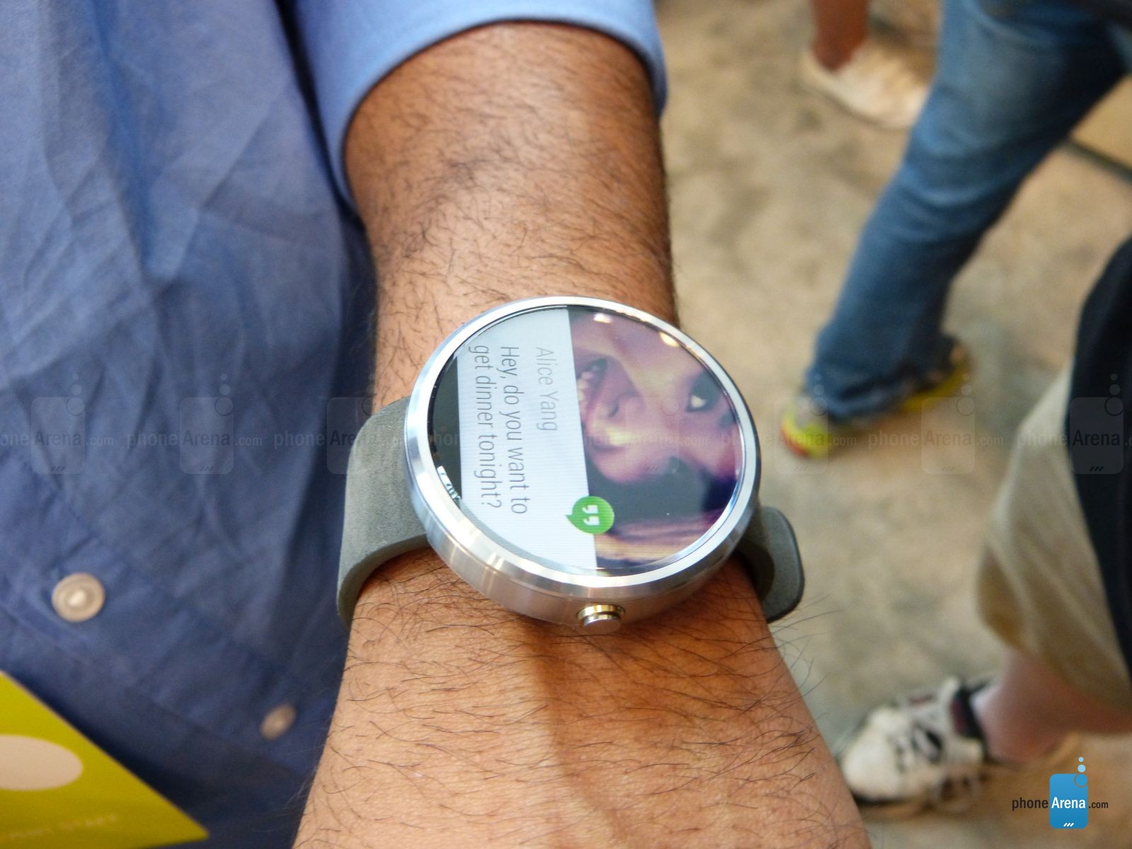
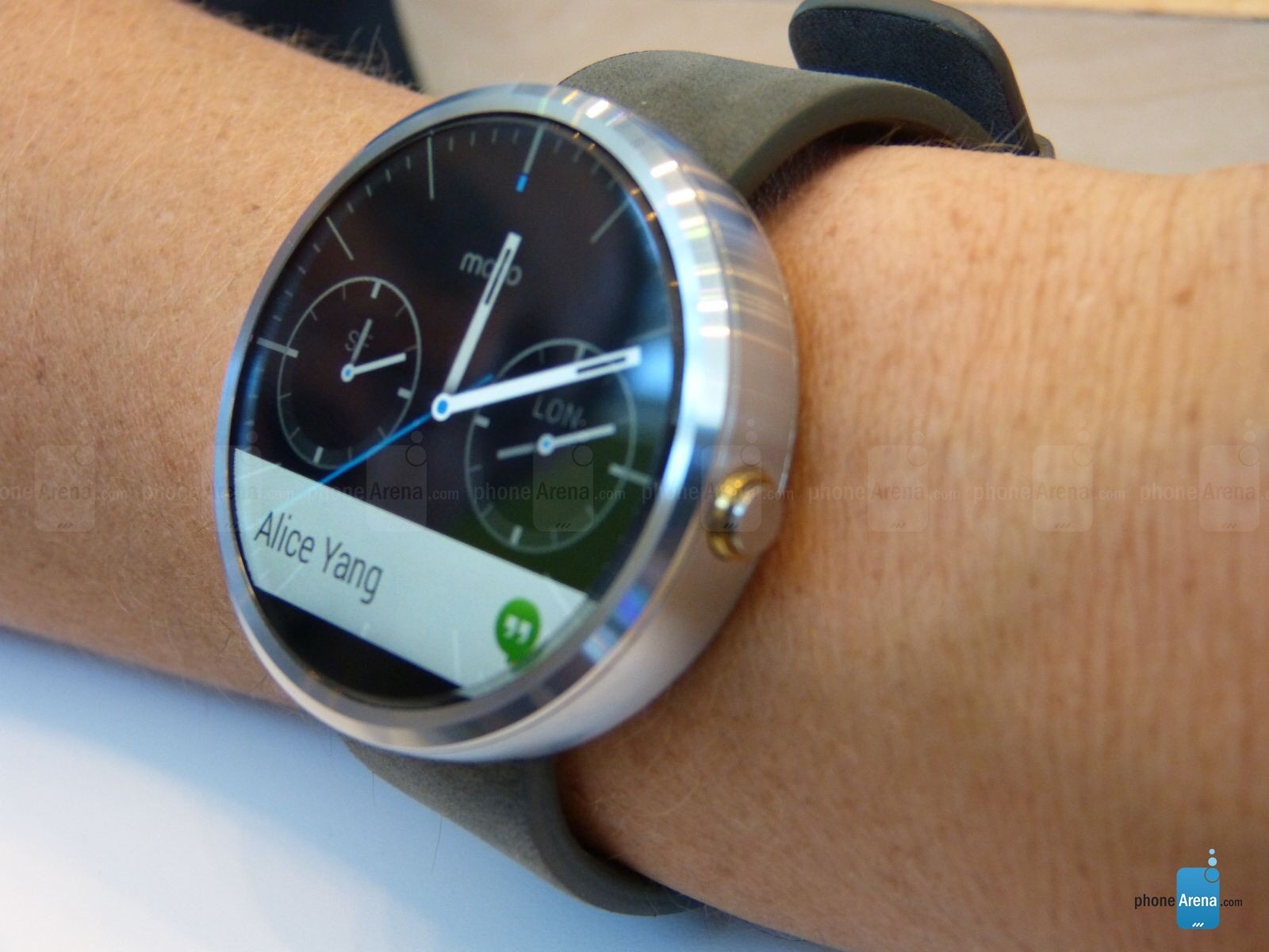
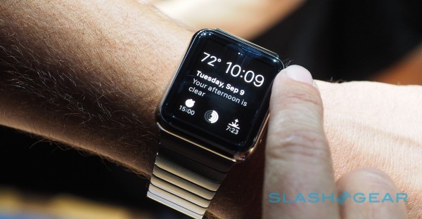
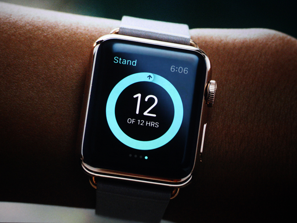
I love the way the screen goes right out to the very edge for almost all of the face, that REALLY is a giant plus point over the Apple watch that has 1/4 of it's entire screen as dead bezel.
It's funny when you think about it. You have a full round screen, right to the edge, which looks lovely, and a section of blank/bezel zone at the bottom.
And of course, I think everyone, in me would love that to not be there, and perhaps in time and future models it won't be there, but it's a price they were willing to pay for this model.
Whereas, on the Apple watch you have a thick black blank/bezel on all 4 sides, not just at the bottom, but somehow that is amazing.
Bezel only at bottom = terrible
Bezel on all 4 sides = superb
That's a kinda odd logic when you think about it.
😀
And yes, I do agree the connection between the strap and the body should be done better and not at the bottom. I don't like it like that.
That is in reality just a easy styling fix, it's no leap of technology to relocate the strap in a future model.
The screen bezel at the bottom will take more but I'm sure they will crack it.
So...
Tweak the body look, improve the strap location/blending into the body better, and hopefully in time remove the bezel totally and it really would be a stunner of a thing.
If you ignore the bezel, the 360 really does have the ability to potentially look a really nice thing on your wrist. Just give it some time.
http://phandroid.s3.amazonaws.com/wp-content/uploads/2014/10/Gold-Moto-360-1-640x820.jpg
http://img.talkandroid.com/uploads/2014/11/Moto_360_Champagne_Gold_01.jpg
http://images.dailytech.com/nimage/Moto_360_18_mm_vs_23_mm_Different_Views_2_Wide.png
I do look forward to later models, and hope they stick to their guns and develop this screen further, as for many, it offers a look a square display with bezels all around the outside just will never be able to do.

 Watch is going to be a runaway winner both at the stores and fashion.