Got a tip for us?
Let us know
Become a MacRumors Supporter for $50/year with no ads, ability to filter front page stories, and private forums.
What the h#%^ did they do to my complications
- Thread starter mpavilion
- Start date
- Sort by reaction score
You are using an out of date browser. It may not display this or other websites correctly.
You should upgrade or use an alternative browser.
You should upgrade or use an alternative browser.

For those of us who can't read minds, would you mind explaining precisely what the issue is? 😉
It‘s complicated!
and what the h#%^ is your problem exactly?
Those big bars of color were not present in the temp or battery complications until this latest update. I don't want them, and it really stinks. Avoiding unnecessary visual elements is a pretty big deal to me. I like a minimal watch face and I look at it throughout the day; its appearance is not something I was wanting or expecting to have completely messed up one morning.
Guess I'll now have to look at 3rd-party apps/complications. Sorry to vent, everyone.
Guess I'll now have to look at 3rd-party apps/complications. Sorry to vent, everyone.
Agree. Same thing happened to me and my utility face. I liked it when they were small, white complications. Don’t need the huge burst of color.
Even putting the color aside, I don't need to see the day's H/L temps every time I look at my watch... just the current temp (with conditions icon) was good. Now there's a separate option with just "conditions" (party sunny, whatever), but it doesn't have the temp.
Well, a minimal watch face would be an hour + minute hand and nothing else (or the hour and minute digits), but I get what you're saying - minimally designed complications. I personally don't see what they've done as a major issue and it looks quite simple to me, but, yes, I guess if it means that much to you, you'll need to find 3rd party alternatives like you said, because I guarantee Apple isn't going to give users THAT level of customizability.
Last edited:
Yeah, by minimal I mean as simple as possible. I think both complications were originally just small, plain numbers for temp & batt % (which was perfect). Then they added conditions icon (which I admit was useful), and a green circle around the battery % (in case you can't parse the number for some reason?); both of which I got used to. But this is a whole new level – they've made the numbers huge (they're the first thing my eyes go to), with big bands of unnecessary color. Perhaps I'll get used to this, but I don't think so.
I know it is pointless to complain; but if they're going to make big changes to something you see dozens of times a day, they are gonna tick off some users. (I roll with changes in iOS easily enough, but my watch face feels different somehow... more personal.)
I know it is pointless to complain; but if they're going to make big changes to something you see dozens of times a day, they are gonna tick off some users. (I roll with changes in iOS easily enough, but my watch face feels different somehow... more personal.)
This may be a solution for your weather complication complaint. If you make the bottom complication the weather instead of the top left, it IS a minimalist display. Then just make the top left your events instead. Doesn't solve the battery complication issue, though. Or you could not use the battery complication and just swipe up to see it in the control center when you need to.

Maybe use Metropolitan instead? It’s a better looking watch face anyway…

Ok, for you and anyone else who cares – here’s a heavily tweaked “California” face. I don’t like it as much as Utility (and I wish it allowed the one big complication on the bottom), but it’s sort of similar, without the garish new colors:Agree. Same thing happened to me and my utility face. I liked it when they were small, white complications. Don’t need the huge burst of color.

You can add the long calendar one to the top middle on that face.Ok, for you and anyone else who cares – here’s a heavily tweaked “California” face. I don’t like it as much as Utility (and I wish it allowed the one big complication on the bottom), but it’s sort of similar, without the garish new colors:
View attachment 2062537
Thanks! I actually did try that out, but it made things too cluttered up there (I didn't think I was so picky, but... lol)You can add the long calendar one to the top middle on that face.
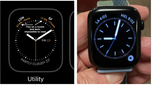
New complications way less usable, and many far too small to read easily. On OS8 World time, the actual time could be read at a glance (R), On OS9 it is effectively unreadable (L) without squinting. PS I also hate the added colour which cannot be changed.
Attachments
Well, a minimal watch face would be an hour + minute hand and nothing else (or the hour and minute digits), but I get what you're saying - minimally designed complications (btw, never made sense to me why they call them that since that word has negative connotations). I personally don't see what they've done as a major issue and it looks quite simple to me, but, yes, I guess if it means that much to you, you'll need to find 3rd party alternatives like you said, because I guarantee Apple isn't going to give users THAT level of customizability.
The complication name comes from mechanical watches and my guess is that the name comes from the fact that they make the mechanism more complicated. The more difficult a complication is to engineer and make, the more status is attached to it!
This one is so funny to me… why not just say “WED 14” on a single line? I think we all know how numbers work.  Is the idea that if it’s the last day of the month, you’ll be reminded that tmrrw is the 1st?
Is the idea that if it’s the last day of the month, you’ll be reminded that tmrrw is the 1st?I have to disagree on both. Love this. Thinks it's perfect (day temp with color). Real easy to understand.Even putting the color aside, I don't need to see the day's H/L temps every time I look at my watch... just the current temp (with conditions icon) was good.
But Apple should make color more correct. In some region normal temp is 25º to 28ºC so 22º is a bit cold. The color should light blue to green not yellow to orange.
Last edited:
Apple: Today's date is the 14th, I wonder what the date was yesterday.
Apple: Codes complication to indicate that 13 is the number that comes before 14.
Apple: It isn't much, but it's honest work.
Apple: Codes complication to indicate that 13 is the number that comes before 14.
Apple: It isn't much, but it's honest work.
See https://en.m.wikipedia.org/wiki/Complication_(horology)Well, a minimal watch face would be an hour + minute hand and nothing else (or the hour and minute digits), but I get what you're saying - minimally designed complications (btw, never made sense to me why they call them that since that word has negative connotations). I personally don't see what they've done as a major issue and it looks quite simple to me, but, yes, I guess if it means that much to you, you'll need to find 3rd party alternatives like you said, because I guarantee Apple isn't going to give users THAT level of customizability.
I wonder if these complications were redesigned to take advantage of the Ultra's larger screen size.
Is this not just the color setting in your watch face? I keep mine on Infograph during the day, with the corner complications white and the interior blue. But I can change the corner complications to be the colors that you show, if I wanted to.
I actually love that they updated them. Those older complications were small and bland. The new ones are fresh and I am super glad they did. Utility is my favorite watch face and I like the refresh!
Register on MacRumors! This sidebar will go away, and you'll see fewer ads.