Got a tip for us?
Let us know
Become a MacRumors Supporter for $50/year with no ads, ability to filter front page stories, and private forums.
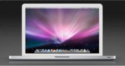
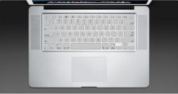
What the new MBP should have looked like!
- Thread starter Europe calling
- Start date
- Sort by reaction score
You are using an out of date browser. It may not display this or other websites correctly.
You should upgrade or use an alternative browser.
You should upgrade or use an alternative browser.
Imo, No.
There was a great mockup pic that made the MBP look similar to the air. I really liked that. But now the new models are out, fantasizing about "what it should've been" isn't gonna change whats already out.
There was a great mockup pic that made the MBP look similar to the air. I really liked that. But now the new models are out, fantasizing about "what it should've been" isn't gonna change whats already out.
Sorry but the macbook pro looks amazing!
They need to change nothing... imo of course")
IMO they should of kept to intel based chipsets...
With a matte screen off course!!
You are correct sir!
Also with
Built in 3G Antenna
Blu-Ray Drive
Hi Res Screen
And Steve would have had my money
that looks nice. The whole black bezel thing is iffy in my opinion. Looks like a HP.
They should have made it all black if they wanted to use black.
The thing is, what works for the iMac doesn't mean it'll work for a notebook. I wish they had realized that.
They should have made it all black if they wanted to use black.
The thing is, what works for the iMac doesn't mean it'll work for a notebook. I wish they had realized that.
I like your design, but I think the black keys on an aluminium body look better than white keys on an aluminium body. I think the MBA is one of the nicest Apple laptop designs in their history, if not THE best.
Right now, with the designs so similar, the MBA has the advantage in aesthetics due to the silver bezel. I don't have an objection to black, but it's just too much black!! Aluminium with a black keyboard looks OK, because black adds a nice touch of contrast to an aluminium body. The contrast looks wonderful.
I think the best look would be to use the new MBP shape, but use an aluminium screen bezel, and aluminium (coloured) chicklet keys. The chicklet keys and new taper along the edge gives the MBP an updated look without making it look gaudy. In other words, it would have looked a bit like the old MBP, but with a taper along the edges, and an aluminium chicklet keyboard.
They looked fine as they were, and they didn't need to ruin it with the two toned shiny toys. This was a change for the sake of change, not because it was needed.
that looks nice. The whole black bezel thing is iffy in my opinion. Looks like a HP.
They should have made it all black if they wanted to use black.
The thing is, what works for the iMac doesn't mean it'll work for a notebook. I wish they had realized that.
Or like an Asus. When did Apple start following PC designs?!
I like your design, but I think the black keys on an aluminium body look better than white keys on an aluminium body. I think the MBA is one of the nicest Apple laptop designs in their history, if not THE best.
I agree completely. Good thing they didn't destroy it this time. Who knows what next revision will do to it, though.
I think many mock-ups are way better than what Apple actually showed us yesterday. All black is fine. All aluminium, possibly with a little black (keyboard) is fine. This iMac-like look might be good when there's screen only (iPhone, iMac, even the new display).
There's only one thing that could help these new notebooks IMO - carbon Colorware. Which is expensive, doesn't cover touchpad and isn't available outside US.
With a matte screen off course!!
Fantastic job!
round it up with FW400 and DVI and I would have bought it instantly!
But now I will simply be using my fully loeaded last revision MacBook and my last revision tiBook and spend the money I had reserved for a MacBook Pro money for something else (maybe an Eames Lounge Chair clone..?!)
vSpacken
I don't understand why the hell couldn't apple think of this exact design, I understand the camera would show, but it would look like a mac. The current new models look like HP/Compaq laptops.
+1
I would've bought the OP's design immediately.
I think the older MBPs look bette than the new onesr...
At first I didnt like the MB MBP but It has grown on me and I think it looks awesome. So awesome Ive ordered one and I dont care what people think, I love it
Thumbs Up
Yeah, I really like those pictures, Europe Calling.
I love the new manufacturing of the MBPs: how solid they're reported to feel and the innovation of it all. They look pretty amazing... until you open them up. Whereupon you get a design that is perfectly fine but yes, that is reminiscent of a bunch of other PC designs and a bit 'loud'.
The whole black/silver/black-chiclet thing isn't a deal-breaker for me though. It's the screen I'm having trouble with. A matte screen and less black would have me scrambling to the Apple store, using my current machine to clobber people over the head and out of my way to the front of the queue. As it is I'll be researching and waiting and playing on it for a while before I decide, I think.
If they had to switch to the chiclet style, it would have been great with actual aluminum keys. That would have been something! ...and more eco-friendly.


Nope sorry, for the first time I will be considering the 15" w/ a 2.8 processor, and 320 Gb 7200 RPM HDD, freaking sweet, w/ 4GB of the new RAM =awesome. One beautiful lappie!
With a matte screen off course!!
silver chicklet keys and i would have bought those mockups. IMO THAT would have been some nice evolution!
Register on MacRumors! This sidebar will go away, and you'll see fewer ads.