Become a MacRumors Supporter for $50/year with no ads, ability to filter front page stories, and private forums.

0000757

macrumors 68040
Original poster
Dec 16, 2011
3,894
850
I consider myself a power user, but I don't really use my Calendar app because I don't have to use a calendar. I'm curious what about the app is it that everyone hates? For my basic use of it, it works fine, so what functionality is missing? Just curious.

Same goes for the music app. 99% of the time I just go into Songs -> Shuffle or iTunes Radio, so what functionality is missing? Just wondering.
 

maflynn

macrumors Haswell
May 3, 2009
72,199
41,554
I'm very happy with both the calendar app and the music app. It does what I need both of them to do and that's the bottom line (for me).
 

darngooddesign

macrumors P6
Jul 4, 2007
15,748
6,636
Atlanta, GA
The changes to the music app don't bother me because of how I listen to music on the go, but I do understand the frustration others are having with hte new Music app. I have never considered the previous Calendar app to be powerful and think that if you are a power user you will have downloaded a better one.
 

Small White Car

macrumors G4
Aug 29, 2006
10,959
1,420
Washington DC
I don't have iOS 6, but here's a screenshot of Fantastical, which is pretty similar to iOS 6's calendar:

cal2.jpg


And here's the same day as seen in the iOS 7 calendar:


cal1.jpg


See the difference?

It's not that I can't find all of that info in 7, but both 6 and Fantastical made it very easy to see a LOT of information all at once. The calendar in 7 makes me hunt, peck, and scroll all over the place just to see what was once much easier to view.

(And yes, I know you can see a similar list in the magnifying glass of iOS 7, but that's a ridiculous workaround...similar to removing menus from a Mac app and just telling people to spotlight the commands. That's not ok.)
 

Dun Properly

macrumors member
Nov 10, 2011
56
0
I don't have iOS 6, but here's a screenshot of Fantastical, which is pretty similar to iOS 6's calendar:


And here's the same day as seen in the iOS 7 calendar:


See the difference?

It's not that I can't find all of that info in 7, but both 6 and Fantastical made it very easy to see a LOT of information all at once. The calendar in 7 makes me hunt, peck, and scroll all over the place just to see what was once much easier to view.

(And yes, I know you can see a similar list in the magnifying glass of iOS 7, but that's a ridiculous workaround...similar to removing menus from a Mac app and just telling people to spotlight the commands. That's not ok.)

+1 This is exactly right. Yet somehow, this will get flooded with people disagreeing with us and suggesting workarounds.
 

snowman1

macrumors regular
Mar 17, 2010
150
13
I don't have iOS 6, but here's a screenshot of Fantastical, which is pretty similar to iOS 6's calendar:


And here's the same day as seen in the iOS 7 calendar:

See the difference?

It's not that I can't find all of that info in 7, but both 6 and Fantastical made it very easy to see a LOT of information all at once. The calendar in 7 makes me hunt, peck, and scroll all over the place just to see what was once much easier to view.

(And yes, I know you can see a similar list in the magnifying glass of iOS 7, but that's a ridiculous workaround...similar to removing menus from a Mac app and just telling people to spotlight the commands. That's not ok.)

I think that the Fantastical screenshot should instead be compared to iOS 7's less-than-useful month view (where you must tap on a date to see your events on that day, instead of having a scrolling list on the bottom like you do in iOS 6/Fantastical). I actually really like iOS 7's day view because most of the time, I would rather see my day as a visual timeline than a list of events (helps me to visualize free time better instead of staring at start/end times to figure out when I'm free). Don't get me wrong though, Fantastical's list view is very useful sometimes, and I wish the iOS 7 list view was integrated with other views better (list + month view and a list + DayTicker-esque view like in Fantastical, instead of a never-ending scrolling list of events).
 

adamj575

macrumors 6502
May 17, 2011
288
3
Tennessee
apple should just buy fantastical and implement their ideas and make a really good calendar app...i've gotten used to the ios 7 one but if given the opportunity id swap back to the ios 6 style one in a heartbeat....as silly as it sounds the only reason i use the built in one now is because i like seeing the date on my calendars icon...
 

kieranet

macrumors member
Apr 24, 2012
37
5
I consider myself a power user, but I don't really use my Calendar app because I don't have to use a calendar. I'm curious what about the app is it that everyone hates? For my basic use of it, it works fine, so what functionality is missing? Just curious.

Same goes for the music app. 99% of the time I just go into Songs -> Shuffle or iTunes Radio, so what functionality is missing? Just wondering.

Some of my issues with both apps have already been covered in this thread and several others.

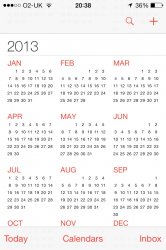
I agree 100% that the day view is totally clunky and requires far too much input to see what's on for that day. Ios6 dealt with this perfectly, as does Fantastical. Another thing I've just noticed, although minor, is this:

In year view, clicking on 'Today' shifts the calendar to focus on today's date, obviously. However, it scrolls the calendar down such that the day isn't actually visible! See screenshot.

Re. music. A few issues but primarily it falls down with its artist>album view. Selecting an artist used to then show all albums with the option of selecting the one you wanted. Now, selecting the artist displays ALL songs by them under the heading of each album. Thus, an artist with lots of albums shows a list of potentially hundreds of songs, meaning scroll scroll scroll.
 

Attachments

  • image.jpg
    image.jpg
    136 KB · Views: 73

me7

macrumors regular
Sep 18, 2013
134
6
Re. music. A few issues but primarily it falls down with its artist>album view. Selecting an artist used to then show all albums with the option of selecting the one you wanted. Now, selecting the artist displays ALL songs by them under the heading of each album. Thus, an artist with lots of albums shows a list of potentially hundreds of songs, meaning scroll scroll scroll.

"Scroll scroll scroll" puts it mildly. With my Dream Theater collection that has currently 241 tracks from studio albums and live albums it's more like "Scroll scroll scroll scroll scroll scroll scroll scroll scroll scroll scroll".

Another annoyance (albeit a minor one) is how playback ignores album borders. After an album ends, the app will automatically start playing another album. Previously, I was used to just taking my headphones off when an album ends. Now I need to take my iPod out of my pocket/bag/whatever, unlock the device, pause playback of an album that I never started to begin with, lock it, put it back.
Yes, it's minor and I understand that Apple doesn't release a 7.0.3 update just for it, but it should get fixed by 7.1.

A bigger problem is how the app ignores the "album name sort" tag. It sorts albums chronologically, which is fine for popular music, but doesn't work out for classical music.
Whatever sorting order Apple imposes by default, you should have the option to set your own order via the order tag. I like chronological for popular music and alphabetical for classical music. Neither default setting will do it for me, I need control back via the sort tag as I had in iOS6.

And one last minor, cosmetic problem: the "now playing" screen shows meaningless track numbers. It doesn't show the current track's position in the album, but rather an "overall" number composed of all tracks by the artist. When I listen to the third track of a ten track album, it doesn't show "3 of 10" but rather something like "172 of 231". I don't really need the counter, I can live without it, but the current broken counter is annoying. It should either be fixed or removed altogether.
 

kieranet

macrumors member
Apr 24, 2012
37
5
A bigger problem is how the app ignores the "album name sort" tag. It sorts albums chronologically, which is fine for popular music, but doesn't work out for classical music.
Whatever sorting order Apple imposes by default, you should have the option to set your own order via the order tag. I like chronological for popular music and alphabetical for classical music. Neither default setting will do it for me, I need control back via the sort tag as I had in iOS6.

I agree with all of your misgivings but can you elaborate on that one.

I agree that for popular music it's actually a nice new feature that it is ordered chronologically not alphabetically. To me that makes more sense. However, are you implying that in ios6 the user had the option of changing how albums were ordered?

I thought they were all alphabetical with no option of changing...but my memory may be failing me.
 

me7

macrumors regular
Sep 18, 2013
134
6
I agree with all of your misgivings but can you elaborate on that one.

I agree that for popular music it's actually a nice new feature that it is ordered chronologically not alphabetically. To me that makes more sense. However, are you implying that in ios6 the user had the option of changing how albums were ordered?

I thought they were all alphabetical with no option of changing...but my memory may be failing me.


iTunes has two sets of tags the normal (display) tags and the sort tags. Most users don't use them. If you specify the "sort album" tag, it will be used for sorting the album rather than the regular album tag. The regular album tag will still be used foe the displayed name. If you want your albums chronologically, you can use the "sort album" tag for that by entering the release date of the album.

Example: Abbey Road by the Beatles. It was released in 1969. The album has the album tag "Abbey Road" and the sort album tag "1969 Abbey Road". When you do this for all albums, they will be sorted chronologically. Internally, they are still sorted alphabetically but the names used for sorting will be "1963 Please please me", "1963 With the Beatles", "1964 A hard Day's Night".... while he displayed names will remain "Please please me", "With the Beatles", "A hard Day's Night"... but now displayed in chronological order.

When an artist has multiple albums in a year, I add the month to enforce proper order. In this case: "1963-03 Please please me", "1963-11 With the Beatles"...

If you have the release years of your music properly tagged, you can use a mass-tagging tool to automatically fill the sort album tag or all albums in your collection. But in cases of multiple albums per year that require the month as well, you will need to add it per hand.


...but all of this is useless at the moment since iOS currently ignores the sort tags.
 

kieranet

macrumors member
Apr 24, 2012
37
5
Thanks for the detailed explanation.

Whilst aware of the various sort fields available I'd never considered doing what you've just described. But yes, as you say: pointless until it's enabled in ios7.
 

haruhiko

macrumors 603
Sep 29, 2009
6,449
5,596
Any.Do has just got an update and it's free. It's one of the best substitute of the stock Calendar app on iOS 7
 

Jovian9

macrumors 68000
Feb 19, 2003
1,961
103
Planet Zebes
I like Calendar quite a bit with the change to it.

However, Music is a different story.

Prior to iOS 7 when watching a music video (tagged music video) when turning the screen horizontally it allowed the video to use up the entire screen (like 16x9'ish). Now, it treats music videos as songs and brings up all the album artwork when turning the phone. When you watch it in iOS 7 the video just plays in the top half of the screen with all the music controls below (like a song). I have a lot of music videos (some from the iTunes Store and some I've ripped myself) so this really bugs me.

Also, prior to iOS 7 whenever I'd click on an artist it was quick and easy to find an album. Now we have to scroll through all the albums songs to get to the later albums. Especially painful when you have entire catalogues from some artists and you want to get to one of the ones further down in the alphabet.

IMO
 

me7

macrumors regular
Sep 18, 2013
134
6
I like Calendar quite a bit with the change to it.

However, Music is a different story.

Prior to iOS 7 when watching a music video (tagged music video) when turning the screen horizontally it allowed the video to use up the entire screen (like 16x9'ish). Now, it treats music videos as songs and brings up all the album artwork when turning the phone. When you watch it in iOS 7 the video just plays in the top half of the screen with all the music controls below (like a song). I have a lot of music videos (some from the iTunes Store and some I've ripped myself) so this really bugs me.

Also, prior to iOS 7 whenever I'd click on an artist it was quick and easy to find an album. Now we have to scroll through all the albums songs to get to the later albums. Especially painful when you have entire catalogues from some artists and you want to get to one of the ones further down in the alphabet.

IMO

They need to fix this ASAP. Please take the time to write a short feedback to apple about your problems (if you haven't already).

http://www.apple.com/feedback/
 

hamis92

macrumors 6502
Apr 4, 2007
475
87
Finland
And one last minor, cosmetic problem: the "now playing" screen shows meaningless track numbers. It doesn't show the current track's position in the album, but rather an "overall" number composed of all tracks by the artist. When I listen to the third track of a ten track album, it doesn't show "3 of 10" but rather something like "172 of 231". I don't really need the counter, I can live without it, but the current broken counter is annoying. It should either be fixed or removed altogether.

This has to do with how the Artists view handles displaying the albums: the track number display in Now Playing screen per se works as it always has worked in iPhones and iPods - it shows your current position in the batch of songs currently being played (be it a playlist, an artist, or an album).

Therefore, because selecting a song from Artists -> [any artist's albums] now basically plays every song from that artist, the number also reflects that fact. Selecting a song through the Albums view counts just the songs in that particular album, because that's all there is to play.

I agree browsing music through the Artists view is annoying, confusing and seriously "user unfriendly". As always, send Apple feedback to let them know what you think. I know I have :)

I hope that explanation made sense, because it is not the track counter that is broken, it's the Artists view.
 
Last edited:

xxBURT0Nxx

macrumors 68020
Jul 9, 2009
2,189
2
I agree that the calendar app has been hampered quite a bit because it takes a lot longer to see information now. Luckily I just use the Today view in NC to see my upcoming tasks rather than go into calendar because it displays the info better imo, but it only shows you whats next not in a few days or next week so it's not perfect.

What is everyones problem with Music.app?? It works pretty much the same as the last music app for everything I have found.
 

NCWildcat

macrumors member
Oct 12, 2011
72
9
I don't like the tiled album art view when you turn it horizontally. I liked it better before when it would put the album you are currently listening to front and center. I have my phone connected to my car stereo and will change albums at stop lights. This is much harder with the current layout, especially if you want to just browse. Also for the love of god enough with having a separate podcasts app.
 
Register on MacRumors! This sidebar will go away, and you'll see fewer ads.