Got a tip for us?
Let us know
Become a MacRumors Supporter for $50/year with no ads, ability to filter front page stories, and private forums.
What's Your Favorite Font?
- Thread starter ceezy3000
- Start date
- Sort by reaction score
You are using an out of date browser. It may not display this or other websites correctly.
You should upgrade or use an alternative browser.
You should upgrade or use an alternative browser.
Helvetica and fonts that resemble Helvetica.
I also like Bookman Old Style and fonts that resemble it. When I'm reading an book, I like to see those old-fashioned numerals where some of them extend beneath the baseline, like 3, 5, 7 or 9 numerals that stick out a little beneath the line. Makes 'em all easier to read.
I also like Bookman Old Style and fonts that resemble it. When I'm reading an book, I like to see those old-fashioned numerals where some of them extend beneath the baseline, like 3, 5, 7 or 9 numerals that stick out a little beneath the line. Makes 'em all easier to read.
When I'm reading an book, I like to see those old-fashioned numerals where some of them extend beneath the baseline, like 3, 5, 7 or 9 numerals that stick out a little beneath the line.
Ah, yes, descenders. Good stuff when laid out well.
That's awesome! Too bad they're sold out... 🙁
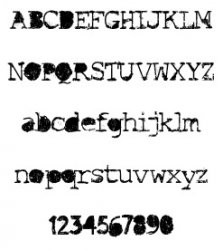
The font that they use for the Gossip Girl title card. Yes, I'm a dude and watch Gossip Girl. Big whoop. 😀
Zapf Dingbats! 😀
Whomever mentioned Garamond was spot on. Always swooned whenever I'd see Apple Garamond on their manuals as well as computers such as the Apple IIGS. Absolute perfection, font-wise.
Whomever mentioned Garamond was spot on. Always swooned whenever I'd see Apple Garamond on their manuals as well as computers such as the Apple IIGS. Absolute perfection, font-wise.
Register on MacRumors! This sidebar will go away, and you'll see fewer ads.


