Got a tip for us?
Let us know
Become a MacRumors Supporter for $50/year with no ads, ability to filter front page stories, and private forums.
Where's the date under the pull down notification panel?
- Thread starter ztmike
- Start date
- Sort by reaction score
You are using an out of date browser. It may not display this or other websites correctly.
You should upgrade or use an alternative browser.
You should upgrade or use an alternative browser.
You're thinking of the today/widget screen, which used to have the date.
The widget screen is now left of home screen, or left of notifications when you pull down the tray within an app(not when on home screen).
But unfortunately they removed the date!
There might be a 3rd party widget that does this.
The widget screen is now left of home screen, or left of notifications when you pull down the tray within an app(not when on home screen).
But unfortunately they removed the date!
There might be a 3rd party widget that does this.

Pretty sure in iOS 9 the current date was here..am I now just limited to the stock app on the home screen?
Yea so it's gone..
For now yes. Possible it gets added back since the Notifications and Widgets are going through a redesign and it's still early in that process.
That's pretty much the only thing I ever used to look at in Today view lol
I can imagine it is quite annoying if you're used to using it this way, personally I have the calendar app on my home screen which shows the date on it
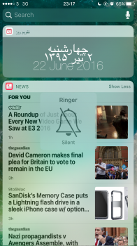
Ok this is a bit of a crappy workaround but if you're desperate...
Search the App Store for: Today Persian Widget.
This will let you add a widget which displays the Gregorian calendar date, but also the Persian one.
Maybe there is a better app but I really don't think an English only widget with the date would be created. seeing as the date's always been there.
Search the App Store for: Today Persian Widget.
This will let you add a widget which displays the Gregorian calendar date, but also the Persian one.
Maybe there is a better app but I really don't think an English only widget with the date would be created. seeing as the date's always been there.
Attachments
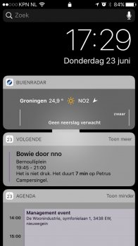
Only on the lock screen.I don't get it... When I swipe right I get a notification screen with date and time.
Used to be a quick way to check date in all parts of the system.
I rthink there is a fair chance it will get added back in a beta. If not there will be widgets (better than the Persian one I posted) to fill its place.
If you have the calander widget in your today view the date is shown on the little widget icon in the top left corner of the widget... I hope they still add it back at the top and also allow today view to stay active after closing Notification Center.
They also need to just leave today view in NC all the time.... It's really inconsistent and confusing to remove in on the home screen.
They also need to just leave today view in NC all the time.... It's really inconsistent and confusing to remove in on the home screen.
It would be logical to include a Clock widget similar to that in MacOS Sierra, there's plenty of new stock widgets in iOS 10 so why isn't there one for the Clock App
View attachment 637825
What's that Clock widget?
Wrong. If you pull down NC when not on the lock screen and then swipe right there is the new "widget/today" view.Only on the lock screen.
Used to be a quick way to check date in all parts of the system.
I rthink there is a fair chance it will get added back in a beta. If not there will be widgets (better than the Persian one I posted) to fill its place.
I cannot believe we are losing the today view that has unique looking widgets for this ugly mess where everything is in the same little box. It looks so horribly cluttered and hard to distinguish one from another. Terrible. I hope you beta users are expressing frustration over this to hopefully get that changed.
Please apple go back to how it was. But, if you're set on those ugly boxes then at least allow for color changes or something for better visibility
Please apple go back to how it was. But, if you're set on those ugly boxes then at least allow for color changes or something for better visibility
Did you see the post I was replying to and what this whole thread is about? I was referring to when there is a date and time visible as shown in the picture. Please apologise for your rude and false 'Wrong.'Wrong. If you pull down NC when not on the lock screen and then swipe right there is the new "widget/today" view.
I cannot believe we are losing the today view that has unique looking widgets for this ugly mess where everything is in the same little box. It looks so horribly cluttered and hard to distinguish one from another. Terrible. I hope you beta users are expressing frustration over this to hopefully get that changed.
Please apple go back to how it was. But, if you're set on those ugly boxes then at least allow for color changes or something for better visibility
Ugly boxes? The Today view in iOS 9 is terrible compared to what Apple did in iOS 10:
1. The Date and Weather widget took up so much space you'd be lucky to add 2 more widgets before needing to scroll down.
2. Swiping between Today/Notifications is inconvenient.
3. Visually it was the most boring looking UI ever.
1) if you're using the stock weather widget that's an issue in itself.
2) I'd agree with that
3) see #1. The stock widgets are terrible. But with many third party widgets and apps it looks quite nice
I agree with 1.Ugly boxes? The Today view in iOS 9 is terrible compared to what Apple did in iOS 10:
1. The Date and Weather widget took up so much space you'd be lucky to add 2 more widgets before needing to scroll down.
2. Swiping between Today/Notifications is inconvenient.
3. Visually it was the most boring looking UI ever.
For 2, even in iOS 10, scrolling to widget page when your Notification Center is full of notifications is still inconvenient.
For 3, I don't think it is boring.
1) if you're using the stock weather widget that's an issue in itself.
2) I'd agree with that
3) see #1. The stock widgets are terrible. But with many third party widgets and apps it looks quite nice
I like the widgets page on iOS 10 personally. The today view/notification pull down is just too busy.
I like the widgets page on iOS 10 personally. The today view/notification pull down is just too busy.
I agree and for me the same goes for the new CC. After using iOS 10 beta Since day one, anytime I see an image of iOS 9's CC or on someone else's phone I can't help but think of how crowded and cramped/cluttered the CC was.
Register on MacRumors! This sidebar will go away, and you'll see fewer ads.


