Got a tip for us?
Let us know
Become a MacRumors Supporter for $50/year with no ads, ability to filter front page stories, and private forums.
Which of these crops is better?
- Thread starter VirtualRain
- Start date
- Sort by reaction score
You are using an out of date browser. It may not display this or other websites correctly.
You should upgrade or use an alternative browser.
You should upgrade or use an alternative browser.
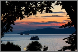
I prefer the greater simplicity of the second one. The dark mass of the tree at the top of the first doesn't add anything to the composition imo.
I missed JazzCollector's crop, but looking at the replies, I guess you've got your answer! Which do you like best VR?
I missed JazzCollector's crop, but looking at the replies, I guess you've got your answer! Which do you like best VR?
But then his horizon would not be straight, and it's really what matters as far as leveling goes.
True, I initially thought that the horizon wasn't quite straight but having another look it's bang on!
I didn't catch JazzCollector's crop either but I would have maybe made it a bit tighter to get rid of the ledge at the bottom.
Attachments
I missed JazzCollector's crop, but looking at the replies, I guess you've got your answer! Which do you like best VR?
I didn't catch JazzCollector's crop either but I would have maybe made it a bit tighter to get rid of the ledge at the bottom.
JazzCollector's crop took some off of the top, but nowhere else. So it left the big opening at the right edge and the distracting sign at the bottom.
As for acearchie's crop: if you're going to go that far, I think you'd have to clone out the street lamp as well--having it appear so close to the margin and without much of a base essentially turns it into a distraction.
I thought the same about the street lamp and I actually reduced the exposure and the saturation on it a bit to make it a little less obvious. I think it might be one to take out in photoshop as the horizon line sits nicely on the lower third of the picture. I might have to open it back up in lightroom and try some other variations to try and get rid of the lamp.
EDIT: hope the OP doesn't mind but I very quickly got rid of the street lamp (very shoddy job but it gets the idea across) but kept the same crop as I did before.

Last edited:
Thanks everyone, I agree that #2 is the better image. I think I framed the image in #1 in order to catch more of the sky and some of the color on the water... but the hulking tree silhouette was too much.
I like acearchie's tighter crop (without the street light). I may try something like this as well. BTW, I can't see JazzColletors.
Overall, it's been an interesting discussion.")
I like acearchie's tighter crop (without the street light). I may try something like this as well. BTW, I can't see JazzColletors.
Overall, it's been an interesting discussion.
now i must be wired
personally i like #1 better
it gets away from the old "frameing your subject with a dark object" thing and has a lot more mystery.
you can still pic out the part that is framed, but at the same time you look at the tree and wonder what the rest of the landscape looks like.
i do like #2 as its own picture however #1 imho is very nice.
#1 gives you more sense of being in place and seing that scene.
my $0.02
I thought the same about the street lamp and I actually reduced the exposure and the saturation on it a bit to make it a little less obvious. I think it might be one to take out in photoshop as the horizon line sits nicely on the lower third of the picture. I might have to open it back up in lightroom and try some other variations to try and get rid of the lamp.
EDIT: hope the OP doesn't mind but I very quickly got rid of the street lamp (very shoddy job but it gets the idea across) but kept the same crop as I did before.
Image
This is exactly what I was thinking. Number 2, but without the lamp. It's too big and distracting if left in. Nice shot!
Register on MacRumors! This sidebar will go away, and you'll see fewer ads.