Become a MacRumors Supporter for $50/year with no ads, ability to filter front page stories, and private forums.

Kardashian

macrumors 68020
Original poster
Sep 4, 2005
2,083
2
Britain.
I've recently upgraded to iTunes 8.1 (and then reverted to 8.0.2).

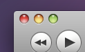
The traffic lights (the 3 buttons on the top left for minimise etc) seem very dull, a la Tiger, in comparison to the rest of Leopard.

I'm sure Apple wouldn't revert to the old dull style, since they're going with this new, polished, unified look for Snow Leopard (supposedly).

The new Safari 4 has the 'bright' traffic lights.

Myself and a few others have posted in the main 'Apple releases iTunes 8.1' thread, but there's not been much said about it.

I've removed all themes from my Unibod MBP, and restored the 'default' rsrc and SArt.bin files, to set the OS back to its default theme - yet the icons still stay the same.

It's really bugging me, it looks dated!
 
Safari 4 vs. iTunes 8.1
 

Attachments

  • Picture 1.png
    Picture 1.png
    3.4 KB · Views: 1,153
  • Picture 2.png
    Picture 2.png
    8.1 KB · Views: 1,151
Safari 4 vs. iTunes 8.1

Your Safari looks just a little richer.

They're moving away from that look, you know. Web 2.0 is out, Web 2.5 is in. Glossy has been replaced with matte in terms of design.

Apple virtually invented the original Web 2.0 look (when OS X and the original iMac had that glossy look, it was copied by... everyone), and now they're going to muted colors.

I love Illuminous (the rumored style change), so I changed my scroll bars system-wide to be Illuminous.
 
Strange, for me the traffic lights on iTunes 8 seem to be more vibrant than on other applications if anything.
 
I love Illuminous (the rumored style change), so I changed my scroll bars system-wide to be Illuminous.

I've done the same :)

Thing is though, if these are 'new' traffic lights, they still have gloss, they're just as rich/intense. So it can't be a move away from glossy.
 
If you feel really eager you could go through the iTunes.app/Contents/Resources/iTunes.rsrc of each of the versions. The OS X resource editors I found were both PPC, but they both seemed to work under Rosetta.

In the iTunes I have they were pretty far down on the list, about at ID 13040.
 
To be honest I have hated the traffic lights ever since Leopard came out far too gaudy for my personal tastes. I have been meaning to try and find a way to change thme back to tiger but gave up.

The traffic lights in iTunes to me seem brighter than other applications however checking the colours they are the same but the background grey is lighter which gives the illusion that the colours are brighter.
 
If you feel really eager you could go through the iTunes.app/Contents/Resources/iTunes.rsrc of each of the versions. The OS X resource editors I found were both PPC, but they both seemed to work under Rosetta.

In the iTunes I have they were pretty far down on the list, about at ID 13040.
I have no idea what to do here :confused:
 
The closest I've got so far is using iLeopard to give the system the Tiger-style traffic lights, which have more of a gloss than the Leopard ones.

Could someone upload the ArtFile.bin from their version of Leopard?

Obviously one that hasn't been tweaked with iLeopard or similar.
 
I noticed my iTunes 8.1 traffic lights were brighter than Finder..

Mine are duller.. by a long shot. It seems though, thats its my Finder traffic lights that are overly rich (why, I don't know)

Could you e-mail me your ArtFile.bin so I can replace it with mine, to change my system icons?
 
I just noticed something about Leopard's GUI

Here we have the 'Traffic light' style buttons from a typical Finder window in Leopard.
picture6y.png


And here we have the same buttons, but from the recently updated iTunes (v8.1)
picture5kyn.png

The colors is slightly darker and a bit saturated and noticeable especially on the Maximize button.


Call me autistic, but I can't help but notice these little differences. I haven't compared it to Safari 4, or any other new applications, but I'm pretty sure there will be a difference there too.
Could this be an update for the Snow Leopard GUI? Also there's some changes to font, and general titlebar color in Safari when opening pop-up windows.
 
Register on MacRumors! This sidebar will go away, and you'll see fewer ads.