Become a MacRumors Supporter for $50/year with no ads, ability to filter front page stories, and private forums.
I think it's because you probably know what you bought, so little reason to advertise to you again.

They put it on the back because there's some chance someone else will see it when you pick it up and walk around with it.

Like others have said, the notch is probably good enough for identifying the device as being from Apple.
 
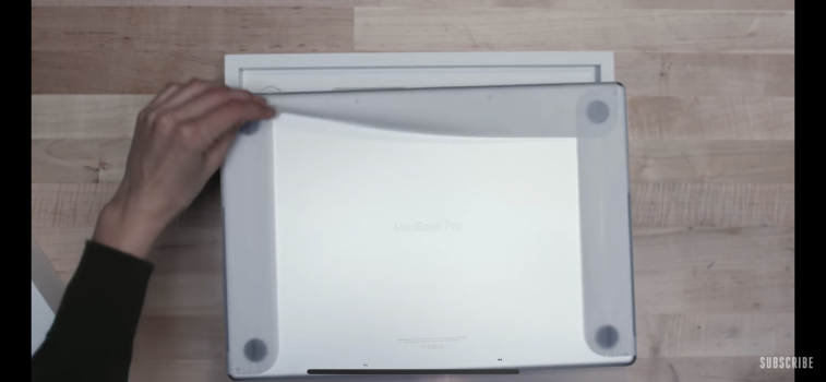
I just don't get the decisions that Apple's design teams make at times. Now that reviews are popping up, it's clear that removing the 'MacBook Pro' label from the display chin just makes the chin look bigger and more noticeable. It makes the new MacBooks look like prototypes. And to put in all the effort to etch out 'MacBook Pro' on the bottom case is also a head-scratcher. Clearly the reasoning for this was not to leave the product name off of the machines, since it's sprawled out all over the bottom case.

Same for the new iMac. A tastefully sized Apple Logo on the chin (perhaps in the contrasting color of the machine) would have completed the throw back design, pulling it all together, and also would have made the chin more forgivable and disappear to the eye. Instead, they left the chin blank, making it look like a movie set prop, and they put a gigantic logo on the back - which most people will never see.
 
Last edited:
I just don't get the decisions that Apple's design teams make at times. Now that reviews are popping up, it's clear that removing the 'MacBook Pro' label from the display chin just makes the chin look bigger and more noticeable. It makes the new MacBooks look like prototypes. And to put in all the effort to etch out 'MacBook Pro' on the bottom case is also a head-scratcher. Clearly the reasoning for this was not to leave the product name off of the machines, since it's sprawled out all over the bottom case.

Same for the new iMac. A tastefully sized Apple Logo on the chin (perhaps in the contrasting color of the machine) would have completed the throw back design, pulling it all together, and also would have made the chin more forgivable and disappear to the eye. Instead, they left the chin blank, making it look like a movie set prop, and they put a gigantic logo on the back - which most people will never see.

The name of the laptop provided a visual break to the thickness of the bottom bezel. Someone decided against it, and Tim is Tim. He is not really a guy who would think from the product's aesthetic angle. He would think from the financial angle. The people who could and would think from the product aesthetic angle did not get their say, apparently.

Just see his pose with the MacBook Pro. Not even holding it. Just posing along with it. Sometimes, it becomes painfully evident (to me, of course) that this is not a guy who can think about a product in any way except for the financial angle of it. He is just not that guy. He is never seen holding the products, showing them off. He just seems to be managing the company from a high angle as against being involved in design and everything - that is something you could see Steve doing. He had a sense of ownership towards Apple that Tim does not.
 
The wording only appeared with the 2016 design. There is so much that needed to disappear from that generation that Apple decided to reverse every change.
 
The name of the laptop provided a visual break to the thickness of the bottom bezel. Someone decided against it, and Tim is Tim. He is not really a guy who would think from the product's aesthetic angle. He would think from the financial angle. The people who could and would think from the product aesthetic angle did not get their say, apparently.
I agree - but in this case, if Tim was on top of the designs from a financial angle, he probably would have said no to the more expensive bottom case etching, and to just leave (or omit) the more cost effective chin branding. This decision was deliberate and there are designers sitting at Apple right now marveling over how 'clean' it looks. :rolleyes:
 
  • Like
Reactions: macintoshmac
I agree - but in this case, if Tim was on top of the designs from a financial angle, he probably would have said no to the more expensive bottom case etching, and to just leave (or omit) the more cost effective chin branding. This decision was deliberate and there are designers sitting at Apple right now marveling over how 'clean' it looks. :rolleyes:

I think it was done for marketing - targeted towords the dockers. The ones who use vertical docks for the notebooks. Who knows.. only Apple knows for sure why they did that, but removed that neatly placed name from the bezel. The notebooks just not look complete without that name there. I have sometimes used that as a center guide for some things. ?
 
I think it was done for marketing - targeted towords the dockers. The ones who use vertical docks for the notebooks. Who knows.. only Apple knows for sure why they did that, but removed that neatly placed name from the bezel. The notebooks just not look complete without that name there. I have sometimes used that as a center guide for some things. ?
Ha! I used to use it to center app and finder windows, then eventually found apps that did that! I just prefer the branding, it just looks more complete with it.
 
  • Like
Reactions: macintoshmac
Wow!
So now Tim has removed the name of the computer from the chin to save some $ ?
Wouldn’t surprise me a bit. But that just says the guy is a plain lunatic.
It looks cheap without the logo on the chin on the 24' iMac. Almost like a copycat of an iMac.
Not looking great on the MBP either without the name there.
Hope they don’t take that away on the bigger iMac! But guess we have to prepare for that.
Timmy boy want to save some money for poor Apple ?
 
“MacBook Pro” is etched on the bottom - see
 

Attachments

  • 8D99A7FA-7FAB-4FD5-965E-89DB1FFD800A.png
    8D99A7FA-7FAB-4FD5-965E-89DB1FFD800A.png
    1 MB · Views: 77
Register on MacRumors! This sidebar will go away, and you'll see fewer ads.