Become a MacRumors Supporter for $50/year with no ads, ability to filter front page stories, and private forums.
I'm still undecided about the new UI.

Those icons sure got some hate but I worry more about performance and being able to do stuff like play OpenEmu etc.
 
From my reply to the 'macOS 'Big Sur' Unveiled With Updated Design, New Features for Safari and Messages, and More' thread in 'News and Article Discussion' → 'MacRumors.com News Discussion:'
  • I sincerely hope there's an accessibility option to reduce the menu bar's transparency back to what it was before! (That is, on top of and separate from/in addition to the current option to disable menu transparency entirely.)
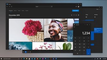
  • This…isn't how I imagined a redesigned Dock.
_________________________________________________________________________________________________

Additionally, I, too, would like a gray theme in addition to the existing light and dark themes, at least for toolbars. Otherwise, I'd miss macOS's classic gradient gray window chrome.
 
Last edited:
  • Like
Reactions: Joelallen3
And Windows 8 was heavily criticised. Actually come to think of it, it really was bad 😉.

(Sorry couldn’t help myself)

I think what caused the biggest fuss in Windows 8, was the dumb move to not have a "start" menu. (yeah I know it was still sorta there, but not in the familiar sense, along with a boatload of methods to bring it back)
 
  • Like
Reactions: TMax
It's actually harder to read text in menus now.
Uh. No, it’s not.

1593396424301.png


vs

1593396650067.png
 
If some of the icons/images of the new GUI weren‘t that bad then the new macOS GUI would be very interesting. I just hope a lot of the icons/images are work in progress and are going to improve a lot until they release it.
 
They went nuts with the rounding. Even the menus in the message above, look amateur compared to Catalina. The spacing of the text and font sizing is actually a slight improvement, but the rounding on the top of the menu and the highlighted item in the top bar being rounded and not connected is just plain ugly and unintuitive.

Some of the icons like messages, or even the System Preferences icon - what the heck is with the spikes in the gears? Brutal lol obviously designed by either a goth chick, or a dude who's never seen the inside of a machine. Some of the icons aren't bad, but all together they look a bit off and need a good amount of work.

The other thing is how tall the control row (top bar) of windows are. They look comically tall, and is a total waste of space especially when Apple claims to want to move more of the focus onto the content - another amateur looking design decision.
 
My biggest problem with Big Sur is for sure the new top menu bar. It dos longer encourage anyone to Interact with It, which is fine on iOS where the top menu are more In place to inform the user about stuff like the time or whether the phone is connected to a telephone tower. But on a computer where it’s primarily used for applications to interact with the user, it should be more static (not totally transparent) and in a visual theme with the applications who makes use of it. The menu bar is normally a part of, or extension of the applications on your machine that make use of it. All dropdown menus are in small speech bubbles and are therefore not what you normally would define as a "dropdown" menu, something are just not meant to be rounded. Another big problem I have is that all windows have the same color shade whether they are in focus or not. And at last the Control Center on a Mac is completely unnecessary, you already in the top menu bar have shortcuts for things like Wifi or bluetooth and on the keyboard you already have the possibility to adjust the sound and screen brightness, now you just add a menu more. macOS are becoming so clustered that Windows with with its flat, clean and straight lines, now has become a all around better interface.
[automerge]1593529596[/automerge]
xD This is what you will see, every time you maximize a window or have to make use of a dropdown menu or popup menu as I would like to describe them in big sur, with all the rounding.
 

Attachments

  • macos-big-sur-maps-favorites-100849706-large.png
    macos-big-sur-maps-favorites-100849706-large.png
    244.2 KB · Views: 525
I wouldn't say Windows 10 is better - but sadly, to a degree I even thought the same. Windows 10 looks more how can I put it "mature" or "masculine" even; and that's a sad day for Apple as I've always thought Windows 10 was just plain ugly like there was next to no time spent on design.

Even with the all solid-white window chrome, its more and more reminiscent of Win 10 ... and that's not a good thing
 
Last edited:
I wouldn't say Windows 10 is better - but sadly, to a free I even thought the same. Windows 10 looks more how can I put it "mature" or "masculine" even; and that's a sad day for Apple as I've always thought Windows 10 was just plain ugly like there was next to no time spent on design.

Even with the all solid-white window chrome, its more and more reminiscent of Win 10 ... and that's not a good thing
I fully agree
 

Attachments

  • windows-10-design-2021-concept.jpg
    windows-10-design-2021-concept.jpg
    100.9 KB · Views: 532
  • Like
Reactions: eflx
From what I’ve seen so far, I really like it.
I like it too. It's definitely different but I really liked when Apple switched the look in Yosemite. My only quibble is it looks like iOS and iPadOS. Besides that I have really no qualms about the updated and refreshed look. Hey, maybe we'll even get cleaner looking fonts because on Mojave and Catalina some of the fonts in 1080p looked pretty bad especially in dark mode.
 
I like it too. It's definitely different but I really liked when Apple switched the look in Yosemite. My only quibble is it looks like iOS and iPadOS. Besides that I have really no qualms about the updated and refreshed look. Hey, maybe we'll even get cleaner looking fonts because on Mojave and Catalina some of the fonts in 1080p looked pretty bad especially in dark mode.

I agreed with you about the fonts. I thought it was just me for a while!
 
  • Like
Reactions: TMax
The Yosemite to Catalina era is an example of great OS UI design for sure; it'll go down as being one of the greats in my books. Especially with the introduction of dark mode.

I think a much more subtle update would've been much nicer in the end. Somewhere "halfway between" Catalina and this latest UI update. There are a handful of nice updates to the fonts, font spacing, and some of the window control layouts etc. even to some degree, revising the radius of the icon set and windows would've given a fresh look - but tone it down to somewhere between the almost comical level of radius, and the tiny window corner-radius in Catalina.
 
There's so many other options than just macOS - the eco system is however harder to find in other systems..
I have had my share of rage against Apple and their locking down of their OS's.
I have to make a decision on what to do.. the UI is ugly some say - that's all in the eye of the beholder.
I say "It looks ... whatever - I'll have to experience it with the public beta for myself and eventually the autumn release of macOS 11 'Big Sur'" See, it isn't that hard.

Now that Haiku beta 2 is out with better hi-dpi support it looks like a viable option for someone like me.

But, really, am I going to switch to an operating system that has seen two beta releases in what seems like 50 years? Or stick to what I know .. I'm sure we will all overcome the look of macOS 11.

Threads will probably emerge;
"I was wrong about macOS 11 - looks great",
"wow -- such great version - double rainbow - looks like a tripple rainbow - it's all rainbows",
"AquaLick for macOS 11"(self-promo)
 
  • Like
Reactions: T-Bob
The design has grown on me, especially now that I’ve see it run on different desktops. I think it was just the shock of seeing it in such an ‘iPad’ light previously - this fades away when you have your own wallpaper, windows, apps etc.
 
Big Sur is like cancer, yes it grows on you, but then again it's still cancer. The menu bar is a part of, or extension of the applications on your machine that make use of it. Not a ****ing part of your wallpaper 😂 Apple's obsession with rounded edges/corners makes me seriously throw up a little. A dropdown menu cannot have rounded edges, because then it is simply not a dropdown menu anymore. It's just like a car, it can't have square wheels, because then it is no longer wheel anymore ;) shape and function. You won't get very far with square wheels.
 
I use dark mode on all of my devices, and I think the new look is great. I've had no readibility issues with menus or UI elements, and the interface flows better in my opinion.
[automerge]1593893033[/automerge]
My biggest problem with Big Sur is for sure the new top menu bar. It dos longer encourage anyone to Interact with It, which is fine on iOS where the top menu are more In place to inform the user about stuff like the time or whether the phone is connected to a telephone tower. But on a computer where it’s primarily used for applications to interact with the user, it should be more static (not totally transparent) and in a visual theme with the applications who makes use of it. The menu bar is normally a part of, or extension of the applications on your machine that make use of it. All dropdown menus are in small speech bubbles and are therefore not what you normally would define as a "dropdown" menu, something are just not meant to be rounded. Another big problem I have is that all windows have the same color shade whether they are in focus or not. And at last the Control Center on a Mac is completely unnecessary, you already in the top menu bar have shortcuts for things like Wifi or bluetooth and on the keyboard you already have the possibility to adjust the sound and screen brightness, now you just add a menu more. macOS are becoming so clustered that Windows with with its flat, clean and straight lines, now has become a all around better interface.
[automerge]1593529596[/automerge]
xD This is what you will see, every time you maximize a window or have to make use of a dropdown menu or popup menu as I would like to describe them in big sur, with all the rounding.

This makes no sense - I interact with the menu bar and it's dropdown menus just as much in Big Sur as I have in prior versions of Mac OS. And speaking as someone who uses both Windows 10 and Mac OS on a regular basis, calling Windows the "all around better interface" is laughable at best. You are also attempting to equate the menu mar in Mac OS with the status bar on iOS/iPadOS/Android devices, which is used in a completely different manner than the menu bar. And as far as transparency is concerned, people have been making the Mac OS Menus and Windows toolbars transparent for years, so this is not some sort of new development that nobody asked for.
 

Attachments

  • Screen Shot 2020-07-04 at 11.53.46 AM.png
    Screen Shot 2020-07-04 at 11.53.46 AM.png
    252.7 KB · Views: 510
  • Screen Shot 2020-07-04 at 11.55.28 AM.png
    Screen Shot 2020-07-04 at 11.55.28 AM.png
    370.4 KB · Views: 462
Last edited:
Big Sur is like cancer, yes it grows on you, but then again it's still cancer. The menu bar is a part of, or extension of the applications on your machine that make use of it. Not a ****ing part of your wallpaper 😂 Apple's obsession with rounded edges/corners makes me seriously throw up a little. A dropdown menu cannot have rounded edges, because then it is simply not a dropdown menu anymore. It's just like a car, it can't have square wheels, because then it is no longer wheel anymore ;) shape and function. You won't get very far with square wheels.

breathe. it's an operating system for your computer, not a cancer. if there's elements you don't like, well... so it goes. apple does what it chooses to do.

and this:

"A dropdown menu cannot have rounded edges, because then it is simply not a dropdown menu anymore"

wait; isn't it, in fact, a dropdown menu? which makes it.... a dropdown menu with rounded edges. simple!
 
Last edited:
Big Sur is like cancer, yes it grows on you, but then again it's still cancer. The menu bar is a part of, or extension of the applications on your machine that make use of it. Not a ****ing part of your wallpaper 😂 Apple's obsession with rounded edges/corners makes me seriously throw up a little. A dropdown menu cannot have rounded edges, because then it is simply not a dropdown menu anymore. It's just like a car, it can't have square wheels, because then it is no longer wheel anymore ;) shape and function. You won't get very far with square wheels.

"A dropdown menu cannot have rounded edges, because then it is simply not a dropdown menu anymore"

who tf do you think you are? the allmighty god of UI? We already gatekeeping computer OS's now?

and what does wheels of a car have to do with the menubar of big sur lol, someones really mad about the redesign of a computer OS lmfao

lets get back to topic:

the catalina menu bar screenshot above already looks so outdated. I do not like every aspect of the redesign but overall, it's a really nice fresh look. and we are just in beta 1, there will be so many changes in beta 2, 3, 4.. like every year.
 
People forget the reason why Apple is doing this redesign. And it is not to please the MacOS lovers.

iPhone is their biggest hardware seller and the way people get into the Apple ecosystem. They use the iPhone for a bit and like it and know it looks and how it works. People may even subscribe for a service like Apple Music and get a year of Apple TV+ for free.

People like iOS, play some game and watch some Netflix and TV+ but the screen is quite small. But hey there is the iPad which looks and works exactly like their iPhone. They try it in the store and decide to buy one because it looks and feels familiar. Katching.

Well the Windows family laptop is broken. What now.. But oh hey, I saw in the store apple sells laptops too. I experimented with it and it has the same icons, dock, default wallpaper style, control center and all the Apple apps look and work like the ones on my iPad. Why not check out and invest in an Apple laptop.

It is all really good marketing. Until this day the general non tech obsessed user looked at MacOS and saw some alien product and ignored it and ran back to Windows. Since MacOS is Apple their smallest platform they can easily experiment with this in the hope of getting more iOS on board.

Personally I love this new design unification. Now it not only works like an ecosystem but also feels and looks like one.
Sadly, I think your theory is probably correct.
 
  • Like
Reactions: TMax
Register on MacRumors! This sidebar will go away, and you'll see fewer ads.