Become a MacRumors Supporter for $50/year with no ads, ability to filter front page stories, and private forums.
Status
Not open for further replies.

applCore

macrumors regular
May 3, 2011
193
78
Well, the problem with simply saying it is ugly is that there's not enough specificity.

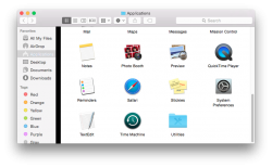
For example, I think many of us can agree that the new icons are most certainly FUGLY. Seriously Apple, it feels like we've just gone 10 years back to KDE or Gnome pre 1.0 in some cases. We were talking about the new icons a week or so ago at a meetup and there were a huge number of developers and designers that were all in agreement on this.

The fonts have also been harder to read, no doubt about it. I find myself having to get closer to my screens now.

BUT, many other aspects are nicer or, more appropriately stated, more refined.

Dark Mode also definitely needs to be expanded. It will be sex-on-the-beech for us pro and night workers! It definitely can't just stop on the menubar and dock. I think the transparency angle is smart there because we can make things dark by virtue of dark desktops and so forth. Smart move and it will help to make the dark interface much easier to work out.
 
  • Like
Reactions: orbital~debris

Martin29

macrumors 6502
Nov 25, 2010
344
113
Quimper, France
Been giving it a good run for it's money for a couple of hours now, and I have to say I love it! Everything is running silky smooth and it looks great.

This is beginning to look like it might become the best version of OS X I've used by a very long way.
 

wolfpackfan

macrumors 68000
Jun 10, 2007
1,547
16
Cary, NC
I have to say I'm rather disappointed in the appearance. Looks so bland and washed out. In fact, other than iCloud Drive (which really won't be truly helpful until IOS 8) I haven't really seen any other features that really jump out at me. I don't regret upgrading and so far everything seems to work fine and since it's free I'll install the final release but not sure what all the excitement is about from Apple.
 

gmanist1000

macrumors 68030
Sep 22, 2009
2,832
824
I have to say I'm rather disappointed in the appearance. Looks so bland and washed out. In fact, other than iCloud Drive (which really won't be truly helpful until IOS 8) I haven't really seen any other features that really jump out at me. I don't regret upgrading and so far everything seems to work fine and since it's free I'll install the final release but not sure what all the excitement is about from Apple.

I haven't tried it on a retina display yet, but the transparency does seem to be washed out looking. Maybe it'll improve.
 

Nermal

Moderator
Staff member
Dec 7, 2002
20,595
3,934
New Zealand
I agree that it looks nice. It's a good change, and it's not completely jarring like Windows 8 (everything's still in the same place!)

I've had a couple of graphical issues such as this black scroll bar, which I've reported using the Feedback Assistant, but I haven't run into anything major.
 

Attachments

  • Scroll Bar.png
    Scroll Bar.png
    146.7 KB · Views: 854

fs454

macrumors 68000
Dec 7, 2007
1,976
1,822
Los Angeles / Boston
An interesting speculation. And yet, what percentage of currently-shipping Macs have Retina Displays?


This will change with the release of the OS, most likely. There was a rumor today that this will drop at the same time as their high-density desktop / display and a retina 12-inch MacBook Air-like machine. That rounds out the whole lineup.
 

Bistroengine

macrumors 6502
Jan 16, 2004
283
292
Loving the new look so far. Is anyone else not seeing the subtle transparency in the window bars? Maybe it's too faint. I don't know. Is there a setting somewhere that enables or disables this feature? I've already checked my Accessibility settings. Reduce transparency is unchecked.
 

Prof.

macrumors 603
Aug 17, 2007
5,299
1,982
Chicagoland
I think the tabs need to be darker. At quick glance it's hard to tell 2+ tabs are open.
 

Attachments

  • Screen Shot 2014-07-24 at 9.20.29 PM.png
    Screen Shot 2014-07-24 at 9.20.29 PM.png
    30.8 KB · Views: 654

xmichaelp

macrumors 68000
Jul 10, 2012
1,815
626
So far I have mixed feelings. It looks ok on my iMac but it IS very hard to read.

Also why are some top bars translucent and others not?


The only ones with transparency are the ones that scroll down. It doesn't show what's behind the app, it shows the content in the app that is currently "under" the menu bar.

----------

For example, I think many of us can agree that the new icons are most certainly FUGLY.

Doubt it. Make a poll if you'd like, i'm sure more like them than dislike them. Most of them are much better.
 

thedeejay

macrumors 65816
Original poster
Aug 16, 2012
1,338
51
Toronto, Canada.
An interesting speculation. And yet, what percentage of currently-shipping Macs have Retina Displays?

I think a lot of the opinions on this forum and also I can imagine it will be hard to read on a non-retina mac. It may not have 'specifically' been made for Retina Display's but it certainly is more optimized for them. Who knows...only time will tell. But for my case...I am quite happy:p
 

coldjeanzzz

macrumors 6502a
Nov 4, 2012
655
17
Right under Appearance

attachment.php

I agree that it looks nice. It's a good change, and it's not completely jarring like Windows 8 (everything's still in the same place!)

I've had a couple of graphical issues such as this black scroll bar, which I've reported using the Feedback Assistant, but I haven't run into anything major.

Were these screenshots taken on a non-retina display? I think I'm starting to see why some people don't have a problem with the font and others do.

Borrowing this screenshot from another thread:

attachment.php


Full size in this link: https://forums.macrumors.com/attachment.php?attachmentid=482172&d=1406261336

The font looks so much better in this image because I'm guessing it was on a retina display? Does that make sense or none at all since I'm viewing all of the fonts on my own non-retina display? If that's the case then can someone explain the discrepancy? Look especially at the title bars.
 

Kwstas

macrumors member
Nov 25, 2013
98
136
I don't get it

What's the point of "dark mode" in menus and "bright mode" in all the rest..?
Make it all dark or leave all as it is. I'm wondering what Steve would think of all that mess..
 

Ploki

macrumors 601
Jan 21, 2008
4,308
1,558
Enable dark mode :p

Finally! I'm going to cry of happiness.
What's the point of "dark mode" in menus and "bright mode" in all the rest..?
Make it all dark or leave all as it is. I'm wondering what Steve would think of all that mess..

people were installing hacks to make menubar and dock black since ever, and they always break when apple updates. Since most of pro-apps are already black or dark grey, this is great!
Having a bright menu bar on a dark-grey Logic X, Adobe PS/AI/ID/everything else, FCPX, etc, really burns the eyes in the middle of the night.

its bad everything isn't dark though :(
 

mr.bee

macrumors 6502a
May 24, 2007
750
468
Antwerp, belgium
I like Yosemite a lot actually. It looks very clean.

The transparency is something to get used to a bit. It looks good after some use.

The finder looks more cheerful than today.

Overall I find it a lot more polished than Mavericks.

If i read the 'yosemite looks terrible' thread, i rarely find a real reason except the change itself.
 

Kwstas

macrumors member
Nov 25, 2013
98
136
its bad everything isn't dark though :(

Let's hope for a true dark mode in final release including all os apps. A company like Apple should not leave things incomplete.
 

Wiesenlooser

macrumors 6502a
Jul 9, 2010
981
1,539
The only ones with transparency are the ones that scroll down. It doesn't show what's behind the app, it shows the content in the app that is currently "under" the menu bar.


And still - not every app has translucency. Some sidebars have translucency and others don't.

Contacts does, notes does not.

Neither does the mac app store app, which does have scrollable content.Its still a mixed bag.
 

downpour

macrumors 6502a
Oct 20, 2009
523
316
I don't agree with that at all.

So you 'like' the new folder icons? :eek::cool::D

os-x-yosemite-folder-icons-blue.jpg


I think they should have made them translucent white, like the trash icon, or at least desaturated them a little. That blue is just too strong, there is no reason to make them stand out so much more than anything else.

os_x_yosemite___trash_icon_by_johanchalibert-d7kvkbp.png
 

c-Row

macrumors 65816
Jan 10, 2006
1,193
1
Germany
They should just re-enable the possibility to change icons for apps downloaded from the app store so everybody could set up their icons the way they like. ;)

(I miss CandyBar :( )
 
  • Like
Reactions: sleek881
Status
Not open for further replies.
Register on MacRumors! This sidebar will go away, and you'll see fewer ads.