Got a tip for us?
Let us know
Become a MacRumors Supporter for $50/year with no ads, ability to filter front page stories, and private forums.
Your iOS 7 text too thin?
- Thread starter sundog925
- Start date
- Sort by reaction score
You are using an out of date browser. It may not display this or other websites correctly.
You should upgrade or use an alternative browser.
You should upgrade or use an alternative browser.
Did this as soon as I upgraded the iPad mini. Been suggesting it since day one. Not a fan of iOS 7 in general but really not a fan of the anorexic text.
BOLD FTW.
Cheers,
I think even on a smaller screen like the iPhone 4, the thin text would be harsh.
Did this as soon as I upgraded the iPad mini. Been suggesting it since day one. Not a fan of iOS 7 in general but really not a fan of the anorexic text.
BOLD FTW.
Cheers,
Did this on the mini when I had the betas. Makes the home screen icon text much nicer. The thin text made the mini screen look worse than it actually is.
Did this on the mini when I had the betas. Makes the home screen icon text much nicer. The thin text made the mini screen look worse than it actually is.
That's so true. No Retina display is bad enough. The thin text made it look even more fuzzy.
Cheers,
I turned it on, and then turned it off again. I personally prefer the thin fonts. I rarely read the text under the icons anyway, and I don't seem to have any trouble reading it under the default settings.
I turned it on, and then turned it off again. I personally prefer the thin fonts. I rarely read the text under the icons anyway, and I don't seem to have any trouble reading it under the default settings.
I found it doubly worse when my background was lighter. u must have a dark background or excellent retinas haha.
Funny thing, I immediately set it to bold as well, but switched it back because the thin presents a cleaner look. Instead I upped the font size to a larger type, with the default apps it read much easier now without the need for bold.
The keyboard though... EPIC FAIL
Huh, I did the same thing. I actually turned contrast off because it seems to turn off the translucent layering effect which is the best part of the new OS.
If Apple can fix the overly white screens in some apps along with a darker background for the keyboard (and of course fix all the small bugs) then I think they have a big winner. I wasn't digging it in the first 24 hours, but It's really growing on me.
I found it doubly worse when my background was lighter. u must have a dark background or excellent retinas haha.
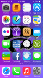
I'm going to go with both.
Attachments
I'm going to go with both.
I meant lighter than that, like white.
Register on MacRumors! This sidebar will go away, and you'll see fewer ads.


