Become a MacRumors Supporter for $50/year with no ads, ability to filter front page stories, and private forums.

lia77

macrumors member
Original poster
Jul 23, 2007
79
0
Hi!

I have recently started working in dreamweaver and I have been trying to set up my own website for an art project that I have worked on for many years. The project involves both texts, photography, scanned notes and short video clips.

I have worked like crazy for the last two months, reading lots of tutorials on dreamweaver and I have now finally managed to get my site to work. ( there is still quite alot of material to be added though...)

Since I am a beginner in creating websites I would be very thankful if someone could give me your opinion about my website, what I could do differently etc etc. or just any cool ideas would be great:)

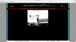
Here is the link to the project: http://www.thedreamdayproject.com

Greetings from Krystallia, The dreamday worker:)
 

efxgraphx

macrumors member
Feb 24, 2009
54
0
Sugar Land, TX
Hi!

I have recently started working in dreamweaver and I have been trying to set up my own website for an art project that I have worked on for many years. The project involves both texts, photography, scanned notes and short video clips.

I have worked like crazy for the last two months, reading lots of tutorials on dreamweaver and I have now finally managed to get my site to work. ( there is still quite alot of material to be added though...)

Since I am a beginner in creating websites I would be very thankful if someone could give me your opinion about my website, what I could do differently etc etc. or just any cool ideas would be great:)

Here is the link to the project: http://www.thedreamdayproject.com

Greetings from Krystallia, The dreamday worker:)

Lia,

Here are a few things I found when looking over your site (for the most part everything looks good). Im VERY picky and notice the slightest details.

1) The Top and Middle frames dont match up. (please see attachment. Red lines). You are slightly off as I have marked on the screen shot.

2) This is a personal comment, but im really not crazy about the green. Obviously this is a personal opinion and others may disagree with me but I think you could take some time and really find a better color that would suit this site a tad better. (Maybe a dark grey? try color code#666666 ? or a possible brighter color?)

3) You might try shrinking the "O" in Project...... whats the image? Its hard to see.... or im getting old and my eyes are going bad, lol

The good things I like. Love the black, white and maroon color you have used. I like being able to click on each pic and have a story or something behind it. I would however add a copyright with your name on your bottom frame to protect you and your photos. You may try this below the name of the photo as well if it doesnt fit well on the bottom frame.

Looks good =)
 

Attachments

  • screen1.jpg
    screen1.jpg
    150 KB · Views: 127

lia77

macrumors member
Original poster
Jul 23, 2007
79
0
Hi!

Thank you so much for your comments! I have stared on the site for so many hours now that I can´t really tell if it is good or bad anymore...

I was also doubting on that green, and yeah, maybe I will try grey then:)

I will keep working and maybe let you know what it will look like in the end...

The O, is a bubble btw:)
I thought it would be clearer the bigger it was, but obviously not...
When you click on a city´s notes then the bubble comes up as a symbole for that person´s dreamday quote, I thought it was a good symbol for a dream, but maybe not so clear!

Thanks again for taking time to check!!

Lia

by bubble i mean a soap bubble by the way....I really am getting tired from working on this site as you can tell:)
 

efxgraphx

macrumors member
Feb 24, 2009
54
0
Sugar Land, TX
by bubble i mean a soap bubble by the way....I really am getting tired from working on this site as you can tell:)

Well, when i get tired on a project, ill stop for a bit then take a fresh look at it when im rested. Always helps when im energized or ready to kick it back into gear.

Stick with it... moving in the right direction =)
 

lia77

macrumors member
Original poster
Jul 23, 2007
79
0
Yeah I should probably just take a break from it now!

Thanks again and good night!
 

FourCandles

macrumors 6502a
Feb 10, 2009
835
0
England
Hi

I'm seeing text wrapping in Safari and FireFox as per attached thumbnails on my old iBook (1024x768 display), so I guess there's a little tweaking needed to the CSS. Sorry, I'm not in my office to see what happens on widescreen.

Other than that, I love the overall design, I think the overall black & white works great. I agree with the previous comment about the "O" bubble - I'd try it the same size as the other letters and see how that looks, though you may need to thicken the outer circle a little so that it still seems similar to the letters. And personally I'd make the main logo a clickable link to the home page.

The B&W images are great; purely subjective but I think I'd have a slightly longer rotation time on the front page; just a couple more seconds would let me see more of the image.

But those are minor comments, I really like the concept and style. I think I'd make my next project to bring the blog into WordPress and integrate it into the main site.
 

Attachments

  • dreamday-1.jpg
    dreamday-1.jpg
    30.2 KB · Views: 95
  • dreamday-2.jpg
    dreamday-2.jpg
    25.2 KB · Views: 74

lia77

macrumors member
Original poster
Jul 23, 2007
79
0
Hello!

Thank you so much for your comments! As for the title, I should just make it a little smaller then or take a way some of the extra spacings?

The rotation time on the slideshow is a good point, I will definitely change it then. And my favorite soap bubble....Ah, I will make it a little smaller then too:)

I really appreciate your opinions!

Have a good day!
 

lia77

macrumors member
Original poster
Jul 23, 2007
79
0
Hi again,
I was thinking about the title, would it be better to make the grey parts to the sides smaller so my website covers a largers part of the screen instead?
( I also noticed that the cities go down on two lines, rather than one as I had hoped for)

I have a macbook, 13 inch, so it is pretty small, I have no idea what it looks like on a bigger screen.
 

lia77

macrumors member
Original poster
Jul 23, 2007
79
0
Ok, some changes have now been done.
The blue-green frames are now slightly wider ( and the same width- i hope!) and dark grey.

My soap bubble is smaller, and the slideshow is chanegd to 7 seconds instead of 5. Hope you like it:)

Speaking about hte bubble btw, what do you think about the size of it when i use it on the dreamday notes pages? (You reach them by clicking on a city, then the coloured picture and then choose read dreamday notes)
 

FourCandles

macrumors 6502a
Feb 10, 2009
835
0
England
Thank you so much for your comments! As for the title, I should just make it a little smaller then or take a way some of the extra spacings?

I think making the browser background narrower is the first action (see below). I like the character spacing as it is. But I've only just noticed that your logo includes the ".com" at the end....personally, and I know this is subjective, I would delete that part as it doesn't really add anything....although I realise it balances the "the" at the start. Just a thought.

Hi again,
I was thinking about the title, would it be better to make the grey parts to the sides smaller so my website covers a largers part of the screen instead?

I would certainly make the light grey parts smaller, and give the text more room.

( I also noticed that the cities go down on two lines, rather than one as I had hoped for)

That may be more difficult to fix, without reducing the number of cities or the point size. Unless you want to have a drop-down menu and group the cities by continent or something. If you're going to add more and more cities then you'll have to go down that type of route anyway.

The blue-green frames are now slightly wider ( and the same width- i hope!) and dark grey.

Much better IMHO.

My soap bubble is smaller,

Also much better IMO - but I would align it vertically exactly with the text.

Speaking about hte bubble btw, what do you think about the size of it when i use it on the dreamday notes pages? (You reach them by clicking on a city, then the coloured picture and then choose read dreamday notes)

Looks good to me. :)
 

lia77

macrumors member
Original poster
Jul 23, 2007
79
0
Thanks again!
Yeah, that .com part, I was not so sure about it myself, but I added it just to balance the "the-part" before the name as you say.. But I might take it away eventually, I will see!

I will also make the backround smaller then so there is more space for the text.

Enjoy the rest of the day and thanks for taking time to help!!
 

lia77

macrumors member
Original poster
Jul 23, 2007
79
0
It is funny how all creative processes seem to go in circles...

I just realized now when I made the backround smaller I got more space in the content frame.

My original ideas was a stretched out content frame rather than the squared one i had just now. In it I would then fit in two slideshows next to each other, one showing the images black and white, the other in colour...
I dont know, I might try that one out again here and see what it looks like:)
 

diemos

macrumors 6502
Mar 6, 2009
283
0
you really have a long way to go, what I would suggest is, download Wordpress, than download a decent skin, and edit it to your liking, youd be surprised how much you can change it, this way you wont have to start from scratch.
 

lia77

macrumors member
Original poster
Jul 23, 2007
79
0
Hi, sorry how did you mean? The website is going to contain a lot more material than i have on the blog as it is today. But yeah, transferring my blogspot blog into wordpress someone else also suggested, so that might be for the future:) If I ever finish this website:cool:
 

jons

macrumors 6502
Apr 24, 2008
326
103
The color scheme is nice. Not a huge fan of the roll over effect.
 

FourCandles

macrumors 6502a
Feb 10, 2009
835
0
England
Hi, sorry how did you mean? The website is going to contain a lot more material than i have on the blog as it is today. But yeah, transferring my blogspot blog into wordpress someone else also suggested, so that might be for the future:) If I ever finish this website:cool:

I think diemos is suggesting that you build the whole site in WordPress, which is certainly possible but may not give you the flexibility that you're after. And since you've invested in Dreamweaver anyway then your site could be a good learning course. But then, installing WP for the blog part and making the two parts of the site look and feel similar will be good practice too.

Regarding the header wrapping, try converting the header text and graphic into one complete graphic element - it's only black and white, so your image size will be very small, and you could then play around with different fonts and it won't matter if the visitors have the font on their system.

And I've only just realised that this thread is in the wrong forum - if you get a Mod to move it to Web Design and Development you may get a whole new bunch of feedback. ;)
 

lia77

macrumors member
Original poster
Jul 23, 2007
79
0
Hi there!

Thanks again for your comments!
You know the last couple of days I have been working on a "Pecha Kucha" presentation for my Dreamday project ( that I will present in Mexico on the 23rd of april) and while doing so I came up with lots of new ideas for my website:) So it might happen that I will redo it completely;-)

When I have tried out a couple of new ideas I will definitely add it to the other forum you suggested and hopefully get alot more feedback!

Happy easter to you!

Krystallia
 

diemos

macrumors 6502
Mar 6, 2009
283
0
Without a doubt, use Wordpress it will save you a lot of time and hassles, plus you will learn a bunch of new things, and it extremely easy to use.
 

lia77

macrumors member
Original poster
Jul 23, 2007
79
0
Ok but can u I use my own domain still?

(Also, I quite like using dreamweaver and learning it, even if I am not a pro yet:))

Thanks for responding!
 

FourCandles

macrumors 6502a
Feb 10, 2009
835
0
England
Ok but can u I use my own domain still?

(Also, I quite like using dreamweaver and learning it, even if I am not a pro yet:))

Thanks for responding!

You can certainly use your own domain name - you can install it on your existing site, provided that your web hosting package supports the minimum requirements. If your current package doesn't support these requirements, your host may offer an upgrade to one that does.

If your current host does support it, you could download and install WP in a subdirectory of your current site and try it out.
 

lia77

macrumors member
Original poster
Jul 23, 2007
79
0
Hi there!

I changed the design completely:D

What do you think about it now?
http://www.thedreamdayproject.com

The thing with the old design was that it didn´t communicate what my project was about; that is people and their dreamdays...

So with this I hope it is a little bit more representative for the material that I have.
(Not all the links are working yet, but they will be later...)
Also, I am aware of the fact that the texts are a little bit hard to read..Any suggestions on how to improve that? Shall I make them into images ( like i did with the logo) or as flash texts with a , for example, white background?

I am very thankful for your opinion! ( Just don´t tell me you like the old design better;)

HAve a good day!

K
 
Register on MacRumors! This sidebar will go away, and you'll see fewer ads.