Become a MacRumors Supporter for $50/year with no ads, ability to filter front page stories, and private forums.
Ford Working With Apple on CarPlay, But Won't Give Up Control of the Dashboard
- Thread starter MacRumors
- Start date
- Sort by reaction score
You are using an out of date browser. It may not display this or other websites correctly.
You should upgrade or use an alternative browser.
You should upgrade or use an alternative browser.
Just to clarify because a lot of people are still confused. If you see videos of CarPlay and Android Auto on the internets, they display in the car after connected via USB. When you unplug, the display goes back to the OEM's infotainment system.
Want CarPlay? Plug in your iPhone.
Want Android Auto? Unplug you iPhone and plug in someone's Android phone.
Did you switch cars? No.
It's really not the end of the world for Apple, Google, or Ford. They can all coexist.
Yes WiFi is now supported for CarPlay as well. Although, I would imagine a car manufacturer would have to have this feature as well.
I'm not sure I want to unluck my car doors. They might fall off on their own if they run out of luck.Proximity awareness to unluck doors would be another.
After buying a Lexus, I could care less about Ford. Who is that?
Are you wearing Lynx?
I couldn't agree more! I've had many Fords with the Sync system as rental cars over the years. The system and the menus are completely counter-intuitive. One time I had the auxiliary input just flat out stop working. The solution - and this is no joke - I had to reboot. Borrowed an adjustable wrench, disconnected the car battery for a few minutes, and reconnected. Auxiliary input worked fine again. It is a Microsoft product, after all...so it would have been nice if they had provided the CTRL-ALT-DEL keys!
Wow, that's hilarious, especially because the auxiliary port is pretty much all you need if you have a smartphone anyway. I try to offload everything I can to the iPhone instead of having the car deal with my music and stuff.
So, performance, economy, comfort, safety, resale value, etc are of no concern - just so long as it can play some crappy so-called music?
As long as it allows me to use CarPlay I don't care about the other crap. Options are good, just make sure CarPlay is one of them.
Yes, of course. It was a $45,000 Toyota Avalon and a $1,000 iPhone. Would do it again in a heartbeat.
How are you enjoying your Avalon? I have a '13 Taurus and like it a lot, but the Avalon was definitely high up on my list
----------
I can not believe how bad the GEN2 Sync system is. When you look at all the other tech in the market place at the same time it was released, it could only be willful negligence. It is the only thing that I dislike in my truck and it is so bad that it constantly reminded you that it is ****.
Can someone fill me in on why sync is bad? I have a '13 Taurus limited with sync and have never had a single issue with it. Everything seems pretty well laid out and easy to get to. There's a section for climate, music, phone with all the functionality on each section. How is that complicated? I don't get it. Maybe there's something I don't see
Heh, someone who will actually admit to buying a Toyota Avalon. Kudos!Yes, of course. It was a $45,000 Toyota Avalon and a $1,000 iPhone. Would do it again in a heartbeat.
Not sure if I'd consider a Toyota/Lexus any better than Ford.
Have you been paying attention to all the issues/recalls/deaths with Toyota's, which also affects Lexus.
----------
Looks like there may be an increase in Hyundai and Kia sales...
Ford recalled 1 million cars this week. If you own a 2014 Ford Fusion it may have 3 recalls in one week. After 5 recalls in my one year with my Fusion, I traded my 2013 Ford in for a 2011 Lexus.
My Ford Fusions Sync was buggy and dangerous. Controls would lock up during driving like full blast heat in the summer.
My Lexus has had 0 recalls since 2011.
The people with the supposed runaway conditions had double stacked floor mats.
Any car can have that issue.
So you have a little care still left for Ford? How much until you couldn't care less about Ford?
I think the poster just wants to let us know they're a Toyota person.
Are they really this clueless? Sync is abysmal (and I've owned multiple fords). The sooner they "give up control" the better. Apple and Google are infinitely more competent at building user interfaces.
I remember you as one of those commenting in the Apple Aiming to Begin Electric Car Production in 2020 thread. Now, car manufacturers are infinitely more competent at building cars so the sooner Apple give up on it the better?
----------
As a potential customer, I'd have been much more interested in hearing him say "we're giving over the design to Apple."
Oh please. Unless youre going to keep the car forever you want to sell for as little loss and to as wide a market as possible. Would not having the option of Carplay, Android Auto and Sync not be better for you at that time?
----------
So you would let a $800 phone dictate what $30k - $50k+ car you purchase?
If I like the car then Hands free and a way to doc would be good enough for me.
This, absolutely this. Forget the presence of Airbags, Isofix car seats, anti lock brakes, four wheel drive. etc. etc, you know all the things that may have an affect on your life. No, make sure you get the right phone instead.
I'm not sure I want to unluck my car doors. They might fall off on their own if they run out of luck.
Ha ha... Thanks, it is fixed.
Agreed, Those very vocal on not buying without carplay probably don't have the money to buy a new car.So you would let a $800 phone dictate what $30k - $50k+ car you purchase?
If I like the car then Hands free and a way to doc would be good enough for me.
Weather it is clueless or not, SYNC has brand recognition and I can see them not wanting give the dashboard to google or Apple.
Would that be sunny, rainy, snowy, windy, tornadic, or what kind of weather?
----------
Here's how: I could care less (but I won't bother to)... the part in the parenthesis is implied.
Um, no. This is as equally as bad as "irregardless"...
And having used Ford (SYNC), Chrysler (UConnect), Cadillac's system and others, they're all pathetic attempts at a usable interface. So much, that I now avoid renting any of these makers' cars when I travel. POSs all.
But to claim sync has attracted buyers? Bwahahaha! I hope sync 3 is better. And in this case better is a very low bar.
Infotainment systems in general are a very low bar. My car is a 2012 Ford that came with with Sync as standard - not even the touch version - and it's hands down better than what came standard from Toyota, Nissan, Chevy, Mazda, Subaru... In some cases, even the upgraded packages still couldn't match Sync.
Of course this was back in the "dark" ages where Bluetooth was still optional on some vehicles, but you get my meaning - Sync was definitely a reason I bought a ford. Insane MPG and the color being the others.
I rent a car every week. I can choose any car in the aisle. I purposely avoid any Ford vehicles because of Sync. It takes forever to figure out how to add a bluetooth device, and the dumb thing doesn't remember to go back to bluetooth each time you start the car. I'll pick a Toyota every time, since they all come with a system that is easy to use, so I can add my phone in a few seconds, and when I get back in the car it starts playing my audio. I never pick a chevy car, because lots of the rental ones don't even have bluetooth.
I remember you as one of those commenting in the Apple Aiming to Begin Electric Car Production in 2020 thread. Now, car manufacturers are infinitely more competent at building cars so the sooner Apple give up on it the better?
Not what I meant. We've seen UIs from Apple/Google and from car companies. Apple/Google is great, car companies are nearly universally terrible.
We've not seen cars from Apple/Google, so we don't know how good they'll be. But we've seen cars from Tesla, another tech company, and they're great. So it's quite possible Apple could be great at cars too. We just don't know. But we do know car companies make terrible UIs.
Also, good memory.
If a car supports CarPlay, both wired and wireless, I'm happy, no matter what other ignorable stuff it supports.
Give Sync 2 a little credit people!
Comparing my 2014 Ford Fusion Energi's Sync 2 (MyFord Touch) UI to my prior car, a 2013 Chevy Volt and it's Chevy MyLink UI - I'd say Sync is damn nice!
Perfect? No, but not the horrid thing it seems many here are reporting.
One problem, I think, is that the original Ford Sync UI was very bad, apparently having a lot of menus and drill-down to find things which distracts you from driving - probably much like the Chevy UI in function (see below). I've never even seen the original Sync UI so I can't comment on it.
Ford Sync 2 (2014-2015) "Main Menu"
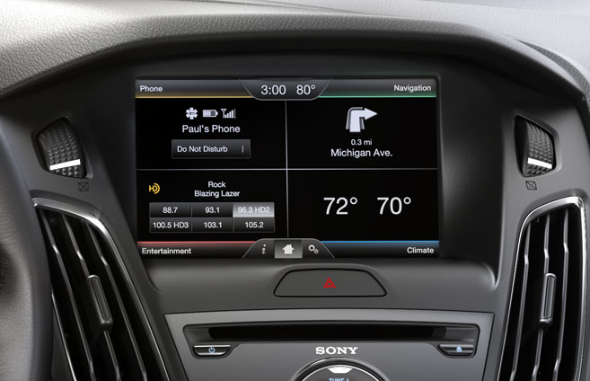
I know, that's a picture from a 2015 Focus, but it the screen looks the same in mine. In the Fusion it's mounted a bit lower, nearer to where your hand can reach the screen. One thing I particularly like about this UI is those color coded, corner buttons are always in the same place, no matter what you're doing in the UI and can be located by the corner bezel of the screen w/out looking away from the road.
Chevy MyLink (2011-2014 model years, not sure on 2015) "Main Menu":
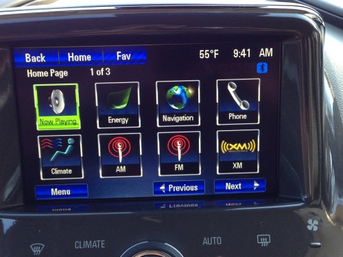
Newer incarnations are, I'm sure, better than this but this is what I used for the 2 years of my Volt lease. I loved most everything about that car but I came to loath this screen and usually just propped my iPhone up in front of it. The menu buttons require you to look down and use fairly precise aim to hit them so it was usually better/safer to just leave it on USB or BT Audio and use the phone. (unless it decided not want to play from my iPhone, which it occasionally did)
That all being said, I'd love for CarPlay to be available as an option on my next car - but the thing that would most attract me would be to have complete choice of apps from either my phone or installable into the car. When my Ford is lease is up in a couple years, if there's a car out there that I can run Waze as my navigation system, that will be a serious contender for my money. (I doubt Apple will ever allow that - but I'd love to be made wrong)
Comparing my 2014 Ford Fusion Energi's Sync 2 (MyFord Touch) UI to my prior car, a 2013 Chevy Volt and it's Chevy MyLink UI - I'd say Sync is damn nice!
Perfect? No, but not the horrid thing it seems many here are reporting.
One problem, I think, is that the original Ford Sync UI was very bad, apparently having a lot of menus and drill-down to find things which distracts you from driving - probably much like the Chevy UI in function (see below). I've never even seen the original Sync UI so I can't comment on it.
Ford Sync 2 (2014-2015) "Main Menu"
I know, that's a picture from a 2015 Focus, but it the screen looks the same in mine. In the Fusion it's mounted a bit lower, nearer to where your hand can reach the screen. One thing I particularly like about this UI is those color coded, corner buttons are always in the same place, no matter what you're doing in the UI and can be located by the corner bezel of the screen w/out looking away from the road.
Chevy MyLink (2011-2014 model years, not sure on 2015) "Main Menu":
Newer incarnations are, I'm sure, better than this but this is what I used for the 2 years of my Volt lease. I loved most everything about that car but I came to loath this screen and usually just propped my iPhone up in front of it. The menu buttons require you to look down and use fairly precise aim to hit them so it was usually better/safer to just leave it on USB or BT Audio and use the phone. (unless it decided not want to play from my iPhone, which it occasionally did
)That all being said, I'd love for CarPlay to be available as an option on my next car - but the thing that would most attract me would be to have complete choice of apps from either my phone or installable into the car. When my Ford is lease is up in a couple years, if there's a car out there that I can run Waze as my navigation system, that will be a serious contender for my money. (I doubt Apple will ever allow that - but I'd love to be made wrong)
Register on MacRumors! This sidebar will go away, and you'll see fewer ads.