oops new page
I don't see having an extra row of icons as a benefit. That would mean more apps per page/less pages of apps, ok, but it then would make it even harder to search visually for an app on a page.
Plus, i spend more times in apps than on the icon grid. That's not frankly the best reason for a vertical growth i would give.
The 1440x960@440ppi example screen means a .24 inch increase in width and .32 inch in height.
The higher pixel density would allow drawing characters at the same physical size as on actual iPhone screens, thus providing more chararacters per line and more lines.
Text is not the only kind of data displayed on screens.
When pictures and text are mixed, more space in width is welcome.
I've been too lazy to do mockups showing the difference with a 16:9.
I think I'll have to do it too, if you don't before, to help better visualize the result.
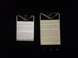
You say this like it's insignificant. ~.5" is an extra row of icons, and 3-5 extra lines of text (depending on font size)
I don't see having an extra row of icons as a benefit. That would mean more apps per page/less pages of apps, ok, but it then would make it even harder to search visually for an app on a page.
Plus, i spend more times in apps than on the icon grid. That's not frankly the best reason for a vertical growth i would give.
The 1440x960@440ppi example screen means a .24 inch increase in width and .32 inch in height.
The higher pixel density would allow drawing characters at the same physical size as on actual iPhone screens, thus providing more chararacters per line and more lines.
Text is not the only kind of data displayed on screens.
When pictures and text are mixed, more space in width is welcome.
I've been too lazy to do mockups showing the difference with a 16:9.
I think I'll have to do it too, if you don't before, to help better visualize the result.
Last edited: