Got a tip for us?
Let us know
Become a MacRumors Supporter for $50/year with no ads, ability to filter front page stories, and private forums.
10.5.2 Drop down menu transparency
- Thread starter t0ny
- Start date
- Sort by reaction score
You are using an out of date browser. It may not display this or other websites correctly.
You should upgrade or use an alternative browser.
You should upgrade or use an alternative browser.
I concur.
When I first got Leopard, it took me awhile to get used to the menubar, but I never had any issues with the opacity and "blurriness" of the menus in regard to legibility. I thought they looked great, and I'm really hating the solid menus in 10.5.2.
When I first got Leopard, it took me awhile to get used to the menubar, but I never had any issues with the opacity and "blurriness" of the menus in regard to legibility. I thought they looked great, and I'm really hating the solid menus in 10.5.2.
The menus in 10.5.2 aren't solid white, they are still translucent... they've just increased the level of opacity.
What I'm asking is if there is a way to decrease it.
They made the menus less translucent? They're still too transparent to me. I wish they were much more opaque, as they were in Tiger. I can't fathom see-through menus. It seems like obviously bad UI, causing unimportant information (applications below the menus) to interfere with the import information (the menu itself).
wow, i didn't even notice that. i enjoyed the see throughness of the .1 menus. much more aesthetically pleasing, if not truly useful.
hopefully someone will find a terminal command or something..
hopefully someone will find a terminal command or something..
I just hate it that Apple gave in to people whining about the translucent menus. I loved it the old way in 10.5.1. It would have been nice to have the option to keep it.
And now that they've changed it, now YOU'RE the one who's whining about it. How ironic. People who were complaining about it before had at least as legitimate a right to complain as you do now. Please take this as a lesson that just because someone complains doesn't mean they're a whiner. If the complaint is legitimate then it's not whining.
Personally I don't see why Apple doesn't make it an option, or at the very least let the info on the how to control the opacity "leak" out of Apple so that 3rd party utilities like tinkertool can add it for tech savvy users.
I don't recall if it was like this before, but the bright white of the menus looks awful beneath the muted white of the bar. I wish they would just make it an option. Just a simple slider in the Appearance configuration section is all that's needed. Hopefully a 3rd party will make a simple utility soon for adjusting it so that everyone can be happy. ")
yeah too bad
i'm kind of sad about this too. i was actually a fan of the blurriness, but now you can't even tell. i'm pretty sure these are even more opaque than they were in Tiger.
i'm going to hold out for Tinkertool having an option, but *sigh* there probably won't be one.
i'm kind of sad about this too. i was actually a fan of the blurriness, but now you can't even tell. i'm pretty sure these are even more opaque than they were in Tiger.
i'm going to hold out for Tinkertool having an option, but *sigh* there probably won't be one.

^^ its a little too opaque to match the menu bar eh?
Apple increased the opacity. i loved the translucency of the menus in .1 but ill probably get used to the .2 menus in no time.
go back to Tiger and wonder how you ever survived with those menus!
Apple increased the opacity. i loved the translucency of the menus in .1 but ill probably get used to the .2 menus in no time.
go back to Tiger and wonder how you ever survived with those menus!
^^ its a little too opaque to match the menu bar eh?
Yeah. It looks fine if Translucent Menu Bar is disabled, though. I think they should keep the .1 menus with translucent menu bar enabled, and zero-transparency menus if disabled.


Wow I didn't even notice the menubar had increased in opacity until ast night reading through the announcement 10.5.2 thread started by MacBytes.
I agree there should be a checkbox (since there is one for the actual bar at the top) but in theory this doesn't bother me at all, especially since I didn't even notice it.
I agree there should be a checkbox (since there is one for the actual bar at the top) but in theory this doesn't bother me at all, especially since I didn't even notice it.
Wouldn't it be possible for someone (who is a little more experienced than me ) to go through the installer with something like pacifist and see what was installed that changed the opacity? Then get the pre-.2 file from someone who hasn't yet updated, and revert back to translucent-town?
) to go through the installer with something like pacifist and see what was installed that changed the opacity? Then get the pre-.2 file from someone who hasn't yet updated, and revert back to translucent-town?They made the menus less translucent? They're still too transparent to me. I wish they were much more opaque, as they were in Tiger. I can't fathom see-through menus. It seems like obviously bad UI, causing unimportant information (applications below the menus) to interfere with the import information (the menu itself).
For me (and many others in this topic), the transparency didn't "interfere" with text on the menus. It's just nice eye-candy that is not too obtrusive. If making information accessible is all you care about, we should all just go back to the UI style in System 7. I guess Apple had to pick a crowd to please, and with the update, they changed their choice.
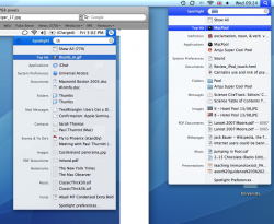
wctaiwan
P.S. Judging from this screenshot that came up with a random Google, Tiger menus are less, not more, opaque compared to 10.5.2
For me (and many others in this topic), the transparency didn't "interfere" with text on the menus. It's just nice eye-candy that is not too obtrusive. If making information accessible is all you care about, we should all just go back to the UI style in System 7. I guess Apple had to pick a crowd to please, and with the update, they changed their choice.
wctaiwan
P.S. Judging from this screenshot that came up with a random Google, Tiger menus are less, not more, opaque compared to 10.5.2
Indeed, you are correct.
Attachments
Is there a way to set the transparency ourselves? I want it to be more transparent.
http://www.versiontracker.com/dyn/moreinfo/macosx/33457
i think this don't change the drop down menu, but could help who's begging for some transparency control in the menu bar...
Register on MacRumors! This sidebar will go away, and you'll see fewer ads.