Become a MacRumors Supporter for $50/year with no ads, ability to filter front page stories, and private forums.

AxisOfBeagles

macrumors 6502
Original poster
Apr 22, 2008
441
112
Top of the South
The purpose of the Challenge is to provide a venue where photographers of all skill levels can work to improve their craft by shooting along a common topic for two weeks - one fortnight. Helpful comments and critiques are key to reaching the intended goal - better photography.

About Your Photos

Shoot for the topics listed on the schedule. You may shoot for upcoming topics, but post photos only to their matching Challenges.

You may post as many photos as you wish for any one Challenge.

About Your Comments

Comments are critical to the success of the Challenge. If you post a photo, add a comment to another one. If you are only viewing, please add your comments, too.

Comments should be meaningful, something that the photographer can use to improve his/her work. Explain why you like or dislike a photo. Spend a moment looking at a photo before commenting on it. Try to answer the question "I like this photo because…" It really helps the photographer.

The Topic Schedule is:

Contrasts March 2 - 15

Upcoming Topics:
Beauty in Unexpected Places (March 16 - 29)
 
Ooo, I'm gonna be first. I took this during the Fernbank Museum (in Atlanta) visit that I'm posting my mythical creatures photos. I was rather self conscious taking this photo, and I wanted to make sure I was not seen doing it. When I saw this scene I was struck by more than one contrast going on. The one I didn't include was with the kids that were also with the couple, but I didn't feel comfortable getting a shot with the kids, too.

 
^^ Interesting literal interpretation of the topic. The couple are so alike and different at the same time. Looks good from the hight point of view.

Dale
 
Keleko, really enjoy the toys on the table. Nice work!

Also, food on her tray, none on his. White shirt, black shirt.

Awesome!
 
^^ Interesting literal interpretation of the topic. The couple are so alike and different at the same time. Looks good from the hight point of view.

Dale

The height was my way of not being seen while taking the photo. I could have taken it at the same level they were, but I'm almost sure they'd have seen me doing it. If I hadn't found the higher vantage point I probably wouldn't have taken a picture of them. I'm glad I did and that it is well received (so far). :)
 
The height was my way of not being seen while taking the photo. I could have taken it at the same level they were, but I'm almost sure they'd have seen me doing it. If I hadn't found the higher vantage point I probably wouldn't have taken a picture of them. I'm glad I did and that it is well received (so far). :)

Then I hope for your sake that they aren't MacRumor regulars. :D
 
I've posted this before on the pic of the day thread but it is one of my favorite "contrast" shots to date.

paint1.jpg
 

The high vantage point and the stuffed animals on the table really make this shot. It's a picture with contrasts on many levels: white/black, obese/gaunt, tough/cuddly, nonconformist/mainstream, just to name a few. Very nice address to the theme, Keleko.

I would probably crop in tighter, since the empty chair and so much railing is not adding anything to the image. You could come in at the top, left, and right, and get us that much closer to this eccentric couple.

^^ Interesting literal interpretation of the topic. The couple are so alike and different at the same time. Looks good from the hight point of view.

Dale

I completely agree about the similarities making a nice counterpoint to the differences. I probably wouldn't call this one a "literal interpretation" of contrast, though, since it goes so far beyond just being dark versus light. (I guess I think of contrast at its most basic as involving tonality.)
 
I've posted this before on the pic of the day thread but it is one of my favorite "contrast" shots to date.

paint1.jpg

A nice contrast of warm and cold colors. The diagonal framing is severe enough to look deliberate and works well with the surreal lighting. If you were to take another whack at it, you might consider placing an object or a person in a window or in the doorway to serve as a focal point. As it is, there isn't really one place in the frame that serves as the primary visual pay-off or subject of the image. Also, you might try an exposure that gives you some more range of tonality, since the blacks are really crushed here, and they occupy large areas of the frame.
 
A nice contrast of warm and cold colors. The diagonal framing is severe enough to look deliberate and works well with the surreal lighting. If you were to take another whack at it, you might consider placing an object or a person in a window or in the doorway to serve as a focal point. As it is, there isn't really one place in the frame that serves as the primary visual pay-off or subject of the image. Also, you might try an exposure that gives you some more range of tonality, since the blacks are really crushed here, and they occupy large areas of the frame.

Of the three shots I got off that night this was the best one in my opinion. The others just had too much light. Although they didn't have nearly the black fields of this shot (other shots). I have printed this out at 20x30 for somebody and really liked the enlargement.

I get your suggestioin about a focal point. That brings up some interesting questions about how to light it. It would have to be very deliberate so as not to spill into the red and blue. As it was I ran around in the dark with a flashlight to light the scene. The total exposure time was 66.7 seconds. :) Perhaps even a faint image of somebody sitting in the foreground. Maybe even a ghostly figure -- only in the frame temporarily so that the cabin bleeds through.

I shot fully open at f-1.4 (it was a dark night). There really wasn't anything of interest in the black areas. That's not to say I couldn't stage anything. The biggest challenge was that I was in a "day use only" area and was worried the park ranger was going to run me off at any moment. My biggest complaint is that they reds are blown out in the right hand window.

The location is only about 45 minutes away. Perhaps I'll give it another go sometime. I've added some strobes and remote triggers to my kit since then. Although I do like the uneven lighting from the flashlight. The way the blue streaks it make me think of an underwater scene.

Thanks for the comments. You definitely made me look at the image again in a different "light." ;)
 
I get your suggestioin about a focal point. That brings up some interesting questions about how to light it. It would have to be very deliberate so as not to spill into the red and blue. As it was I ran around in the dark with a flashlight to light the scene. The total exposure time was 66.7 seconds. :) Perhaps even a faint image of somebody sitting in the foreground. Maybe even a ghostly figure -- only in the frame temporarily so that the cabin bleeds through.

I love this kind of thinking! You obviously have a creative mind, so go for it! I frequently return to the same sites to try out new ideas; it can be an extremely rewarding way to shoot because you eventually become a master of that location and know exactly what you want to do there. So yeah, let your imagination run wild and go back to try out something fun.

I do a lot of this kind of shooting (gelled strobes, dilapidated structures, low light), and I know all too well how challenging it is to get the balance right between the artificial and ambient light. You said you now have some more strobes and triggers, and that will free you up a lot to do shorter exposures, which will help you to incorporate more ambient light and get more detail into the shadows.

I look forward to seeing what you come up with next. :)
 
Ooo, I'm gonna be first. I took this during the Fernbank Museum (in Atlanta) visit that I'm posting my mythical creatures photos. I was rather self conscious taking this photo, and I wanted to make sure I was not seen doing it. When I saw this scene I was struck by more than one contrast going on. The one I didn't include was with the kids that were also with the couple, but I didn't feel comfortable getting a shot with the kids, too.


Very interesting shot to look at. There is a lot going on but it makes you want to look. I'd agree with maybe cropping some off the top.
 

There's a lot more going on here than I thought at first glance. There's not only the contrast between the bright flowers and the dark background, which is what I noticed first, but there's also the contrast between the front and the back of the flowers and thirdly red and green are on opposite sides of the colour wheel. Well done JD!


I went out to make use of the first bit of sunshine I've seen for ages:

contrasth.jpg
 
The high vantage point and the stuffed animals on the table really make this shot. It's a picture with contrasts on many levels: white/black, obese/gaunt, tough/cuddly, nonconformist/mainstream, just to name a few. Very nice address to the theme, Keleko.

I would probably crop in tighter, since the empty chair and so much railing is not adding anything to the image. You could come in at the top, left, and right, and get us that much closer to this eccentric couple.


I completely agree about the similarities making a nice counterpoint to the differences. I probably wouldn't call this one a "literal interpretation" of contrast, though, since it goes so far beyond just being dark versus light. (I guess I think of contrast at its most basic as involving tonality.)

I agree with the crop. I'm not sure why I didn't think of it or do it before. I remember feeling the same way but then ignoring myself. :)

This is a "quick and dirty" crop using the crop tools in flickr. I would like more room on the right for the table. This is cropped to the edge of the empty chair, so to do a bit more room I'll have to erase the part of the chair that shows. I may try that when I have more time.


That's better but give it a try even tighter. Bring the right edge up past the tray. That might make the toys jump out a little more. Same thing if you bring the bottom edge up closer to his elbow. You may have some room to bring the top and right in a little tighter to match the bottom and left crop.

I'm not sure if this will make a better photo but from what I see I think it is worth a try. (Gotta love the digital age!)

I found the original crop interesting at first glance but the more I looked at it the more I lost interest. It may have been the clutter of the bars and expanse of the table and chair to the right - the main focus seemed to get lost. I dunno. ;)
 
Nicely framed flower photo. Good use of DOF to add to the prominence of the subject while allowing the background to have it's own character. You have contrast in the brightness of subject and background which are, intriguingly, complementary colors...:)

I went out to make use of the first bit of sunshine I've seen for ages:

contrasth.jpg
Same issue of lack of sun over here, too. I like the feel of this posed shot. I think it would be a bit stronger if the watch face were more visible. It's kind of hard to tell if the time is the same. Shooting this with something like a pocket watch on the sundial would be interesting, too. Similar shape but different "mechanisms".

Dale
 
I went out to make use of the first bit of sunshine I've seen for ages:

contrasth.jpg

I like the idea a lot. Great interpretation. I agree with Dale that an older style watch might make it an even stronger shot. Something a bit more classic with mechanical movement...though I do appreciate the contrast between the sundail and digital. I also wonder how a rectangular crop would look that brought us in closer to the sundail and the watch.
 
An idea?

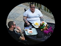
I saw some of the difficulties in cropping this, and wondered if an oval crop would help. Once I started playing with it, then I started really seeing the ovals/circles: chips, cups, table, his hat, her glasses, tomatoes. And I saw the rectangles: floor tiles, trays, paper dishes. More contrasts! After experimenting with the oval crop, it felt right to put this within a rectangle frame --another contrast, and it makes me feel more like I'm sneaking a peek at this couple, as Keleko did when shooting this pict.

What do you think?

(Keleko: I saw some of your other flickr photos from this day. Some good candidates for the Surrealism contest!)

I'll say this much: the challenges and the weekly contests are making me think about ... and see ... things differently!!! Thank you, all! (I think! Photos I loved a few weeks ago now look like garbage!)

~Waybo
 

Attachments

  • Experiment.jpg
    Experiment.jpg
    159.8 KB · Views: 90
What do you think?

~Waybo

NOOOOOOO. Might as well selective color the barney doll too :p

I've posted this before on the pic of the day thread but it is one of my favorite "contrast" shots to date.

paint1.jpg

Love it! My only qualm is how dark it is. If it had some more "pop" and was brightened up a bit I would be even more in love! Did you have lights inside that place?


Sepeta-Photography-4.jpg


Used some off camera flash to create contrast between the falling snow and the rest of the scene. Totally forgot to CTO gel it but oh well! Even more contrast now!
 
I saw some of the difficulties in cropping this, and wondered if an oval crop would help. Once I started playing with it, then I started really seeing the ovals/circles: chips, cups, table, his hat, her glasses, tomatoes. And I saw the rectangles: floor tiles, trays, paper dishes. More contrasts! After experimenting with the oval crop, it felt right to put this within a rectangle frame --another contrast, and it makes me feel more like I'm sneaking a peek at this couple, as Keleko did when shooting this pict.

What do you think?

I think it feels a little too tight for me. It might work if it was more room in it, though. I saw someone else disagreed with the oval, though. Anyone else have thoughts?

(Keleko: I saw some of your other flickr photos from this day. Some good candidates for the Surrealism contest!)

Dang, I already posted one from a long while ago for the contest. I didn't think any of the museum shots fit the surreal theme. Which ones did you think were a good fit? (You can PM them to me if you prefer.)
 
Register on MacRumors! This sidebar will go away, and you'll see fewer ads.