Become a MacRumors Supporter for $50/year with no ads, ability to filter front page stories, and private forums.
///
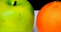
OK, my own submission for this challenge. With the utmost apologies to JD, I had to stick with the apples & oranges theme which is what had immediately occurred to me when we set this topic. I've tried to expand on the conceptual interpretation of apples & oranges with some more technical interpretations - a split b & w background, and an over-saturated and high contrast post treatment.

5517805179_d69cdf5849_b.jpg


Canon EOS 40D
EF 24-70 f/2.8L @ 32mm
ISO 100 f/11 @ 1/250th manual exposure
Two 150watt strobes plus an on-camera 430EX bounced off of an overhanging reflection card
Post in Aperture 3
I like the idea you have going here. I would like the saturation more realistic, but that's just me. Different framing and cropping come to mind. Maybe play off the differences in the textures and color, putting them closer and cropping or framing in tight. I may play with this idea when I can. I have nice oranges, but I need an apple. And the nice lighting setup you have.

Please excuse the PhotoShop hack of your image...:)

Dale
 

Attachments

  • A&O.jpg
    A&O.jpg
    329.4 KB · Views: 92
I like the idea you have going here. I would like the saturation more realistic, but that's just me. Different framing and cropping come to mind. Maybe play off the differences in the textures and color, putting them closer and cropping or framing in tight. I may play with this idea when I can. I have nice oranges, but I need an apple. And the nice lighting setup you have.

Please excuse the PhotoShop hack of your image...:)

Dale

Dale - no excusing required. You are one of a handful of folks here whose opinions I highly value and look forward to. To the suggestions you raise;
* Saturation. Acknowledged. to be fair to my concept tho, that was intentional. To achieve the greatest degree of obvious contrast in the photo I pushed the colors on the orange and the apple - but not overall in the photo.

* Composition (framing). This was the issue that concerned me the most. I played with different crops but elected to go with a very symmetrical and obvious crop - with the idea in mind that this best reinforced the obvious contrast elements (apples-oranges and black-white). But I never even thought of or attempted a close crop such as you used here, and now I'm gonna go play with that. I rather like it and it still seems to carry the conceptual message of contrast.

As always - thanks much for the great feedback.
 
Thanks for the feedback. It was a challenging mountain to frame as it was the first of many other peaks off to the right. Here is a broader view of Jones Peak and the adjacent peaks to the right... to me this takes away the focus from the alternating snowy/dark areas of Jones Peak, and it also seems unfinished on the right:

jonespeak2.jpg

1/640s, f/7.1, 70mm, ISO 100
EF 70-200mm f/2.8L IS II USM


Just for grins, here is a shot of the Collegiate Peaks at 10mm focal length... and it still appears unfinished on the right. :eek: I guess I should have done what my sidekick did and just take a panorama. :)

collegiatepeaks.jpg

1/320s, f/10, 10mm, ISO 100
10-22mm f/3.5-4.5 USM

I like the wider one a bit more but you are right it's still hard to make it look complete edge to edge. I like the panorama alot. Very nice range shot.
 

This is great contrast. Love the yellow. Even though it's a bit centered it works because of the curves and the lighting. My suggestion is to go ahead and black out the sky that's showing through. To me it makes it even stronger. I tried cropping it and I think it looks better at it's current size with the sky blacked out.
 
OK, my own submission for this challenge. With the utmost apologies to JD, I had to stick with the apples & oranges theme which is what had immediately occurred to me when we set this topic. I've tried to expand on the conceptual interpretation of apples & oranges with some more technical interpretations - a split b & w background, and an over-saturated and high contrast post treatment.

5517805179_d69cdf5849_b.jpg


Canon EOS 40D
EF 24-70 f/2.8L @ 32mm
ISO 100 f/11 @ 1/250th manual exposure
Two 150watt strobes plus an on-camera 430EX bounced off of an overhanging reflection card
Post in Aperture 3

No apologies necessary. I think it's great when we have similar ideas implemented differently for these challenges. I very much like the color, textures and saturation. It gives it a very modern feel, especially with the very bold black and white. Like others have said, I'm not sold on the placement or the crop. I get what you were going for in emphasizing the contrasts though. Maybe a tighter crop? Maybe playing with where the black/white line falls in the frame? Maybe placing one fruit in the black and one in the white somehow. Not sure, I think a tighter crop would help the most.

Great work.
 
I liked the first one much better. The angle and the background just don't work for me on this one.

I agree. I was trying to show the time on the watch more clearly but it's not right.

Two very different interpretations of apples and oranges. I prefer the second one of yours, JD. The top of the apple is more clear, there's more texture in the front orange and the red apple is clearer and reflects the light nicely and adds a bit of sparkle. I also like the contrast between the fruit and the black background and the subtle reflection in the surface.


OK, my own submission for this challenge. With the utmost apologies to JD, I had to stick with the apples & oranges theme which is what had immediately occurred to me when we set this topic. I've tried to expand on the conceptual interpretation of apples & oranges with some more technical interpretations - a split b & w background, and an over-saturated and high contrast post treatment.

5517805179_d69cdf5849_b.jpg

I like the idea you have going here. I would like the saturation more realistic, but that's just me. Different framing and cropping come to mind. Maybe play off the differences in the textures and color, putting them closer and cropping or framing in tight. I may play with this idea when I can. I have nice oranges, but I need an apple. And the nice lighting setup you have.

Please excuse the PhotoShop hack of your image...:)

Dale

No apologies necessary. I think it's great when we have similar ideas implemented differently for these challenges. I very much like the color, textures and saturation. It gives it a very modern feel, especially with the very bold black and white. Like others have said, I'm not sold on the placement or the crop. I get what you were going for in emphasizing the contrasts though. Maybe a tighter crop? Maybe playing with where the black/white line falls in the frame? Maybe placing one fruit in the black and one in the white somehow. Not sure, I think a tighter crop would help the most.

Great work.


Another nice interpretation, Axis. Very different and the crisp black and white adds to the contrast. If I may make one or two suggestions, I might choose something like a very green Granny Smith apple and rub it with a soft cloth until it shone. The one in the pic looks a bit blotchy. That might allow you to turn down the intensity on the orange just a tad so it looks a bit more realistic.

Also wondering what it would look like with the orange slightly in front of and overlapping the orange a little, then the view closed in a bit more on them. Just thoughts!
 
Nice one! :)

Thanks. I found out my D700 & 70-200mm VR ii is indeed weather proof at this match. Not much fun getting such an expensive toy wet for the first time, but nice to know it works.

This was a pretty unusual opportunity. I find you end up taking a lot of similar pictures at these games, so when you have an interesting setting with the mud, and the interesting contrast of the new player, it's a rare and nice opportunity. Happened fast though, his team mates had covered him with hand prints in seconds.
 
I like the idea you have going here. I would like the saturation more realistic, but that's just me. Different framing and cropping come to mind. Maybe play off the differences in the textures and color, putting them closer and cropping or framing in tight. I may play with this idea when I can. I have nice oranges, but I need an apple. And the nice lighting setup you have.

Please excuse the PhotoShop hack of your image...:)

Dale

In the original photo I felt the black/white line was a little too high. In your crop I like the placement a little better. I can definitely see a framed print with the tight crop -- possible a gallery wrap.

Also wondering what it would look like with the orange slightly in front of and overlapping the orange a little, then the view closed in a bit more on them. Just thoughts!

Now that would be something to see - the orange in front of itself. Some sort of 4th-dimensional super orange? ;)
 
Thanks. I found out my D700 & 70-200mm VR ii is indeed weather proof at this match. Not much fun getting such an expensive toy wet for the first time, but nice to know it works.

This was a pretty unusual opportunity. I find you end up taking a lot of similar pictures at these games, so when you have an interesting setting with the mud, and the interesting contrast of the new player, it's a rare and nice opportunity. Happened fast though, his team mates had covered him with hand prints in seconds.

When I saw your muddy rugby photos, my first thought was how could they?? Oh yuck! Glad your camera can stand it though. Do you get scraping noises afterwards when you zoom? :) Loved the comment about him getting covered in handprints! :D

Now that would be something to see - the orange in front of itself. Some sort of 4th-dimensional super orange? ;)

Ah! :eek: Acute brainfailure time I think. Anyway, have you never heard of getting ahead of yourself?? :)
 

I agree with fcortese: I really like the picture, but would love it if there was more space to the right, where the horse is looking. Could you crop the left and top a bit? I think that would make it more powerful. IMHO, Rule of Thirds would turn this good shot into a great shot.


I'm still trying to decide if I love it or hate it! It's beautiful, yet ugly ... all at once. I definitely see all 4 elements -- another nice contrast. I think it would have done well in the surreal contest we just had.
 
Last edited:
I'm still trying to decide if I love it or hate it! It's beautiful, yet ugly ... all at once. I definitely see all 4 elements -- another nice contrast. I think it would have done well in the surreal contest we just had.

It'd probably work for the next contest theme "Beauty in unexpected places", too.
 
I agree with fcortese: I really like the picture, but would love it if there was more space to the right, where the horse is looking. Could you crop the left and top a bit? I think that would make it more powerful. IMHO, Rule of Thirds would turn this good shot into a great shot.


Something like this? I would be interested to see your preferred crop.

 
I like the crop you used here better than the original post. The frame is broken up with the subject in the left portion and the horses head leads into the right. Nice(er).

I know I'm a bit late, but I took this on saturday partially with this challenge in mind. What do you think?

PassingTheGate_1000.jpg
Very good Tall Ship and the Golden Gate shot. I like the framing with the ship placed off center.


AoB has the next Challenge posted. It is the last of the original three chosen and one of us will open a new topic thread to cover the next three in a week or so.

Hats off to everyone for keeping this up and running.

Dale
 
Hats off to everyone for keeping this up and running.

Dale


Actually Dale - hats off to you for resurrecting the challenge. While I enjoy many of the threads in MR, this is by far the one of greatest interest to me. Taking on a challenge and working to achieve it in an image; getting specific feedback from others ... these are invaluable. Thanks much.

Now to figure out "beauty in unexpected places". this one is, for me, a much harder concept. At least, to do so without being cliche.
 
Master-D said, "Something like this? I would be interested to see your preferred crop.

My crop would have been just like this! Very nice!
 
Last edited:
Register on MacRumors! This sidebar will go away, and you'll see fewer ads.