Become a MacRumors Supporter for $50/year with no ads, ability to filter front page stories, and private forums.
I know I must be overtired ... I actually reached out and touched my screen to see if this was really 3-dimensional!

That made me chuckle, I've done that before myself. :)

Love it! My only qualm is how dark it is. If it had some more "pop" and was brightened up a bit I would be even more in love! Did you have lights inside that place?

Thanks! I find monitor gama really makes or breaks this one. Small changes in the can really darken it up quickly. I have printed it out at 20x30 and it really worked well in my opinion. I'm just finishing up some web site programing before I can get back into my photography. Once I do I plan on revisiting this one. I want to try printing it on both regular paper and metallic.

As for the lighthing I'm lucky I didn't break my neck that night. It was extreamly dark - no Moon and the cottages are wedged between some steep hills. I set the camera up on a tripod and took a couple of test shots for the framing. I just looked at the original images and there are only a couple of blurry images and one only lit from inside before this shot. I was using an old manual lens and must not have focused for the first couple but they were so dark it was hard to see on the LCD. (Still better than waiting for the film to develop.)

Once I had the angle I thought I wanted -- it was still hard to tell on the preview -- I set the camera for remote trigger with a three second delay. I triggered the cammera and when the shutter opened up I held a deep blue Rosco gel over a five watt LED flashlight and swept it across the front of the building a few times.

I then turned off the flashlight and dashed over the uneven ground into the room on the left. There I switched to a red gel and waved the light around the room for a couple of seconds. Then in the dark I ran around to the door and the room on the right. Here I again waved the flashlight around trying to give it an uneven wash. Then I stuck my head out the door and triggered the camera. The whole exposure was about 67 seconds.

In this shot you can see how uneven the ground was. ;)

paint2.jpg


In this and another shot from that night I used way too much light. I like the uneven texture of the red and blue image. The other two are just too flat. I do like the texture of the bricks in this one but overall I ruined the shot in my opinion. In the one above you can also see that I didn't have the flashlight fully covered. There is a bit of white light spilling in the foreground.

If I were to do it again I would try putting a strobe in each room. I would need to find something to breakup the flash to get the uneven wash -- maybe some bottle partially filled with water. Then I could use the flashlight for the front lighting and maybe another strobe or two set very low for some side fill.

Overall it was a fun exercise. I had wanted to do some light painting for a long time and I got really lucky for a first try at it.
 
I saw some of the difficulties in cropping this, and wondered if an oval crop would help. Once I started playing with it, then I started really seeing the ovals/circles: chips, cups, table, his hat, her glasses, tomatoes. And I saw the rectangles: floor tiles, trays, paper dishes. More contrasts! After experimenting with the oval crop, it felt right to put this within a rectangle frame --another contrast, and it makes me feel more like I'm sneaking a peek at this couple, as Keleko did when shooting this pict.

What do you think?

Honestly, it doesn't really work for me. Not sure why. The black shirt does fall into the black of the crop but there is something else I can't explain.

Although when you mentioned the circles and squares I did see something else. Had you been able to stage the picture it might have been interesting to align the trays and their contents with the tile pattern. But then if you staged it you probably would have lost the candid nature.
 
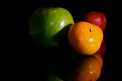
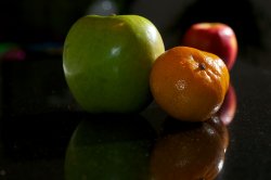
Apples and Oranges.

Same two shots just lit differently with off camera flash. Not sure I necessarily like either, just thought I'd post them. Figurative and literal contrast, I guess. Hopefully next weekend will be nice and I can get outside.
 

Attachments

  • _DSC1095.jpg
    _DSC1095.jpg
    359.3 KB · Views: 76
  • _DSC1099.jpg
    _DSC1099.jpg
    499.6 KB · Views: 75
Sepeta-Photography-4.jpg


Used some off camera flash to create contrast between the falling snow and the rest of the scene. Totally forgot to CTO gel it but oh well! Even more contrast now!

Nice. My only complaint is the really bright street lamp. It keeps sucking me in. I like the bright lights in the background though. How does this shot look in black and white? I'm a sucker for snow shots in black and white. Don't know why.
 
Apples and Oranges.

D&^$ it all anyway JD! I was gonna do an apples and oranges for this one. Oh well, back to the drawing board.

Meanwhile, last day of a long weekend down here in the Baja. will post a few photos on the POTD thread from the trip - and ponder how to address this challenge WITHOUT apples and oranges. Darnit!
 
^^^ dslade-nice concept. Several contrasts here some obvious, some subtle. Obvious- B&W coloring; Subtle- in focus keys: A-to-Z, and Q&A.
 
Macbook Pro keyboard!

The Mac keyboards do seem to be photogenic, don't they? I like the use of strong contrast in this image. What lens did you use and is there any of a vignette applied in post?

///
Sepeta-Photography-4.jpg


Used some off camera flash to create contrast between the falling snow and the rest of the scene. Totally forgot to CTO gel it but oh well! Even more contrast now!
Nice composition except for the bright light. Maybe a long shutter time to streak the snow?

Interesting simple subject. Nice lighting and use of selective focus. The tone of the background is nice. Is this a lamp?

Dale
 
The Mac keyboards do seem to be photogenic, don't they? I like the use of strong contrast in this image. What lens did you use and is there any of a vignette applied in post?
I'm glad you guys like it! I Used a Canon T2i with its standard lens 18-55mm. There was no vignette applied. I had to take some noise out of it and and a little bit of saturation. other than that thats it! The inspiration came to me when I was using my MBP in the dark.
 
D&^$ it all anyway JD! I was gonna do an apples and oranges for this one. Oh well, back to the drawing board.

Me too! :)


Macbook Pro keyboard!


I like this one! I tried that a while back but it wasn't as successful as yours. Maybe the keyboard would be better positioned not quite so close to the left hand edge imo. Well done though!


Same issue of lack of sun over here, too. I like the feel of this posed shot. I think it would be a bit stronger if the watch face were more visible. It's kind of hard to tell if the time is the same. Shooting this with something like a pocket watch on the sundial would be interesting, too. Similar shape but different "mechanisms".

Dale

I like the idea a lot. Great interpretation. I agree with Dale that an older style watch might make it an even stronger shot. Something a bit more classic with mechanical movement...though I do appreciate the contrast between the sundail and digital. I also wonder how a rectangular crop would look that brought us in closer to the sundail and the watch.

Apologies for not coming back earlier, and thank you for your suggestions and comments. I agree a pocket watch would look good. Less contrast but nicer photo. However, it's a moot point as I'm fresh out of pocket watches at the moment! :) I've been waiting for some sun and me being here to reshoot it. Had to do it from the other side as it was 2 pm before the opportunity arose and maybe the background isn't as good, also tried a lower viewpoint this time.

contrast2.jpg
 
jonespeak.jpg

Jones Peak, Nathrop, Colorado
1/500s, f/8, 238mm, ISO 100
Canon Rebel T2i + EF 70-200mm f/2.8L IS II USM + EF 2x Extender II
 
Sepeta-Photography-4.jpg


Used some off camera flash to create contrast between the falling snow and the rest of the scene. Totally forgot to CTO gel it but oh well! Even more contrast now!

Really love this image, The contrast of falling snow compared to the resting snow is excellent. I love the bokeh balls as well from the falling snow :)

My take on contrast.

5468280034_9f44fc13c2_z.jpg
 
jonespeak.jpg

Jones Peak, Nathrop, Colorado
1/500s, f/8, 238mm, ISO 100
Canon Rebel T2i + EF 70-200mm f/2.8L IS II USM + EF 2x Extender II

This is a good classic take on contrast. B&W landscape really brings out the contrast and textures.

I have a second entry I took today. I found this burned out stump filled with a pool of water reflecting the sky. I saw it and realized it had all 4 "elements" in it.

 
Apologies for not coming back earlier, and thank you for your suggestions and comments. I agree a pocket watch would look good. Less contrast but nicer photo. However, it's a moot point as I'm fresh out of pocket watches at the moment! :) I've been waiting for some sun and me being here to reshoot it. Had to do it from the other side as it was 2 pm before the opportunity arose and maybe the background isn't as good, also tried a lower viewpoint this time.

contrast2.jpg

I liked the first one much better. The angle and the background just don't work for me on this one. I think you were headed in the right direction on the first one though.
 
jonespeak.jpg

Jones Peak, Nathrop, Colorado
1/500s, f/8, 238mm, ISO 100
Canon Rebel T2i + EF 70-200mm f/2.8L IS II USM + EF 2x Extender II

Classic B&W mountain photography is probably my favorite of all time. I can just stare at Bradford Washburn's photos for days. I think you did really well here and I enjoyed this one for sure. My only complaint is that the right side left me wanting more, like we weren't quite finished with the ridge.
 
I've posted this before on the pic of the day thread but it is one of my favorite "contrast" shots to date.

paint1.jpg

This is a very interesting photograph. For as spooky as the dwelling looks, it has a certain inviting quality to it. It contrasts not only in color but in mood. I like it. Thanks for the explanation of the coloring; I'm surprised this was light painted!

Macbook Pro keyboard!

5510770436_a24e5fc2de_b.jpg

Very nice capture. This reminds me of the lighting style used in Tron and Tron: Legacy. What might be fun is to drastically reduce your aperture / increase your f-number and do a long exposure shot of it so that it is entirely in focus. I would also center it in the frame but that could just be me.
 
Classic B&W mountain photography is probably my favorite of all time. I can just stare at Bradford Washburn's photos for days. I think you did really well here and I enjoyed this one for sure. My only complaint is that the right side left me wanting more, like we weren't quite finished with the ridge.

Thanks for the feedback. It was a challenging mountain to frame as it was the first of many other peaks off to the right. Here is a broader view of Jones Peak and the adjacent peaks to the right... to me this takes away the focus from the alternating snowy/dark areas of Jones Peak, and it also seems unfinished on the right:

jonespeak2.jpg

1/640s, f/7.1, 70mm, ISO 100
EF 70-200mm f/2.8L IS II USM


Just for grins, here is a shot of the Collegiate Peaks at 10mm focal length... and it still appears unfinished on the right. :eek: I guess I should have done what my sidekick did and just take a panorama. :)

collegiatepeaks.jpg

1/320s, f/10, 10mm, ISO 100
10-22mm f/3.5-4.5 USM
 
Very nice capture. This reminds me of the lighting style used in Tron and Tron: Legacy. What might be fun is to drastically reduce your aperture / increase your f-number and do a long exposure shot of it so that it is entirely in focus. I would also center it in the frame but that could just be me.

That is what I thinking of doing but I do not have a tripod at the moment! That and a remote are on my shopping list of things to get. the reason its in that angle it I was charging the laptop and it would of exposed the charging light in the left.


I like how everything is dark except the yellow road stripe and light where cars are passing. Nice shot!
 
Last edited:

Definitely my favorite thus far, amongst many excellent interpretations of the challenge theme. The neon glow of the keyboard backlight really makes this pop, and I like the angled composition.


This one I'm not too sure how it communicates the challenge theme (assuredly more my lack of insight and interpretation than the photo) but more distracting to me is the overexposure of the foreground flower. Was this exposed with the in-camera meter? I find a lot of over-exposure problems when using the camera meter, so I usually use an incident meter, or a spot-meter - or else I bracket with a specific intention of some low-value captures. I find that recovering slightly under-exposed images easier in digital than I do hot or over-exposed images. Just my limited experience - your mileage may vary.


OK, my own submission for this challenge. With the utmost apologies to JD, I had to stick with the apples & oranges theme which is what had immediately occurred to me when we set this topic. I've tried to expand on the conceptual interpretation of apples & oranges with some more technical interpretations - a split b & w background, and an over-saturated and high contrast post treatment.

5517805179_d69cdf5849_b.jpg


Canon EOS 40D
EF 24-70 f/2.8L @ 32mm
ISO 100 f/11 @ 1/250th manual exposure
Two 150watt strobes plus an on-camera 430EX bounced off of an overhanging reflection card
Post in Aperture 3

I love the colors and the amazing detail in the textures, but the composition isn't all that exciting for me. Maybe with it a bit tighter, and the fruits offset a bit would bring in a little more excitement? The black vs white background is a nice touch.
 
Register on MacRumors! This sidebar will go away, and you'll see fewer ads.