Got a tip for us?
Let us know
Become a MacRumors Supporter for $50/year with no ads, ability to filter front page stories, and private forums.
This is what the dock should look like
- Thread starter Gogurt48
- Start date
- Sort by reaction score
You are using an out of date browser. It may not display this or other websites correctly.
You should upgrade or use an alternative browser.
You should upgrade or use an alternative browser.

Instead of the heavy frosted glass look, I think the dock would look so much better with just a subtle tint, like the video section of the camera app:
Image
Agreed. I think you walk a fine line when you do the "frosted" look. The notification center needs to be a darker translucency to make sure the content is front and center, but in places like the camera, I think the high level of translucency just makes sure that your content (in this case the picture) is front and center.
The Keynote was all about "content first" and making sure that everything unnecessary gets out of the way of your phone doing what its meant to do, so I think this could be something we see as we move forward in the beta process.
Given the changes in Beta 3, Apple is listening, and the changes are being made to make sure that its perfect. If they can change the font to a thicker bold, then they can easily change the translucency of the dock!
Yes, that would be perfect, the dock looks really bad depending on the wallpaper. With all the workers at Apple you would think someone would have thought of that, that was my first thought, why not nothing, or just a simple line.
I would even want that for my folders, just a dark tint, but still see my wallpaper, maybe even darker than the camera overlay, but not a blur or a frost unless it's a single color frost...because using the colors of the wallpaper is too inconsistent.
I would even want that for my folders, just a dark tint, but still see my wallpaper, maybe even darker than the camera overlay, but not a blur or a frost unless it's a single color frost...because using the colors of the wallpaper is too inconsistent.
What happens when you've got a wallpaper with a lot of lines or lettering? You wouldn't be able to see the app names, even with heavy shadowing.
I think they started out with the non-heavy frosted look but realized they can't control user backgrounds. Which would make text display a problem. with that example what if you background was all white or a mixture of white and black? how would you handle text coloring in that situation. would half the dock text be in white and the other half be in black?
You'd have the same problem on the rest of the home screen, off the dock, wouldn't you? The only way to guarantee the text can be read against any background would be to give it a one or two pixel drop-shadow, like in iOS 6.

I wish they would do that because I think it looks nice anyway. And unless they do, readability of the text is going to be problematic against certain wallpapers regardless of how opaque the dock is.
I agree with the OP.
It's kind of sad when the users on Mac Rumors have better ideas than Apple's famous design team.
It's kind of sad when the users on Mac Rumors have better ideas than Apple's famous design team.
You'd have the same problem on the rest of the home screen, off the dock, wouldn't you? The only way to guarantee the text can be read against any background would be to give it a one or two pixel drop-shadow, like in iOS 6.
Image
I wish they would do that because I think it looks nice anyway. And unless they do, readability of the text is going to be problematic against certain wallpapers regardless of how opaque the dock is.
I thought it was reported drop shadow on app name text is back in Beta3?
I agree with the OP.
It's kind of sad when the users on Mac Rumors have better ideas than Apple's famous design team.
Oh please! Where were all these better ideas before iOS 7 was released!
It seems to me that the iOS7 build that Apple used during the developer sessions had a less frosted dock. It's possible they will tweak it before the fall release.
https://forums.macrumors.com/posts/17410923/
https://forums.macrumors.com/posts/17410923/
I have less of an issue with the frosted glass and more of it being basically a background overlay for the icons. What I don't like is that it comes up over the icons which makes the phone space feel... smaller.
The 3D dock in iOS 6 is ironically more minimalistic as it covers less space on the screen.
The 3D dock in iOS 6 is ironically more minimalistic as it covers less space on the screen.
I thought it was reported drop shadow on app name text is back in Beta3?
It is, sort of. It looks more like a drop smudge than anything else. I prefer how they did it in iOS 6.

It is, sort of. It looks more like a drop smudge than anything else. I prefer how they did it in iOS 6.
Image
oh ew, that's kind of weird and hideous.
Oh please! Where were all these better ideas before iOS 7 was released!
I saw quite a few concept videos before iOS 7 was release which looked pretty good.
oh ew, that's kind of weird and hideous.
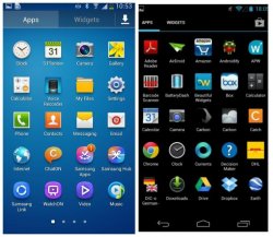
Yeah, wow. Reminds me of Linux of all things!
I think it should look just like this.
** SIGH **
What is it? Ok, great, you like Android. You have an Android phone that you use and love the look and functionality of. Wonderful. But you're insecure in your life. Mommy scolded you too much. Daddy wasn't proud. You have no idea who you are. So you compensate for it all on a friggin tech blog, playing out the 'Android vs iOS' war to show your superiority, following daddy's lead because he was the hero of the epic 'Windows vs Mac' wars of the '90s, championing XP and its great market share and user customability, vs Apple's 'oppressive' regime of imposed interface control. You really think you can prop up your inadequacies by trying to slam a mobile OS? Just use your android devices and be happy for your friends who use their iOS devices.
This is funny
** SIGH **
What is it? Ok, great, you like Android. You have an Android phone that you use and love the look and functionality of. Wonderful. But you're insecure in your life. Mommy scolded you too much. Daddy wasn't proud. You have no idea who you are. So you compensate for it all on a friggin tech blog, playing out the 'Android vs iOS' war to show your superiority, following daddy's lead because he was the hero of the epic 'Windows vs Mac' wars of the '90s, championing XP and its great market share and user customability, vs Apple's 'oppressive' regime of imposed interface control. You really think you can prop up your inadequacies by trying to slam a mobile OS? Just use your android devices and be happy for your friends who use their iOS devices.
Read some of his other posts. I'm pretty sure he was joking.
Instead of the heavy frosted glass look, I think the dock would look so much better with just a subtle tint, like the video section of the camera app:
come on designers let's get a mockup!!!!
come on designers let's get a mockup!!!!
Not a designer but here's a quick and dirty mockup:

Instead of the heavy frosted glass look, I think the dock would look so much better with just a subtle tint, like the video section of the camera app:
Image
Actually agree.
Register on MacRumors! This sidebar will go away, and you'll see fewer ads.