Become a MacRumors Supporter for $50/year with no ads, ability to filter front page stories, and private forums.

bchery21

macrumors 6502a
Aug 3, 2009
783
586
Boston, MA
** SIGH **

What is it? Ok, great, you like Android. You have an Android phone that you use and love the look and functionality of. Wonderful. But you're insecure in your life. Mommy scolded you too much. Daddy wasn't proud. You have no idea who you are. So you compensate for it all on a friggin tech blog, playing out the 'Android vs iOS' war to show your superiority, following daddy's lead because he was the hero of the epic 'Windows vs Mac' wars of the '90s, championing XP and its great market share and user customability, vs Apple's 'oppressive' regime of imposed interface control. You really think you can prop up your inadequacies by trying to slam a mobile OS? Just use your android devices and be happy for your friends who use their iOS devices. :rolleyes:

Read some of his other posts. I'm pretty sure he was joking.

Right. PrometheusGeek, falconeight is known for being sarcastic...
 

Gogurt48

macrumors 6502a
Original poster
Jun 17, 2013
663
1
Mockups of a better dock

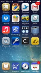
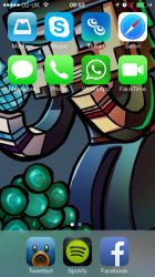
I've mentioned before that I think the dock would look better if it consisted of a subtle tint, like in the video section of the camera app. Here's what I had in mind, as seen on two different wallpapers:
 

Attachments

  • dock1.jpg
    dock1.jpg
    148 KB · Views: 291
  • dock2.jpg
    dock2.jpg
    151.6 KB · Views: 251
Last edited:

OneZweiThree

macrumors regular
Feb 17, 2013
224
329
Bavaria
Looks pretty good!

But I guess, they made it the way it is, because it`s consistent with the other translucent UI-elements such as the keyboard.
 

ionjohn

macrumors 65816
Jun 5, 2013
1,185
10
Canada
looks better than the actual dock but why do that? I mean, why don't we just take the mountain lion dock? Aren't iOS and Mac os x suppsoed to be connected?
 

Gogurt48

macrumors 6502a
Original poster
Jun 17, 2013
663
1
Looks pretty good!

But I guess, they made it the way it is, because it`s consistent with the other translucent UI-elements such as the keyboard.

True, but it's inconsistent with their stated design philosophy. They say they want to get the UI out of the way as much as possible and let the content shine through. In the case of the keyboard, and the Notification Center, and the Control Center, it's necessary that the background be somewhat opaque so that the text thereon can be read.

In the case of the dock, though, the "content" is the wallpaper, and the "frosted glass" dock is in the way. There's simply no reason for it to be that way, and if they adopted a tinted look, it would be consistent with what they did in the camera app.
 

falconeight

Guest
Apr 6, 2010
1,866
2
I have yet to see anything that is different or better than what apple has come up with. Lots of saber rattling but no action.
 

Rogifan

macrumors Penryn
Nov 14, 2011
24,142
31,199
The tinted one looks like quite an improvement, given that the implementation they've had so far has been fairly jarring and out of place. I'd even settle for the (simply somewhat more transparent) one that Apple has/had in various places on their site and during WWDC: https://forums.macrumors.com/attachment.php?attachmentid=417031&d=1371065766

I still think its possible the transparency of the dock will change before iOS 7 ships. I know people keep saying the UI is locked and Apple's only doing bug fixes but I disagree. No I don't think we'll see major UI changes but little things like a more transparent dock certainly are possible, especially since we've already seen screen shots of it.
 

sulpfiction

macrumors 68040
Aug 16, 2011
3,075
603
Philadelphia Area
** SIGH **

What is it? Ok, great, you like Android. You have an Android phone that you use and love the look and functionality of. Wonderful. But you're insecure in your life. Mommy scolded you too much. Daddy wasn't proud. You have no idea who you are. So you compensate for it all on a friggin tech blog, playing out the 'Android vs iOS' war to show your superiority, following daddy's lead because he was the hero of the epic 'Windows vs Mac' wars of the '90s, championing XP and its great market share and user customability, vs Apple's 'oppressive' regime of imposed interface control. You really think you can prop up your inadequacies by trying to slam a mobile OS? Just use your android devices and be happy for your friends who use their iOS devices. :rolleyes:

Considering his past posts, and his list peripherals, I'm pretty sure he was being sarcastic.
 

bigpoppamac31

macrumors 68020
Aug 16, 2007
2,452
431
Canada
I like this Dock design. This is what Apple should do. Make more sense as it does not interfere with the wallpaper background like the current iOS 7 dock does.
 

Zerilos

macrumors 6502a
Dec 18, 2012
903
24
I've mentioned before that I think the dock would look better if it consisted of a subtle tint, like in the video section of the camera app. Here's what I had in mind, as seen on two different wallpapers:

Love it. Not a fan of the current iOS 7 dock.
 

ry23

macrumors member
Jul 8, 2013
74
0
I would have to agree, I like that mockup. The current dock really just looks as tho it doesn't belong :)
 

emckai

macrumors regular
Jun 24, 2013
120
0
The mockup does look better than what's in Beta 3.
Of course, Apple might change how it actually looks by the time GM is released.
 

betabeta

macrumors 6502a
Jun 28, 2013
878
156
OK, If it was me, I would not put the final design out in the beta, I would put something else out that looks a little blah, then wham! gold master looks like gold! Apple never shows everything in the beta, they did say it was a work in progress, and they always leave surprises.

I can not imagine with all the amazing workers at Apple that this is the finished dock. Of course I think the icons are close to finished, even if they are not my cup of tea, oh well, styles will change again soon enough.

So I can't believe this is the final dock, you can't really leave something that depends on the wallpaper so much. The average just slaps up a picture of a baby, pet, vacation photo...and these could make everything look very poor. ios6 you could almost use any wallpaper and things looked fine.
 

charlituna

macrumors G3
Jun 11, 2008
9,636
816
Los Angeles, CA
I say dump the dock. The point was a spot for our biggest hitters but if we are in them that much they are in 'the task bar' so let them just stay there. Let us have that line for more apps and folders
 

falconeight

Guest
Apr 6, 2010
1,866
2
Even though I'm not to fond of the dock changing it would take away from the overall design. The only thing I see apple doing is thinning it or canting it like in iOS 6.
 

TheRainKing

macrumors 6502a
Jun 11, 2012
999
535
looks better than the actual dock but why do that? I mean, why don't we just take the mountain lion dock? Aren't iOS and Mac os x suppsoed to be connected?

Exactly!

This is what upsets me the most about iOS 7. They took away all the consistency that existed between OS X and iOS. Before you had similar colours, textures and icons, so it was easy to see that iOS was a mini version of OS X. But now they look completely different. :(
 

MacDevil7334

Contributor
Oct 15, 2011
2,527
5,717
Austin TX
Exactly!

This is what upsets me the most about iOS 7. They took away all the consistency that existed between OS X and iOS. Before you had similar colours, textures and icons, so it was easy to see that iOS was a mini version of OS X. But now they look completely different. :(

I doubt that will be the case for very long. I imagine that Apple is using iOS as a test for this new flat UI concept. Unless it's a total flop, I'd bet OS 10.10 (or would they just finally go to OS 11?) will feature the same flat design as iOS 7. You can already tell they're thinking about it. Just look at the icon for the new maps app in 10.9.

Whether a flat look would be good for OSX, I can't really say yet. I really like all the translucencies in iOS 7. They make the OS look so elegant and refined. But I absolutely detest the flat, cartoony icons and the text-based navigation controls that have replaced most of the buttons in the system. iOS 7 definitely feels less professional than iOS 6 in some ways, and I would hate to see that come over to the Mac as well. Only time will tell though so let's wait and see!
 

DiscoMcDisco

macrumors regular
Jul 31, 2013
166
40
London
I don't have a problem with it, or the frosting, but I do have a problem with the height. It could be 2/3rds the icon height and be brilliant... I just don't like this big block of 'meh' across the bottom of my screen.

Even if just 'tinted' it would still use up too much space.

My thoughts are that it should be linked to text scaling. If i set to smallest, I obviously care about screen-estate and as such, many other UI elements should be linked to the same scaling mechanic and 'adjust'.

I'd just like to see a 3rd chopped off the current one.
 

Attachments

  • 73D3A6AA-AA42-4D05-8E4F-B22FCE7EFD52.png
    73D3A6AA-AA42-4D05-8E4F-B22FCE7EFD52.png
    980.2 KB · Views: 104
Register on MacRumors! This sidebar will go away, and you'll see fewer ads.