Become a MacRumors Supporter for $50/year with no ads, ability to filter front page stories, and private forums.
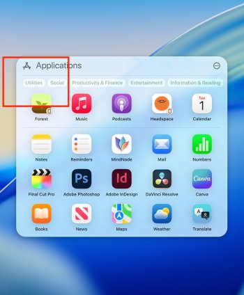
don't use spotlight, use the 'apps' app; you could put that in your dock, and/or setup a key command for it (am using my mac trackpad). much better overall (as of 26.1 beta 1) than spotlight for this...

well. the "Apps app" is not a thing. it's just a shortcut to open Spotlight, it only opens the apps search in Spotlight. it doesn't do anything else.
 
well. the "Apps app" is not a thing. it's just a shortcut to open Spotlight, it only opens the apps search in Spotlight. it doesn't do anything else.
this:
Screenshot 2025-09-23 at 4.07.10 PM.png
 
It did that in prior betas. It's just the same as opening Spotlight and clicking on the "A" for Apps icon.
26.1 beta 1 (as of 22 sept). if it's not working that way for you on the post-26 beta, not sure why

EDIT: my point is, the Apps app opens the larger app window by default; spotlight opens the simpler spotlight window. and (like most here) i don't want to spend time getting to the apps list, i want to open an app. the revised window in the Apps app is much better than it was before the current beta...
 
Last edited:
I’ll be happier when they fire the person or persons responsible for getting rid of Launchpad.
I never used it, but I sympathise with those who do/did. Things is, it's 678KB in size – less than 1Mb. It's smaller than most single images on a web-page. It's so trivial surely the most junior dev could look after it. And in any case, what it does is not remotely complex. For $3T company, killing it is not a cost-saving. It's not even a rounding error.

So why did they kill it? It really does smack of some bizarre ideology.
ideology? i'd say you're overthinking it. apple decided, for whaever reason (no one here knows what that is), to replace Launchpad with the Apps app, they must feel it better fits the new OS, and whatever plans they have for what comes next.

anything else is just theory, guesses, speculation (and nothing wrong with that).
 
Last edited:
  • Like
Reactions: maflynn
26.1 beta 1 (as of 22 sept). if it's not working that way for you on the post-26 beta, not sure why

EDIT: my point is, the Apps app opens the larger app window by default; spotlight opens the simpler spotlight window. and (like most here) i don't want to spend time getting to the apps list, i want to open an app. the revised window in the Apps app is much better than it was before the current beta...

It is working for me in 26.1 - my point is that it's been this way for quite a while.

For my personal usage, I dragged the apps folder to the dock and shrunk the icon sizes down so that they all fit without scrolling. A poor substitute for the Launchpad, but it'll have to do.
 
  • Like
Reactions: Starfia
and since that's not going to happen, is the new window better for you?
The new window is better, and thanks for sharing this information.

In an earlier post, you stated that, “we’re all keyboard jockeys.” I realize that there different definitions for the term “keyboard jockey,” but the one I think of for this label is someone who likes to use the keyboard for everything. Usually, these are people who are fast typists and have memorized many keyboard shortcuts. I’m not one of these people. However, with Launchpad, I bet I can open apps as fast as some of the best keyboard jockeys. The reason for this is that I have arranged the icons in Launchpad so that all my most used apps are on the first page, and when I use the four finger swipe to bring up Launchpad, my cursor is very near the app I want to launch. Additionally, I am most often going to select something after launching an app, and my hand is already on my trackpad instead of the keyboard, thus resulting in an increase in efficiency over launching an app via the keyboard. Hence, whenever I install Tahoe, barring any epiphanies by Apple, my productivity will drop. This is why I am justifiably unhappy with Apple.

Edit: Though I am a long time Mac user, I just discovered the awesomeness of Launchpad when combined with a trackpad gesture several months ago. Thus, I can understand why others don't appreciate why many people are upset over the demise of Launchpad.
 
Last edited:
And here's yet another idiotic aspect of the Spotlight apps listing introduced on Tahoe:

There's not even always a way to know what it actually shows.

For example, I have two InDesign versions installed: 2024 and 2025. There's no way to know which one is which. Spotlight doesn't even display tooltips (unlike the Applications folder in the Dock):


1758688172262.png


Don't forget that we're unable to even set this window to the desired size as I described here (and it's 2025 btw):

So yeah. At this point, this thingie looks and feels like a poorly developed amateur concoction.
 
26.1 beta 1 (as of 22 sept). if it's not working that way for you on the post-26 beta, not sure why

EDIT: my point is, the Apps app opens the larger app window by default; spotlight opens the simpler spotlight window. and (like most here) i don't want to spend time getting to the apps list, i want to open an app. the revised window in the Apps app is much better than it was before the current beta...

Drag the Apps folder to your deck then?
ideology? i'd say you're overthinking it. apple decided, for whaever reason (no one here knows what that is), to replace Launchpad with the Apps app, they must feel it better fits the new OS, and whatever plans they have for what comes next.

anything else is just theory, guesses, speculation (and nothing wrong with that).

I mean...ideology is a system of ideals and beliefs. Apple does have an ideology of making things simpler and less complex for their users. So I think the word is appropriate, just loaded with the current state of affairs.
The new window is better, and thanks for sharing this information.

In an earlier post, you stated that, “we’re all keyboard jockeys.” I realize that there different definitions for the term “keyboard jockey,” but the one I think of for this label is someone who likes to use the keyboard for everything. Usually, these are people who are fast typists and have memorized many keyboard shortcuts. I’m not one of these people. However, with Launchpad, I bet I can open apps as fast as some of the best keyboard jockeys. The reason for this is that I have arranged the icons in Launchpad so that all my most used apps are on the first page, and when I use the four finger swipe to bring up Launchpad, my cursor is very near the app I want to launch. Additionally, I am most often going to select something after launching an app, and my hand is already on my trackpad instead of the keyboard, thus resulting in an increase in efficiency over launching an app via the keyboard. Hence, whenever I install Tahoe, barring any epiphanies by Apple, my productivity will drop. This is why I am justifiably unhappy with Apple.

Edit: Though I am a long time Mac user, I just discovered the awesomeness of Launchpad when combined with a trackpad gesture several months ago. Thus, I can understand why others don't appreciate why many people are upset over the demise of Launchpad.

Actually, this is a great perspective. I primarily have one hand on my mouse, the other possibly on any of the following: trackpad, cat, mug, cat, phone, cat, cat, chin, head, cat, remote, and sometimes my cat that hates when I use my computer (less attention for him) but that's not too common. I also think it's funny to have a cat in one hand and a mouse in the other.

That said, when my hands are on the keyboard I'm on a focused task so I'm not launching apps. I don't like navigating the UI with my keyboard because I rely on my spatial memory instead of looking and reading everything since eyestrain is an issue for me. I don't use many focused applications that are both mouse and keyboard so it's almost a one or the other most of the time.

The other issue I KNOW I will run into is family tech support. Launchpad was easy. Hot corner or a backup alias on their desktop and they can find any app by icon since they're larger and easier for them to see. I also had a toolbox folder in launchpad for them to easily open up teamviewer or attempt an automated fix on their own which was handy. I did make an alias folder in advance of their mac auto-updating to Tahoe, but that's vulnerable to someone fat fingering their finder view settings and now their icons are a tiny list with a bunch of alien names to them.

And they still do refer to the Apps app as 'Launchpad' in their support documents, https://support.apple.com/en-ca/guide/mac-help/syspfl2291/mac, which makes it even more confusing to have an App called 'Apps' that is referred to as the 'Apps App' or 'Launchpad but completely different than every iteration since Lion, 14 years ago.
 
The new window is better, and thanks for sharing this information.

In an earlier post, you stated that, “we’re all keyboard jockeys.” I realize that there different definitions for the term “keyboard jockey,” but the one I think of for this label is someone who likes to use the keyboard for everything. Usually, these are people who are fast typists and have memorized many keyboard shortcuts. I’m not one of these people. However, with Launchpad, I bet I can open apps as fast as some of the best keyboard jockeys. The reason for this is that I have arranged the icons in Launchpad so that all my most used apps are on the first page, and when I use the four finger swipe to bring up Launchpad, my cursor is very near the app I want to launch. Additionally, I am most often going to select something after launching an app, and my hand is already on my trackpad instead of the keyboard, thus resulting in an increase in efficiency over launching an app via the keyboard. Hence, whenever I install Tahoe, barring any epiphanies by Apple, my productivity will drop. This is why I am justifiably unhappy with Apple.

Edit: Though I am a long time Mac user, I just discovered the awesomeness of Launchpad when combined with a trackpad gesture several months ago. Thus, I can understand why others don't appreciate why many people are upset over the demise of Launchpad.
i have no argument against launchpad, i used it all the time. that's why i've posted (numerous times) about alternative methods to get to apps, or linked to something like QAL Pro (on the apple store).

i personally find the Apps app to have been easy to adapt to, but i know that's not true for others. discuss, complain... and look for solutions. all seems reasonable.
 
It is working for me in 26.1 - my point is that it's been this way for quite a while.

For my personal usage, I dragged the apps folder to the dock and shrunk the icon sizes down so that they all fit without scrolling. A poor substitute for the Launchpad, but it'll have to do.
the window, as of 26.1 beta 1, is wider, and deeper. hopefully a sign that apple does, in fact, check these forums, and ppl are heard 👍
 
@pappkristof
May i add some more feedback?
(lest i missed it, you don't have a dedicated thread here)

- Someone posted this in github too, though i can't find it now; would be really nice if you made it behave like the original launchpad. Click the dock icon, it pops up, click the dock icon again, it goes away.
Before you say it, lol, i know how you can currently close it, am just saying that rather than forcing everyone to defy years/decades of muscle memory you could perhaps consider adding this option too; if possible.

- An optional hiding of all menus inside the launchpad would be nice.
* ideally: i) hide all menus, leave search bar and ii) hide all menus including search bar

Fully on topic, aka pap Kristof can safely ignore me now :)

Am.. revising my opinion on Launchpad..
Not a keyboard fan, we invented mouses and complex GUIs to make things easier and faster.
Had all the programs i'd use on a daily basis on the dock, the rest -considered handy and/or to be used once in a blue moon- were on Launchad's page 1.
This new Spolight-centric approach with some AI sauce isn't really the same.
I just went back to the '80s, or some hardcore Archlinux build.
2025 and here i am typing for the simple effin function of all; selecting.

I do not see the logic behind this. Do not.
I eat my hat and repent humbly; i recall all i said about Launchpad in my first post.
 
6 reasons why the loss of Launchpad is okay:

  1. With the same gesture, all of our apps are now accessible from one window; no need to scroll through pages to hunt for an app
  2. When you go to open an app, you can start typing the name, see the app, hit return. It’s simple and immediate
  3. Notification badges continue to show in the Dock as always
  4. You can remove app store apps from the Applications folder (non-app store apps never were removable from Launchpad). Now there is one basic route to delete any app
  5. Apps generally update pretty quickly, not sure why someone would need to watch an updating progress bar (but whatever makes one happy 👍)
  6. Some people want to open an app quickly and get to work (versus admiring the app icon for a few minutes)

it’s really so easy to open an app (using the finger swipe or command-spacebar, for instance). and since we’re on keyboard-based computers, we’re all keyboard jockeys


(disclaimer: this is all just my opinion) 🙏

1. All my apps were on one page. That's why it was so efficient. Main apps in the open, other apps in category folders [Music] [Photo] [Utilities] [Games] [Other]
2. Having to take my finger off the track pad as I try to recall the name of an application which I used to know how to launch with muscle memory, place it on the keyboard, and type the name of that app is not efficient - at all.
3. That would require putting all your apps in the dock.
4. It was beneficial to know which app was downloaded from the App Store and which was "side-loaded". This function actually informed me about how I should be looking for app updates and reminded me how I paid for it.
5. Not something I've ever been concerned with.
6. Agreed. That's why the App Launcher was so superior to every other method and people are vocal about it.
 
  • Like
Reactions: lotones
It's not a problem if you don't use the launchpad... :cool:

I put icons of my Applications folder and Utilities folder into the dock above the trash can:
View attachment 2544515
I set them up so that they display Apps "in a list":
View attachment 2544516
Gives me quick access to my apps that way.
The issue with this, for people who aren't you, is that this limits your ability to organize them in a logical manner. I have category folders in Launch Pad and in those folders I have "hot spots" where the most used apps are located. Accessing. Launch Pad and all my apps with one finger swipe becomes muscle memory to the point where sometimes I don't even have top look at the screen. And there are many apps that I do't even know the name of - just the location and color.
 
For my personal usage, I dragged the apps folder to the dock and shrunk the icon sizes down so that they all fit without scrolling.

I wonder how do you shrink the icon sizes down in the Dock's folder view? I don't see any way to do this. Or am I missing something?
 
Register on MacRumors! This sidebar will go away, and you'll see fewer ads.