I agree this has been a good discussion. I'd like to add just a few more thoughts on why I think the text-only approach Apple has adopted doesn't quite work. Right now, colored action item text is has no constraints on its length in most cases. As a result, it is often allowed to literally run into the page title.
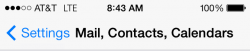
When I look at the above screenshot, I see "Settings Mail, Contacts, Calendars" all as one line of text on first glance. This is because the word settings is so close to the page title that it looks like it is part of it. It's only when I look more closely that I see that the word settings is actually separate. But, the point of a UI is that I shouldn't HAVE to look a second time to navigate it easily.
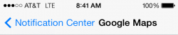
The text-only approach is also inconsistent. In some cases, the navigation text actually pushes the page title way off center. This can be confusing to people who are used to the page title always being centered. It also just looks bad.
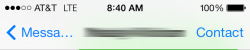
In other cases, the UI shortens the navigation text to keep the page title (mostly) centered. In this case, you can't really tell what the back button says unless you already know your way around the OS. I would also submit that this method also looks cluttered.

I know that getting rid of buttons is one of the ways Apple is trying to shove off the "dated" UI paradigms from iOS 1-6. But this feels like change for the sake of change rather than a true design improvement. And yes, as several people have pointed out, you can eventually train yourself to recognize that the blue text represents an actionable item. I've pretty much reached that point. But, I'm pretty technically minded. I worry about my parents and my grandmother, all of whom have iDevices and none of whom are into technology. Especially in the case of my grandmother, this change will, without a doubt, make her iPad harder to use. And even in my case, I still have to hunt for the actionable text from time to time because it is so often allowed to slam into the page title.
For comparison here's what that last screen from the messages app looks like on iOS 6. I'm not trying to start a debate on iOS 6 vs. iOS 7. However, I think it's pretty clear that the actionable items are more clearly marked. And, because the buttons use a smaller font size, the entire word "Messages" can be fit into the back button.
Personally, I think Apple really needs to bring back some sort of button outline like the one I posted in my original post. It would make the navigation elements more uniform by giving them a defined size and would also make them easier to identify. This is just my opinion though. If Apple does stick with the "text-only" approach, I hope they will at least consider making the actionable items have a smaller font size. This would allow them to fit longer words in a smaller space, and would help separate them from the page title. Apple could still do their "slides in to become the page title" animation by adding a simple scaling effect.
Anyway, just my two cents!
")