Become a MacRumors Supporter for $50/year with no ads, ability to filter front page stories, and private forums.
It seems to me that Apple is making some poor aesthetic choices when it comes to the design of their UI with the upcoming release of Leopard.

I thought the same thing as i saw the keynote.. it looks like Apple are losing
their "touch".

.
Apple's decision to switch Front Row over to the AppleTV interface is also a disappointing change. AppleTV's interface looks like a few Apple designers discovered Photoshop layers and went crazy with poorly implemented transparencies and gradients. I sure hope they didn't use the icons from AppleTV too, because Front Row's original icons are superior..

TOTALLY AGREE... The current Front Row is MUCH more good looking than this AppleTV style.

Also, am I the only one who thinks the new Apple website is tacky? Strange gradients, cluttered elements, my eyes feel visually assaulted after visiting..

No functionality AT ALL !

Wake up Apple.. you didn't get that "most innovative" prize for nothing .. Bring that old Apple magic back..

p.s - I think it's time to change the tutleneck ... it's getting pretty cheesy tacky..
 
Good point!

I use a wacom tablet most of the day and whether drawing from wrist or elbow, the path of the pointer does indeed follow an arc *very* similar to the arc in which the stacks in Leopard are arranged. Selecting through such an arrangement could possibly be much easier and faster than selecting from a straight vertical column.

Anyway, I would be very surprised if there wasn't some kind of Preference controls included for setting the arc, spacing, size etc to suit everyone's personal tastes.

This is just a slightly educated guess, but the hand and arm's normal and most natural movement (using a mouse) is in an arc, making it easier if the stack is at slight angle. This is just a guess of course, but I wouldn't put it past Apple to have thought about something as minute as this.
 
I wondered about the scaling too but what's the problem with the "stage" automatically adjusting?
Unless you mean something else...?

I mean that right now you can scale the size of the dock by dragging on the seperator line. I wonder how you do it in Leopard.
 
The most glaring to me was the modification of the dock and the introduction of angled/tapered edges. Was this change for the mere sake of change? I see no functional improvement to tapering the edges, and to my eye, the change looks amateur.

tapered edges?... hmm i'm hearing this a lot from people and i'm finding it totally amazing people are misinterpreting illusory perspective with 2 dimensional tapering. the dock is a floor extending into the depth of the image. maybe it's time to check out some M.C. Escher pictures again so you can see what you've been missing all this time. ;)

Jobs did another CoreAnimation demo in which the whole exercise illustrated perspective and motion effects. if Jobs is hoping to get programmers to create apps with the full potential of Core Animation then expect to be seeing a lot of 'tapering' in the future interface.

trapezoids, the flat man's 3D
 
I think the new dock looks great. The 3D look integrates perfectly with stacks. There is nothing childish about it.

However, I do not like the new Front Row look. Ever since they released :apple: TV, I thought it looked pretty lame and now they have copied that for Front Row. The old looked far surpasses the :apple: TV look.
 
If I could add all the negative reviews since the launch of Tiger...


And then after a little while, most praise apple.
 
I think the problem is people are going from what the transcription from the WWDC said and the small low quality video feed. People need to get there hands on it to really see what is going on and how well it works. I think it looks great and really can't wait to be able to buy it.
 
It seems to me that Apple is making some poor aesthetic choices when it comes to the design of their UI with the upcoming release of Leopard.

........................

The most glaring to me was the modification of the dock and the introduction of angled/tapered edges. Was this change for the mere sake of change? I see no functional improvement to tapering the edges, and to my eye, the change looks amateur.

Your subject title certainly suggests more than the content of your post warrants. So, maybe you will not like the look of Leopard. Hardly something to lose sleep over. Maybe you should wait until you are actually using the product, before forming an opinion.
 
I think the problem is people are going from what the transcription from the WWDC said and the small low quality video feed. People need to get there hands on it to really see what is going on and how well it works. I think it looks great and really can't wait to be able to buy it.

Yeah... except there are plenty of high-quality videos and screenshots on Apple's Leopard preview page.

I'd advise all those who think the new UI is horrifying (I was one of you, too) to take a look at Leopard Server's preview page, specifically shots of the desktop like this one. It's amazing what a clean, calming desktop can do to the entire look and feel of the UI. The grass was, arguably, the worst part about the keynote. I frankly never want to see another grass wallpaper again in my lifetime.

Regardless, even on a simple wallpaper the menu bar's blue highlight has got to go. Make it black or something.
 
Things that NEED to change:

Default Wallpaper
Level of transparency in the menu bar I like the look--not the transparency, I'd prefer they remove it entirely and just make it be any colour of your choice.

Other than that I love it!
 
Things that NEED to change:

Default Wallpaper
Level of transparency in the menu bar I like the look--not the transparency, I'd prefer they remove it entirely and just make it be any colour of your choice.

Other than that I love it!

Wallpaper - you can change
Transparency - you can remove

Problems solved.
 
Wallpaper - you can change
Transparency - you can remove
Problems solved.

What fact do you base this upon? So far I have seen no resolute evidence that the transparency effect is adjustable, or can even be disabled.
 
What fact do you base this upon? So far I have seen no resolute evidence that the transparency effect is adjustable, or can even be disabled.

First hand information from WWDC

A couple of notes from Moscone WWDC (woohoo!)

Menubar transparency can be turned off

However after trying it out, you never want to, it makes you more focused, and less distracted. I thought it was ugly, then tried it. It's actually very good for productivity.

It's fast.

Stacks are fantastic.

The new finder is absolutely the best part. How many years have we wanted a cocoa finder? It's HERE!!!!! Browsing network shares is no longer met with delays, it's using the fast Unix finally. I can try to mount 10 shares without every seeing a cursor.

Proper multi-threaded support. No more pauses when clicking on the menubar or anything else. Apps keep chugging along.

No more beachball so far.

It's the perfect OS for productivity. No crazy changes, just refinement to the extreme.

It's a beautiful thing!

DVD player has been able to play HD-DVDs for a long time. It has blu-ray and HD-DVD settings in prefs now.

Dock works fine on the sides, 3D but the icons are sideways (proper) with shadow. Looks awesome on the side. I'd post pictures but I'd rather not be in Apple prison.
 
I also don't really like the new look. The menu bar should've been kept white with the curve at the top corners. The new dock seems like it'll be a bit awkward when it's set at the smallest size. I don't like the new folder icons either. The current ones are perfect. The new standard wallpaper is just too Vista-y.

Personally, I rather have all the features they showed without the new transparent menu bar and the 3D dock.
 
Awesome; somehow I missed this thread.

There is more information about different features throughout that thread, just a case of cutting through the guff (as usual).

Inkhead (thank you) has posted lots of information, here is one more gem of information for example
 
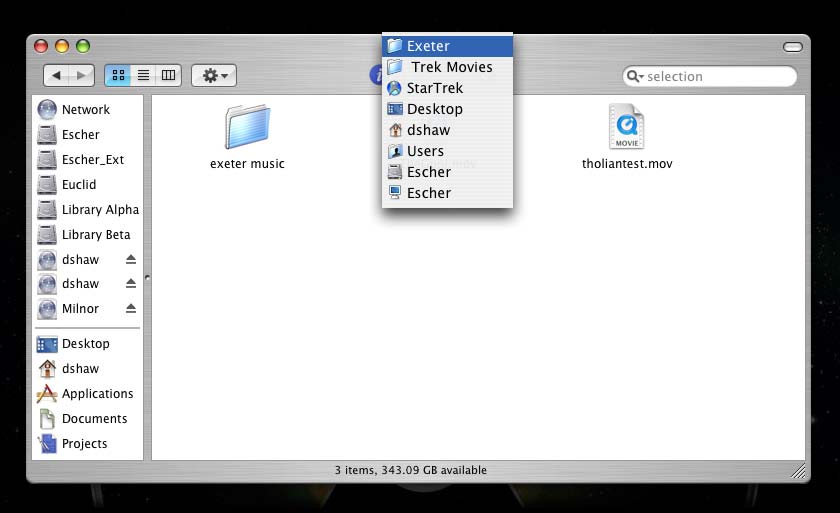
Agreed. Finder definitely needs a way of reaching the parent folder besides the column view. They can do it on their website and in the iTunes Store, why not Finder?
The Finder has had a way to do this since Mac OS 8 (maybe earlier)... command click on the Finder window title...

finder_path.jpg

breadcrumbing would be great. cmon apple wake up and listen to us!
Apple removed this type of thing after Rhapsody because Mac users thought it was too NeXT-like. This is what we had before Aqua was introduced...

fonts_01_TIFF_Image_10.jpg

I've always liked the paths displayed as icons, and Jobs touted it back in the NeXT days as a much easier way to navigate... but like I said, people complained and Apple listened.

:rolleyes:

Come to think of it, people complained about Aqua being too bright and colorful, but now that the UI is getting darker and grayer people are complaining again. Maybe Apple should actually stop listening to people. :eek:
 
Apple removed this type of thing after Rhapsody because Mac users thought it was too NeXT-like. This is what we had before Aqua was introduced...

I've always liked the paths displayed as icons, and Jobs touted it back in the NeXT days as a much easier way to navigate... but like I said, people complained and Apple listened.

:rolleyes:

Come to think of it, people complained about Aqua being too bright and colorful, but now that the UI is getting darker and grayer people are complaining again. Maybe Apple should actually stop listening to people. :eek:

Agreed. Although I personally would actually like to see the iTMS-style bread-crumbing. It is space-efficient, which is the one thing that still bugs me when I see screenshots from Rhapsody.

I like the direction the UI is taking. I like a fair amount of contrast for text, but UI elements don't need the same stark contrast, and a return to the platinum-esque style, along with the attention drawn to the front window is rather nice.
 
If I could add all the negative reviews since the launch of Tiger...


And then after a little while, most praise apple.

I think its like Mac fans go though a sort of monthly cycle.

Product Release or upgrade or announcement > Complaining because Apple somehow let them down > Acceptance and enjoyment > rumors > suspense and excitement > Product Release or upgrade or announcement > Complaining because Apple somehow let them down.

The funny thing is that with this monthly cycle is an apparent sense of amnesia that occurs around the acceptance and enjoyment stage. It explains why the same people who were cursing tiger back in the day are cursing leopard now and saying Tiger is the next best thing to fire.

And take this analysis the wrong way, I think all of us on here experience it in some way shape and form (besides the recent influx of trolls), I include myself as part of this monthly cycle.

What, like a period?
 
New designs often get negative reaction because of fear of change. However, when iTunes 7 came out, it was much different. One of the first times they actually made something uglier, and people still thought so months later. (Not all people, just a lot of people)

So, it goes both ways. I know from iTunes that I don't like the muddy sidebar already, or the header treatments therein. I don't have to wait until I see it in the Finder. Some other things, like the dock, may grow on people.
 
I think its like Mac fans go though a sort of monthly cycle.

Product Release or upgrade or announcement > Complaining because Apple somehow let them down > Acceptance and enjoyment > rumors > suspense and excitement > Product Release or upgrade or announcement > Complaining because Apple somehow let them down.

What, like a period?

Ha ha ha! Absolutely!

Apple's biggest fans are it's worst critics.

I think Leopard is going to be awesome! I'll turn off the menu bar transparency, and hopefully we have some control over the Finder sidebar to clean it up a little, but Time Machine, Spaces, Mail, the 3D dock, Stacks, etc... is incredible!

I'm very much looking forward to Leopard, and the things that I don't particularly care for in the beginning will be fine after a while.
 
tapered edges?... hmm i'm hearing this a lot from people and i'm finding it totally amazing people are misinterpreting illusory perspective with 2 dimensional tapering.

I hear what you are saying, ghiangelo, and perhaps I missed something, but consider this: if so many people are missing out on illusory perspective as you say, maybe its not the viewer who is in error, but the artist who has failed to effectively convey the effect?


Your subject title certainly suggests more than the content of your post warrants...
Yeah, I can see why you'd say that. My bad. I wasn't really intending to address Apple aesthetics in a general sense, this was more specifically pointed at Leopard's new UI.

The new dock *is* starting to grow on me, but I still don't think I can yet stomach that transparency on the menu bar.
 
Register on MacRumors! This sidebar will go away, and you'll see fewer ads.