I keep reading this, but it doesn't make sense to me. The menubar has never distracted me from what I was doing.
That's 'cause the menu bar keeps distracing yo... hey, are you even listening to me?
😛
It seems to me that Apple is making some poor aesthetic choices when it comes to the design of their UI with the upcoming release of Leopard.
The most glaring to me was the modification of the dock and the introduction of angled/tapered edges. Was this change for the mere sake of change? I see no functional improvement to tapering the edges, and to my eye, the change looks amateur.
Apple's decision to switch Front Row over to the AppleTV interface is also a disappointing change. AppleTV's interface looks like a few Apple designers discovered Photoshop layers and went crazy with poorly implemented transparencies and gradients. I sure hope they didn't use the icons from AppleTV too, because Front Row's original icons are superior.
How about the new transparent dock? I'm worried that, much like Vista, getting the wrong colors behind it will make it look like mush. Things end up looking far busier as weird contrasts form depending on the background.
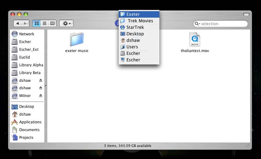
The new finder uses strangely capitalized letters on the side and odd color choices (much like iTunes). Again, to my eye, the old Finder looks more aesthetically pleasing (whether it is more functional or not is not what I'm discussing in this post).
Also, am I the only one who thinks the new Apple website is tacky? Strange gradients, cluttered elements, my eyes feel visually assaulted after visiting.
Anyway, these are just my thoughts, for whatever they are worth. Just want to know if anyone else feels similar, and I don't mean to come across as elitist.
I agree wholeheartedly. I am worried about Apple's current direction, where style is more important than usability.
The 3D Dock is distracting, the reflections make it more so. Why do away with the border which delineates the Dock? Otherwise, the Dock 'base' serves no purpose, other than being shiny.
Stacks are a nice feature, but I doubt the arc is a good idea, as having the filenames at an angle doesn't aid legibility.
The unified window appearance is functionally flawed too. Where is the visual divide between title bar and the tool bar? You think you don't need one? Well, you can double click on a title bar to minimize a window, but not on the tool bar. How do you know where to click? With the unified window appearance, you guess.
Remember back when the title bar had ridges/undulations (as the drag thumb at the bottom right of OSX windows) to reflect that it's draggable? Why isn't that a good idea now? Not pretty enough?
Considering OSX windows tend to have a lot of title/border space, I'd have thought a dark-ish gray a poor choice of fill colour for such a large area on-screen. Surely a lighter colour, or a soft texture (other than brushed metal) would be more appropriate. Or ideally, just provide themes in the OS and let people choose themselves without resorting to risky 3rd party solutions.
Time Machine (especially the version-control element of it) looks like it could be incredibly useful, but the UI (i.e. the 'black hole' background) is, to me, very tacky.
I actually think Leopard is a very solid, worthwhile update, not that you could tell that with Steve spending the entire keynote pimping "The Shiny". It has so many worthwhile features that he either skimmed over or skipped entirely in lieu of "Woo, reflections!", or "Let's see that again in slo-mo!!!"
😱